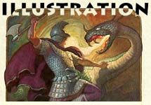
As a special thank you to our annual General and Student members, we have created a special page where we will archive past Reference Packs. There will be a new rerun of a complete RefPack between the new ones.
Available to Student and General Members
JOIN TODAY To Access Members Only Content
Blaeksprutten (Cuttlefish)![]()
1912-1913 Christmas Annuals
The Scandinavian countries (Denmark, Sweden, Norway, Finland, & Iceland) have contributed many traditions to the celebration of Christmas around the world: Christmas trees, elves, reindeer, advent calendars, and even Santa Claus. But one of the most unique holiday traditions in Scandinavian countries is the "Christmas book flood". Catalogs are distributed of special books and magazines, and people order them as gifts for friends and family. More books are sold in this part of the world between November and December than the rest of the year. Scandinavians are among the most literate people in the world. Amazingly, 1 in 10 Icelandic residents is a published author. The holiday tradition of giving books as holiday gifts is so ubiquitous, Scandinavians don’t even recognize it as a tradition. They assume all countries buy special books for Christmas.
In addition to books, Norwegian publishers put out annual Christmas magazines, the earliest of which date back to the mid 19th century. These early annuals featured sheet music, stories, humorous cartoons, satirical gossip about local public figures and recipes, and they were usually presented in a horizontal format to set them apart from monthly and weekly periodicals.
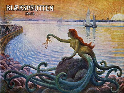
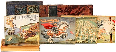
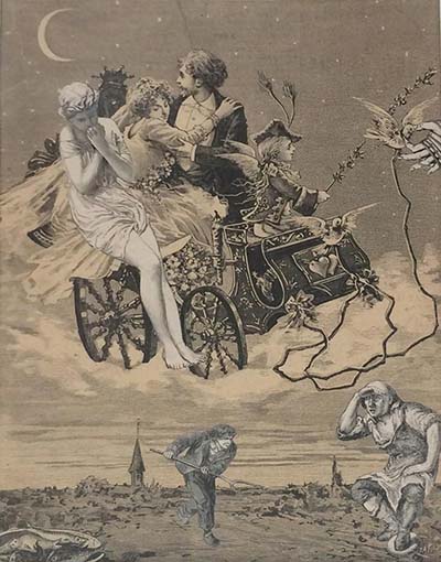
In Copenhagen, a satirical Christmas annual magazine called Blaeksprutten was launched in 1889. The title translates to Cuttlefish, and the idea was that the writers and artists who worked for the magazine had their "tentacles" in all aspects of life in Denmark. The magazine blended both the tradition of the Christmas annual and the satirical magazines flourishing around the world at the time. Beautifully printed, the magazine featured catty theater reviews, humorous stories and poems, and sentimental music; and it was illustrated with panoramic "birds eye view" shots of Danish villages bustling with life, fanciful subjects in lavish color, caricatures and line drawings in ink. The principle artists in the beginning of the 20th century were Alfred Schmidt, a well known caricaturist and poster designer; painters Paul Gustav Fischer and Axel Nygaard; line artists Sven Brasch and Gerda Ploug Sorenson Sarp; and fashion illustrator Gerda Wegener. Blaeksprutten is still being published every Christmas after 125 years.
This publication is pretty much unknown in the United States, but Animation Resources has been working to collect a sampling of these hard-to-find magazines to share with its members. We hope you find it useful to your in your studies.
Adobe PDF File / 124 Pages / 812 MB Download
Click to access the…
Downloads expire after July 2025
JOIN TODAY To Access Members Only Content
DVD QUALITY VIDEO:
A Collection of Polish Animation![]()
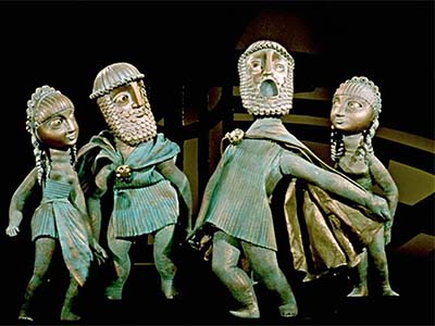
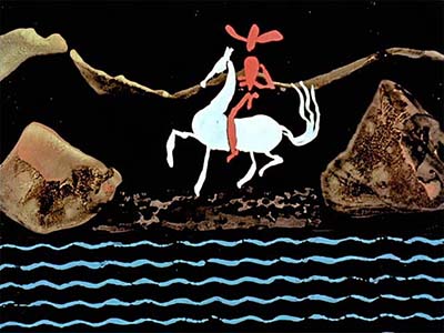
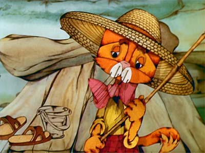
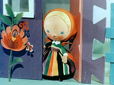
"Dumpling" Lucjan Dembinski (1959) / "Beyond The Wood, Beyond The Forest" Wladyslaw Nehrebecki (1961) / "The Little Quartet" Edward Sturlis (1965) / "A Little Western" Witold Giersz (1960)
In one of our previous Reference Packs, we discussed how The Wan Brothers’ "Havok In Heaven" perfectly adapted the format of the animated feature to reflect the art and culture of China. This time we are presenting a couple of films that show how film makers halfway around the globe used animation to reflect a distinctly Polish point of view.

Wycinanki: The art of paper cutting

![]() Lucjan Dembinski’s "Dumpling" and Wladyslaw Nehrebecki’s "Beyond The Wood, Beyond the Forest" both are styled after traditional Polish folk art.
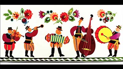
Lucjan Dembinski’s "Dumpling" and Wladyslaw Nehrebecki’s "Beyond The Wood, Beyond the Forest" both are styled after traditional Polish folk art.
The folk art form known as wycinanki (pronounced vee-chee-non-kee) originated in the Ukraine at the end of the 15th century. Shepherds would cut designs out of bark and leather, and artists would paint colorful floral patterns on furniture, beams and walls of homes. The art of wycinanki paper-cutting for holidays became very popular in the mid-1800s, and regional styles developed. The tradition still continues with skilled artisans competing to create the most beautiful patterns.
Wladyslaw Nehrebecki, who is best known for the television series "Bolek and Lolek", became interested in the peasant art of his native Poland, and teamed up with a Polish folk art museum to adapt the designs to animation using paper cut outs. The result was "Beyond The Woods, Beyond The Forest". Beautifully composed using a wide screen format, the bright colors and simple shapes are skillfully animated, essentially bringing wycinanki to life. Puppet animator Lucjan Dembinski also mined this rich well of inspiration with a film called "Dumpling" that translated wycinanki designs into three dimensional stop motion animation.
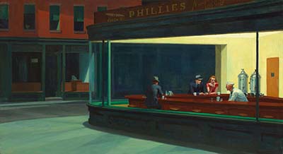
Too often we take culture for granted. As film makers, we look to other films for inspiration instead of seeing the creativity that surrounds us. Obviously in the United States, we don’t have anything like wycinanki, but that doesn’t mean that we can’t draw on our culture for inspiration. Roy Lichtenstein saw comic books as fine art, Andy Warhol painted Campbells soup cans and Edward Hopper created an incredibly powerful image of a diner in the city late at night. Who’s to say that modern highway interchanges, television, neon signs, computer screens or billboards aren’t American equivalents of cultural folk art. As you watch these films, think about the unappreciated man-made beauty that exists in the place you live and try to incorporate that into your work. I guarantee you it will be a lot more engaging and interesting than recycling the same old tired animation tropes and done-to-death styles.
MP4 Video File / SD / 9:44 / 118 MB Download
Beyond The Forest (1963)
MP4 Video File / SD / 9:55 / 186 MB Download
Click to access the…
Downloads expire after July 2025
JOIN TODAY To Access Members Only Content
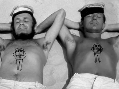
In RefPack 032, we shared a simple film called "Beach" that Edward Sturlis made in 1964. The following year, he made a fantastic puppet film called "The Little Quartet". It’s interesting that Sturlis moved so effortlessly from hand drawn animation to stop motion. He must have seen himself as an animator, not a person who just draws or makes puppets. The two skills might be different from a technical standpoint, but the principles of creating personality and displaying it through timing and movement are the same. A lot of current animators define themselves as 2D or CG or Stop-Mo, but an animator is an animator. Sturlis proves it. As you watch this film check out the wonderful musical timing and expressive posing. It’s pure genius.
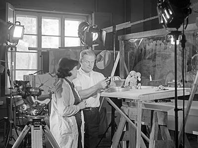
Edward Sturlis at work in his studio
Witold Giersz is a towering figure in Polish animation. He pioneered the art form in Poland as early as 1950 and went on to produce fifty films. Michael Sporn’s "Splog" has a great interview with Giersz that you really should make a point of reading. That blog post will give you a sense of his work and biography. But I would like to focus on a specific aspect of his technique here…
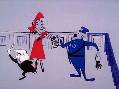
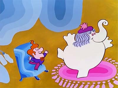
"Rooty Toot Toot" / John Hubley / UPA (1951)
In the past decade or so, there has been renewed interest in "modern animation". Books have been written on artists like Mary Blair and studios like UPA. Highly stylized animation is de rigueur for title sequences of CGI features, often looking more expressive and appealing than the film itself. Television animation and internet cartoons are produced with programs like Flash using libraries of modular virtual puppets designed with the flair of the 1950s cartoons and early 60s TV animation. But even though it’s nicely designed and colored, modern stylized animation always seems to look flat compared to films like "Rooty Toot Toot" and even some of the television commercial reels Animation Resources has shared here in the past. Why is that?
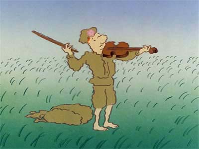
If you analyze Witold Giersz’s film "A Little Western" you will spot the missing element. The film looks deceptively simple— flat featureless shapes, abstract textured blobs for backgrounds, simple bold primary colors. But behind that simple surface, there is a magic trick being performed.
Still frame through a few scenes and you will see simple, elegant flat shapes. Play it in motion and those flat shapes turn into solid volumetric forms. How can it be two dimensional and three dimensional at the same time? The secret is the fourth dimension of time and space. Ward Kimball once said that the art of animation doesn’t exist in individual drawings. The art is in the differences between the drawings. The way those flat shapes change from one to another is the secret that gives it form. Look at Grim Natwick’s animation of the courtroom scene in "Rooty Toot Toot" for another brilliant example of fourth dimensional animation. The characters exist as two dimensional shapes which reveal their three dimensional volume only when they move. Think about that as you watch "A Little Western".
MP4 Video File / SD / 9:44 / 118 MB Download
MP4 Video File / SD Widescreen / 5:27 / 112 MB Download
Click to access the…
Downloads expire after July 2025
JOIN TODAY To Access Members Only Content
Three Early Columbia Cartoons
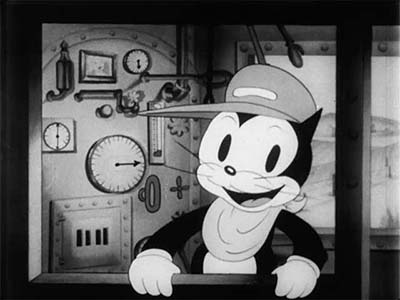
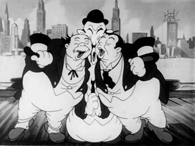
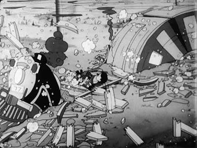
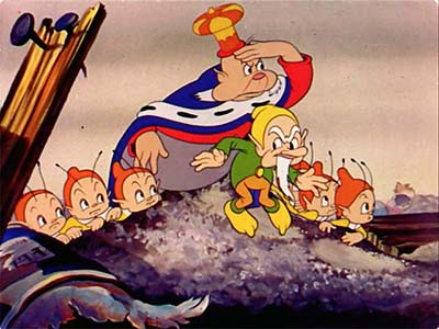
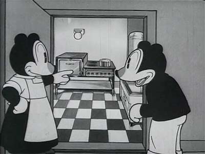
"Scrappy’s Expedition" (1934) / "Railroad Rhythm" (1937) / "Happy Tots’ Expedition" (1940)
I want to make it clear from the outset that I don’t think these cartoons are very good from an entertainment standpoint. The gags aren’t particularly funny, the characters are devoid of personality, the stories don’t make a whole lot of sense, and they contain subject matter that ranges from completely obsolete to downright offensive. "Scrappy’s Expedition" features caricatures of radio stars that few people today will recognize. The Kate Smith caricature is accompanied by a song from 1917 that must have seemed out of date even in 1934 when the film was first released. There’s inappropriate sexual innuendo sprinkled in everywhere. A ship’s whistle behaves like a stereotypical gay man, and in "Happy Tots’ Expedition" the characters ride on a rocket in a blatantly phallic manner repeatedly sliding under other characters’ butts. "Railroad Rhythm" takes discomfort to a whole new level with stereotypical Eskimos rubbing noses and an incredibly insensitive caricature of character actor Steppin Fetchit as a chimpanzee… So why am I sharing these awful cartoons with our members?
Ancient pop culture trivia and long gone derogatory depictions of people from different races and cultures might be a subject for study by social scientists and historians, but they should hold no interest for film makers designing animation for modern audiences. The content of these old scratchy cartoons— specifically the gags, plots and characters— just don’t translate to our modern era. Creating cartoons like this today is a wrong-headed thing to do. But that doesn’t mean that there’s nothing to learn from these films, and it doesn’t mean that breaking them down and studying them is wrong.
A film maker sees films differently than audiences do. The audience expects to be entertained. A film maker is looking for techniques he can learn from. Even though these three cartoons are about as entertaining as watching paint dry, they do have value. There are some scenes that are brilliantly animated, particularly when it comes to the animation of rain, water and smoke; as well as the rendering of the scale and perspective of large vehicles like ships and trains.
In "Railroad Rhythm" still frame through the scene where the train dives under the tracks at 2:58. Notice how the train digs down in front in to avoid hitting the characters, while the momentum of the cars behind causes them to bunch up. The force from the rear drives the front of the train down into the dirt. As soon as the engine and coal car clear the scene into the hole, the animator creates a repeating cycle of passenger cars to save on pencil mileage, and turns his attention to the locomotive bursting through the tracks on the other side. The engine flexes like rubber back onto the rails and off screen, while incredibly well tracked layers of steam, rubble and railroad ties fly in all directions. Throughout all this, the characters tied to the track strain at the ropes holding them until the train clears the scene leaving a hole and rubble behind. This animation is every bit as complex as anything in a Mickey Mouse cartoon, and it’s even more amazing when you realize that the density of nitrate cels meant that all of this animation had to be accomplished on just three layers. Any way you slice it, it’s a brilliantly organized bit of animation.
"Happy Tots’ Expedition" was clearly intended to emulate the style of animation Disney created for "Snow White", but it does it in a totally bizarre way. Instead of "Squash and Stretch" and "Overlapping Action", the Columbia animators employ "Drag and Droop" and overlap the overlap until the characters wiggle like jello. It’s completely unprincipled— solid forms defining bone structure stretch like taffy, just like the soft fleshy jowls and chin wattles. At one point the animator misinterprets the King’s jowls as a mustache, and the ink & paint department dutifully corrects it by painting the mustache flesh colored. The King’s robe swirls around in random S curves like a cobra. Head and eye proportions change from frame to frame. Hook ups between scenes are sometimes totally wrong. Still frame through the scene at 3:18 with the cyclops take; or even worse, check out the drawings in the mustache scene at 4:39. The topper gag really does top everything that came before with one of the most obscene sequences ever to get past the Hayes Office.
As you still frame through this cartoon you’ll find a million hilarious drawings. But it’s hard to know whether it was supposed to be funny in that way or not. It might be a devastatingly sharp parody of Disney animation with extreme overlap, rubbery squash and stretch and butt joke after butt joke… or perhaps it’s a crew of inexperienced animators making a high splat on the wall. Either way, it’s worth taking a close look at and puzzling out what the animators might have intended.
I hope you won’t dismiss old films because they don’t live up to modern tastes. As a film maker, you shouldn’t be studying films for their content. You should focus on how they were made. If you do that, even bad films can make you think and inspire you to go on and make much better films yourself.
Many thanks to Steve Stanchfield and Thunderbean Animation for sharing these rare films with our members.
MP4 Video File / SD / 6:47 / 125 MB Download
MP4 Video File / SD / 6:35 / 124 MB Download
MP4 Video File / SD / 6:21 / 112 MB Download
Click to access the…
Downloads expire after July 2025
If you are currently on a quarterly membership plan, consider upgrading to an annual membership to get access to our bonus page with even more downloads. If you still have time on you quarterly membership when you upgrade to an annual membership, email us at…
membership@animationresources.org
…and we will credit your membership with the additional time. These bonus downloads expire after May 1st, 2025.
JOIN TODAY To Access Members Only Content
Whew! That is an amazing collection of treasures! The most important information isn’t what you already know… It’s the information you should know about, but don’t know yet. We bring that to you every other month.
THIS IS JUST THE TIP OF THE ICEBERG!
Animation Resources has been sharing treasures from the Animation Archive with its members for over a decade. Every other month, our members get access to a downloadable Reference Pack, full of information, inspiration and animation. The RefPacks consist of e-books jam packed with high resolution scans of great art, still framable animated films from around the world, documentaries, podcasts, seminars and MORE! The best part is that all of this material has been selected and curated by our Board of professionals to aid you in your self study. Our goal is to help you be a greater artist. Why wouldn’t you want to be a member of a group like that?
Membership comes in three levels. General Members get access to a bi-monthly Reference Pack as well as a Bonus RefPack from past offerings in the in-between months. We offer a discounted Student Membership for full time students and educators. And if you want to try out being a member, there is a Quarterly Membership that runs for three months.
JOIN TODAY!
https://animationresources.org/membership/levels/
FREE SAMPLES!
Not Convinced Yet? Check out this SAMPLE REFERENCE PACK! It will give you a taste of what Animation Resources members get to download every other month! That’s 560 pages of great high resolution images and nearly an hour of rare animation available to everyone to download for FREE! https://animationresources.org/join-us-sample-reference-pack/
![]()
![]() Animation Resources depends on your contributions to support its projects. Even if you can’t afford to join our group right now, please click the button below to donate whatever you can afford using PayPal.
Animation Resources depends on your contributions to support its projects. Even if you can’t afford to join our group right now, please click the button below to donate whatever you can afford using PayPal.


