![]() Seeing the fantastic examples by Mary Blair, Milt Gross and Jack Kirby on the internet reminds me how UN-designed many animated films and print cartoons are today. Mark Kennedy has a great post on Rhythmic Composition that you’ll want to check out too.
Seeing the fantastic examples by Mary Blair, Milt Gross and Jack Kirby on the internet reminds me how UN-designed many animated films and print cartoons are today. Mark Kennedy has a great post on Rhythmic Composition that you’ll want to check out too.
When I went to design school, I don’t remember any real serious analysis of compositional techniques beyond the most basic principles. Compositions were critiqued with “gut reactions”, which might be helpful in identifying a design that isn’t working, but it doesn’t help an artist trying to figure out how to improve and strengthen his work.
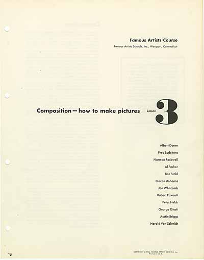
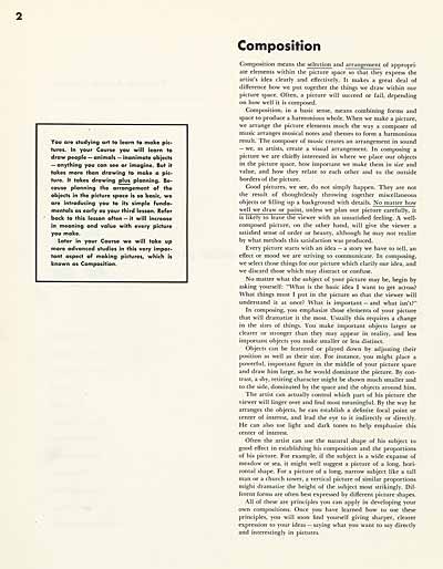
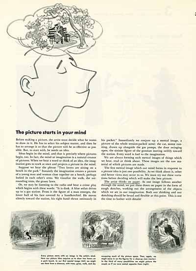
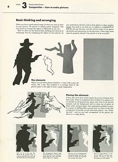
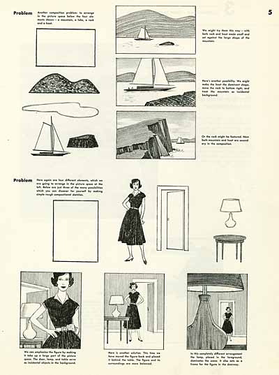
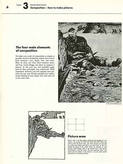
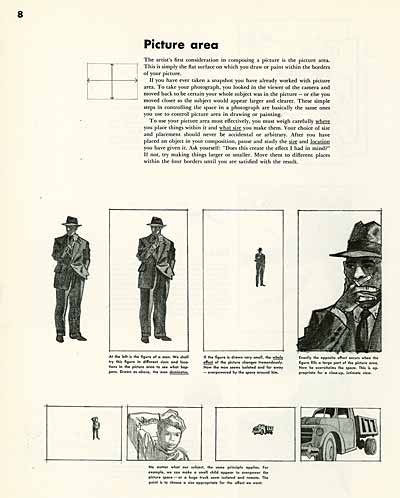
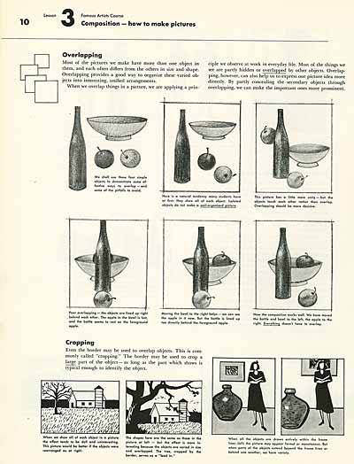
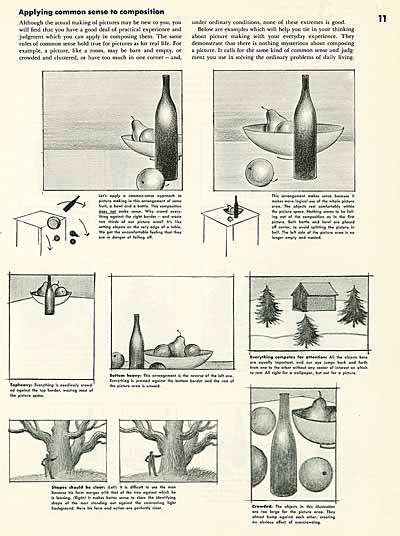
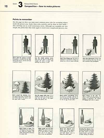
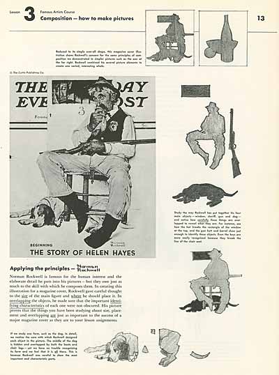
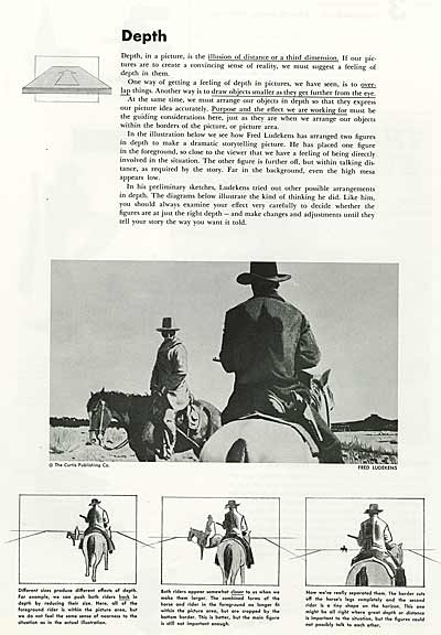
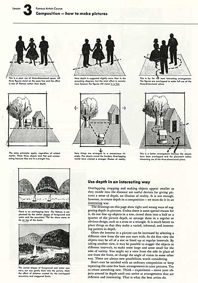
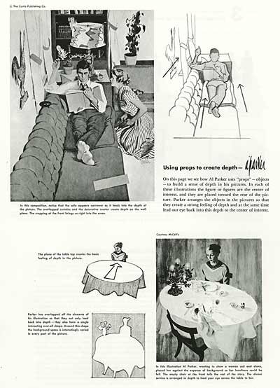
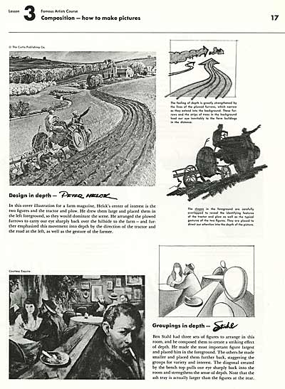
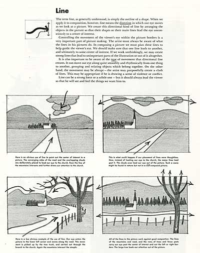
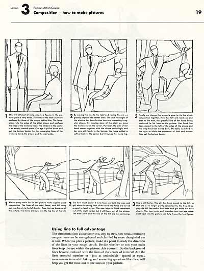
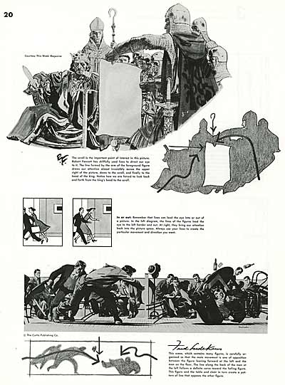
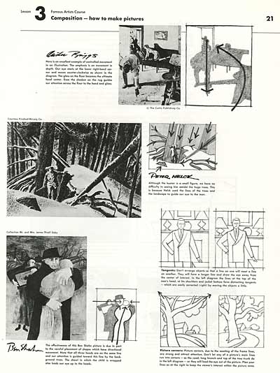
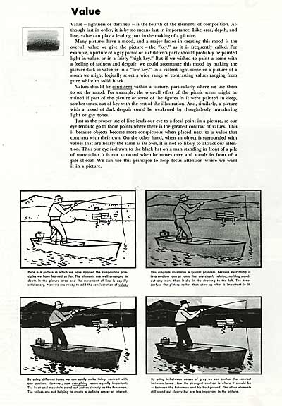
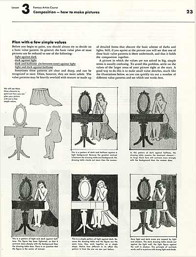
I dug through my reference shelves and pulled another invaluable lesson from the Famous Artists Course. This is lesson three from the Illustration Course this time. In methodical fashion, the famed illustrators Albert Dorne, Norman Rockwell, Al Parker, Peter Helck, Austin Briggs, Ben Stahl and Fred Ludekens team up to break down the nuts and bolts of what makes a picture work.
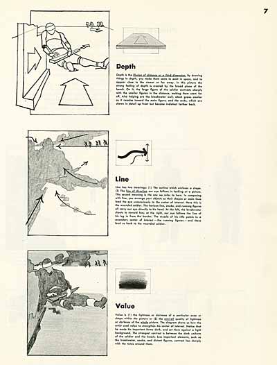
THE FOUR MAIN ELEMENTS OF COMPOSITION
1.) PICTURE AREA

2.) DEPTH
3.) LINE
4.) VALUE
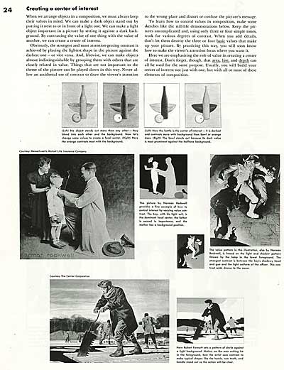
![]() The Famous Artists Course was created in the mid-1950s by Norman Rockwell, Rube Goldberg and Albert Dorne, among others. The correspondence lessons and educational materials are still available at www.famous-artists-school.com. Books from the three courses: Painting, Illustration/Design and Cartooning turn up on eBay as well. I highly recommend these great resources to students.
The Famous Artists Course was created in the mid-1950s by Norman Rockwell, Rube Goldberg and Albert Dorne, among others. The correspondence lessons and educational materials are still available at www.famous-artists-school.com. Books from the three courses: Painting, Illustration/Design and Cartooning turn up on eBay as well. I highly recommend these great resources to students.
Stephen Worth
Director
Animation Resources
This posting is part of an online series of articles dealing with Instruction.
THIS IS JUST THE TIP OF THE ICEBERG!
Animation Resources has been sharing treasures from the Animation Archive with its members for over a decade. Every other month, our members get access to a downloadable Reference Pack, full of information, inspiration and animation. The RefPacks consist of e-books jam packed with high resolution scans of great art, still framable animated films from around the world, documentaries, podcasts, seminars and MORE! The best part is that all of this material has been selected and curated by our Board of professionals to aid you in your self study. Our goal is to help you be a greater artist. Why wouldn’t you want to be a member of a group like that?
Membership comes in three levels. General Members get access to a bi-monthly Reference Pack as well as a Bonus RefPack from past offerings in the in-between months. We offer a discounted Student Membership for full time students and educators. And if you want to try out being a member, there is a Quarterly Membership that runs for three months.
JOIN TODAY!
https://animationresources.org/membership/levels/
FREE SAMPLES!
Not Convinced Yet? Check out this SAMPLE REFERENCE PACK! It will give you a taste of what Animation Resources members get to download every other month! That’s 560 pages of great high resolution images and nearly an hour of rare animation available to everyone to download for FREE! https://animationresources.org/join-us-sample-reference-pack/
![]()
![]() Animation Resources depends on your contributions to support its projects. Even if you can’t afford to join our group right now, please click the button below to donate whatever you can afford using PayPal.
Animation Resources depends on your contributions to support its projects. Even if you can’t afford to join our group right now, please click the button below to donate whatever you can afford using PayPal.


