JOIN TODAY To Access Members Only Content
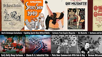
The latest Animation Resources Reference Pack has been uploaded to the server. Here’s a quick overview of what you’ll find when you log in to the Members Only Page…
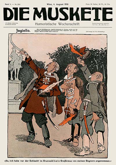
Die Muskete Volume Two![]()
Vol. X Nos. 253-160 (August-September 1910)
Download this article
During the 19th century, society had a totally different relationship with cartoons than we do today. Beginning with artists like James Gillray and George Cruickshank in early decades of the century, cartoons were seen as serious business. They crystalized the image of the rich and powerful in the minds of the masses, and even Kings and religious leaders were forced to take notice of their impact. The pen truly had become “mightier than the sword”.
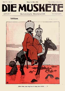
![]() With the dawn of the 20th century, the lives of people were changing. The modern world was emerging, and with it came pressures brought on by technology, new forms of government, colonialism and war. The gloves were off. Cartoonists no longer limited their satire to Kings and religious leaders. They wielded their power to satirize by skewering everyone and everything around them– religion, ethnicity, the rich as well as the poor, and the power that the government held over the public. Cartooning became a powerful tool for changing hearts and minds, as well as disseminating nationalistic propaganda. The conflicts that these new challenges created began building to a head, and it would eventually result in “The Great War”, World War I.
With the dawn of the 20th century, the lives of people were changing. The modern world was emerging, and with it came pressures brought on by technology, new forms of government, colonialism and war. The gloves were off. Cartoonists no longer limited their satire to Kings and religious leaders. They wielded their power to satirize by skewering everyone and everything around them– religion, ethnicity, the rich as well as the poor, and the power that the government held over the public. Cartooning became a powerful tool for changing hearts and minds, as well as disseminating nationalistic propaganda. The conflicts that these new challenges created began building to a head, and it would eventually result in “The Great War”, World War I.
But even though it was a difficult time politically, the world was experiencing a renaissance in the arts. There were two principle styles during this period: Historicism and Art Nouveau. Historicism was an ecclectic style which embraced neo-classical forms and themes. The subject matter consisted of idealized imagery of ancient Greece, mythological and historical tableaux, or exotic locales in faraway lands. The other popular style was Art Nouveau. In Germany, it was known as “Jugendstyl” (Jugend Style), named after Jugend, one of the most famous arts magazines of the day. Art Nouveau was based on craftsmanship and hand work. It rebelled against the machine-made look that was taking hold in graphics and consumer products in the early industrial age. It did this by putting the hand of the artist at the forefront and incorporating lush organic patterns derived from nature. These two styles were represented in all forms of art, from architecture to interior design, to ceramics, fabrics, fashion, sculpture, illustration… and even cartooning.
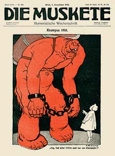
![]() The center of the arts at this time was Vienna, Austria, so it is natural that a great humorous arts magazine would come from that city— Die Muskete (The Rifle). The principles behind Die Muskete were initially quite different than either Jugend or Simplicissimus, its principle competitors from Berlin. Die Muskete was a humorous “men’s magazine” aimed at military officers and veterans. It still made fun of bureaucratic excesses, military inefficiency, social mores, the battle of the sexes, and religion, as well as political corruption, while remaining steadfastly loyal to the Emperor of Austria.
The center of the arts at this time was Vienna, Austria, so it is natural that a great humorous arts magazine would come from that city— Die Muskete (The Rifle). The principles behind Die Muskete were initially quite different than either Jugend or Simplicissimus, its principle competitors from Berlin. Die Muskete was a humorous “men’s magazine” aimed at military officers and veterans. It still made fun of bureaucratic excesses, military inefficiency, social mores, the battle of the sexes, and religion, as well as political corruption, while remaining steadfastly loyal to the Emperor of Austria.
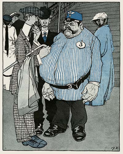
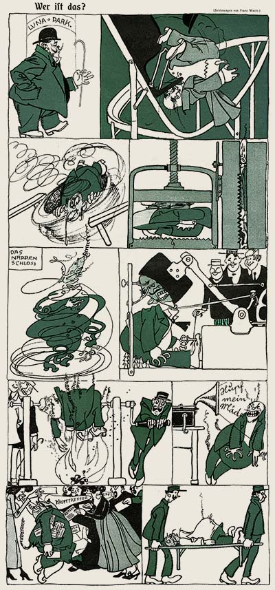
The staff consisted entirely of local artists like Fritz Schönpflug, Karl Wilke and Franz Wacik. Each one brought something different to the table. Schönpflug specialized in military caricature, gently poking fun at the men who made up a large part of Die Muskete’s subscriber base, Wilke excelled at drawing pretty girls with a nouveau flair. And Wacik specialized in a wide range of fantastic subjects- strange creatures and fairy tale settings. Working along side them were the political cartoonist Josef Danilowatz, fashion artist Heinrich Krenes, and the brilliant caricaturist Carl Josef. These artists were well matched as a team to provide a variety of images and stylistic approaches. During World War I the focus of Die Muskete shifted from being a humor magazine to being a magazine for soldiers in the trenches. The tone became more political and the focus shifted to demonizing the enemy. But the level of artistry remained at a high level until many of the original team of artists began to leave the magazine in the mid 1920s.
It’s important to remember that in the heyday of caricature journals like Die Muskete, the artists didn’t identify strictly as cartoonists. For instance Franz Wacik was a designer for the theater, he painted frescos and murals, and he illustrated children’s books. Most of the cartoonists at Die Muskete were fine artists as well as being cartoonists, and this was typical of their contemporaries at other caricature journals as well. I hope you find this e-book useful. This file is set up for printing on 8 1/2 by 11 three hole punch paper, and is optimized for high quality display on tablets and high resolution computer monitors. Thanks to JoJo Baptista for sharing his collection of these rare magazines with us.
JOIN TODAY To Access Members Only Content
Quickdraw McGraw![]()
Hanna-Barbara (1959)
The third animated television series for Hanna-Barbera (after Ruff n Ready and Huckleberry Hound) was Quick Draw McGraw, sponsored by Kelloggs. The show featured a bumbling Wild West sheriff attempting to capture criminals with his sidekick, Baba Looey. Sometimes Quick Draw would go after the bad guys as El Kabong, a parody of Zorro. With a budget of $3,000 per segment, animation on Quick Draw was extremely limited, so the focus was placed on design, layout, color and backgrounds.
"Cattle Battle Rattled" has layout by Ed Benedict and the animation was handled by Disney alum, Dick Lundy. Benedict’s style provides a charm and warmth to the characters and Lundy’s animation is terrifically appealing with snappy pose to pose acting, expertly utilizing concise breakdowns between sharp keyframes. Other artists who stand out in these episodes are George Nicholas, who handled the character animation on "El Kabong Meets El Kazing" and "Bad Guy’s Disguise" with Carlo Vinci. Vinci’s characters have life-like expressiveness in their movement and posing, while Nicholas employs solid drawing and clear gestures in his scenes.
Dick Bickenbach handled the layout on the majority of these shorts. A phenomenal draftsman, he would be responsible for many of the model sheets at Hanna-Barbera, along with Ed Benedict. Benedict and Bickenbach’s clean and appealing designs are the driving force behind these classic TV cartoons. The background environments suit the character shapes perfectly and feel lived in, not at all arch or academic like other modern style animation backgrounds.
It’s commonly said that story is the most important part of an animated film, but Hanna-Barbera’s early series prove that isn’t the case. The stories in these films are beyond basic, leaning on formulas and stereotypes rather than expressing anything remotely real. Instead, the characters carry the show with expert voice acting and appealing design. Friz Freleng once said that he never made a cartoon that had a story. His films had characters and gags. That is more than enough to make a great cartoon.
JOIN TODAY To Access Members Only Content
Gulliver’s Travels Beyond The Moon
Sanae Yamamoto and Yoshio Kuroda / Toei Animation / 1965
Download this article
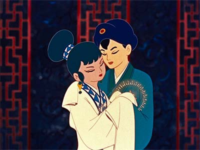
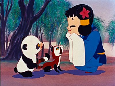
From 1958 onward, Toei Animation had the ambitious goal of creating one fully animated feature per year. During this period They produced Tale of the White Serpent (1958), Magic Boy (1959), and Alakazam The Great (1960). The feature we are sharing today is one of Toei’s first departures from Asian mythological stories— Gulliver’s Travels Beyond The Moon (1965). This was an attempt on Toei’s part to break into the international market with a Western-style science fiction film based on Jonathan Swift’s character, Lemuel Gulliver. Unfortunately, it did not make waves and bombed at the American box office. Toei did not export another film to the U.S. until 1971.
The newly restored copy of the film we are sharing in this Reference Pack is the original Japanese version with no English subtitles, but the story can be followed easily. The basic plot concerns a homeless boy named Ted who is ejected from a movie about Lemuel Gulliver after it is discovered that he snuck into the theater. Depressed, he wanders the streets until he is nearly hit by a truck and is thrown against a wall. Upon awakening, he encounters a talking dog and toy soldier. The three of them team up and decide to visit a closed amusement park where a comical chase ensues with three security guards before Ted and company escape into the countryside. There, they meet Professor Lemuel Gulliver, now a space traveler. In his rocket, they travel to the Planet of Blue Hope. This planet has been taken over by a group of robots serving the Queen of the Purple Planet. Ted, Gulliver and the others step in to fight the invaders and save the Planet of Blue Hope from the invading horde of robots.
Toei Animation employed assembly line production techniques overseen by the directing team of Sanae Yamamoto and Yoshio Kuroda. Shinichi Sekizawa (Mothra, Godzilla vs. Mechagodzilla, King Kong vs. Godzilla) was hired to write, and interestingly a young Hayao Miyazaki worked on the movie as an inbetweener.
The visuals in Gulliver’s Travels Beyond The Moon reflect the science fiction aesthetic of Japanese TV animation of the era, and the character animation flows with a little more rhythmic bounce than is usual for Japanese animation. Not surprisingly, the effects animation is exceptional and is worthy of frame by frame study.
JOIN TODAY To Access Members Only Content
Locomotive
Zbiegniew Rybczynski / Poland / 1976
Director of the Academy Award winning short film, "Tango" (1980), Zbiegniew Rybczynski is a pioneer of experimental animation in Poland. He emigrated to the U.S. in 1982 during the martial law period of the Polish People’s Republic and created Z-BIG Vision, a film studio based in New York. He worked with dozens of musicians such as Mick Jagger and Rush on stylistically avant-garde music videos during the 1980s and 90s and created state-of-the-art experimental films like "Orchestra" (1990) which we featured in a past Reference Pack.
Set to Julian Tuwim’s 1938 poem of the same name, "Lokomotya", or "Locomotive"(1976), was created in the mid-1970s right before his departure from Poland for America. It blends live action photography and hand drawn animation bathed in saturated colors akin to pop art. Like many of Rybczynski’s other films, this makes deft usage of optical printing focusing on rhythms to create funny and compelling movement.
This short redefines how we traditionally think of animation by boiling it down to its essence— interesting and expressive timing. It’s an impressive feat. Rybczynski reinterprets the movement frame-by-frame to its simplest form using cycles, without ever losing the element of delightful surprise.
JOIN TODAY To Access Members Only Content
Well, Just You Wait Ep.10
![]()
Vyacheslav Kotyonochkin / Soyuzmultfilm, Russia / 1976
We continue the Russian Wolf and Rabbit cartoons with episode 10, “Construction Site”.
The premise of Nu, Pogodi! (which translates into English as Well, Just You Wait!) was pitched by a writing team of satirical humorists to many directors at Soyuzmultfilm, but was rejected every time. Finally in 1969, Gennady Sokolsky agreed to direct a 2 1/2 minute pilot for the series in an omnibus film called “Happy Merry Go Round”. The general consensus at the studio was that the cartoon was “low class” and beneath the dignity of Soyuzmultfilm, but director Vyacheslav Kotyonochkin strongly believed in the concept, so the studio decided to take a chance and allow him to direct a few episodes… and then a few more… and then more.
Kotyonochkin was proven correct. The cartoons were a huge success. Between 1969 and 2006, Soyuzmultfilm ended up making 22 episodes, and in a 2014 poll of audiences all over Russia, Well, Just You Wait! was voted the most popular cartoon series of all time by a landslide. Although the series resembles both Tom & Jerry and the Roadrunner and Coyote series, the director, Kotyonochkin claimed not to have ever seen any of these Hollywood cartoons until 1987 when his son got a video tape recorder and Western tapes began to be imported.
In these Russian cartoons, there’s almost no dialogue, and the action almost always occurs on screen. Static tableaux are rare, as are detailed backgrounds and “on model” drawings. These cartoons focus on expressive poses and movement, and save time and expense by avoiding the careful cleanup required for character model details and overlapping action. The theory here is, if it moves funny, it’s funny… and they are right about that.
Shamus Culhane once lamented that television animation consisted of mostly lip-sync animation. He would have preferred to do away with lip-sync entirely and just have simple drawings that really move. Well, Just You Wait proves that he was correct.
JOIN TODAY To Access Members Only Content
Vaclav Mergl
![]()
Curated By David Eisman
Download this article
Vaclav Mergl was a Czechoslavakian animator during the latter period of the Soviet Union, who was famous for his experimental filmmaking that combined elements of stop-motion, paper-cut, claymation, xylographic, and traditional hand-drawn animation. He was also a master of cinematic editing: Mergl knew exactly which shots to use and in which order to place them so as to craft the desired narrative and thematic effects.
The following breakdowns are each from different films in Mergl’s career – Laokoon (1970), Crabs (1976), Homonculus (1984), Hello, Albert (1990). From these, we will dissect Mergl’s cinematic editing practices and seek to understand how he went about constructing scenes.
JOIN TODAY To Access Members Only Content
Whew! That is an amazing collection of treasures! The most important information isn’t what you already know… It’s the information you should know about, but don’t know yet. We bring that to you every other month.
THIS IS JUST THE TIP OF THE ICEBERG!
Animation Resources has been sharing treasures from the Animation Archive with its members for over a decade. Every month, our members get access to a downloadable Reference Pack, full of information, inspiration and animation. The RefPacks consist of e-books jam packed with high resolution scans of great art, still framable animated films from around the world, documentaries, podcasts, seminars and MORE! The best part is that all of this material has been selected and curated by our Board of professionals to aid you in your self study. Our goal is to help you be a greater artist. Why wouldn’t you want to be a member of a group like that?
Membership comes in two levels. General Members get access to a bi-monthly Reference Pack as well as a Bonus RefPack from past offerings in the in-between months. We offer a discounted Student Membership for full time students and educators.
JOIN TODAY!
https://animationresources.org/membership/levels/
FREE SAMPLES!
Not Convinced Yet? Check out this SAMPLE REFERENCE PACK! It will give you a taste of what Animation Resources members get to download every other month! That’s 560 pages of great high resolution images and nearly an hour of rare animation available to everyone to download for FREE! https://animationresources.org/join-us-sample-reference-pack/
![]()
![]() Animation Resources depends on your contributions to support its projects. Even if you can’t afford to join our group right now, please click the button below to donate whatever you can afford using PayPal.
Animation Resources depends on your contributions to support its projects. Even if you can’t afford to join our group right now, please click the button below to donate whatever you can afford using PayPal.


