Here is a sample of work by influential pen and ink illustrator Franklin Booth.
-Nicholas John Pozega

Tuesday, October 14th, 2014
Here is a sample of work by influential pen and ink illustrator Franklin Booth.
-Nicholas John Pozega
Monday, February 4th, 2013
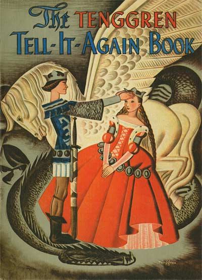
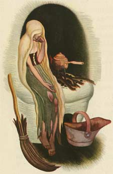
![]() In the twenties, Gustav Tenggren had been paid handsomely for his work. At Disney, his position guaranteed steady work. But the wartime economy changed all that. Publishers were no longer able to pay him to work a week or more on a single painting and jobs were scarce. He was forced to simplify his style.
In the twenties, Gustav Tenggren had been paid handsomely for his work. At Disney, his position guaranteed steady work. But the wartime economy changed all that. Publishers were no longer able to pay him to work a week or more on a single painting and jobs were scarce. He was forced to simplify his style.
While at Disney, Tenggren chaffed under the bit of anonymity. It’s said that Walt instructed his artists, "If you’re going to sign a name to your artwork, spell it ‘Walt Disney’." But Tenggren defiantly maintained his individuality, signing many of his key paintings for Pinocchio. He left the studio under unhappy circumstances, and was bitter about the whole episode. But he had learned one thing from Walt… the power of branding one’s self.

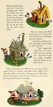
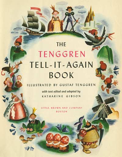
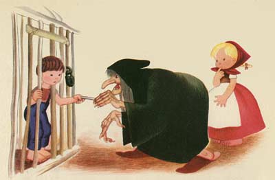
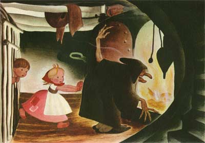
This particular book is amazing, because it shows Tenggen’s thought process and refinement gelling into what would become the classic "Golden Book style". (Click on the Three Little Pigs images above for a vivid example.) He simplifies by going back to his roots… combining the character designs of his mentor John Bauer with the colored pencil and watercolor style of his successor on the Bland Tomtar Och Troll series, Einar Norelius. It’s fascinating to compare this new streamlined style with the techniques of traditional golden age illustration. See how Tenggren has distilled the essence of the earlier attempts into a clear and simple presentation that still has plenty of beauty and balance.
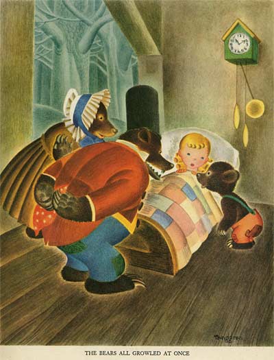
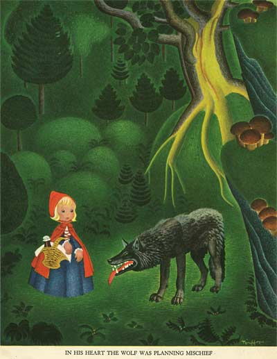
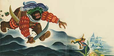
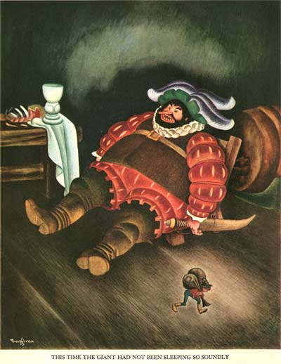
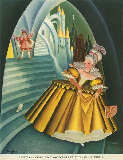
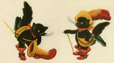
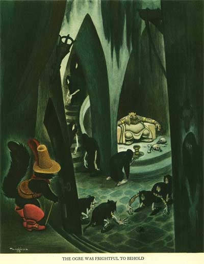
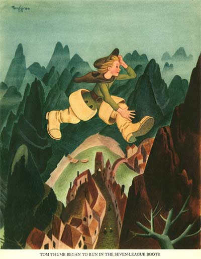
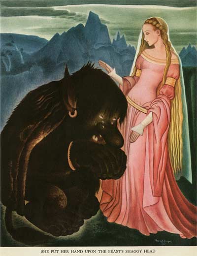
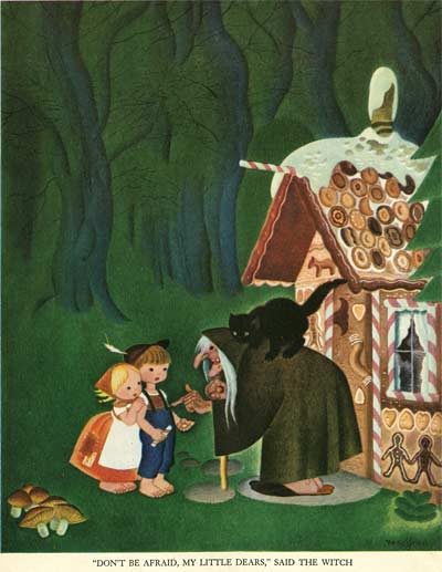
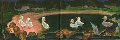
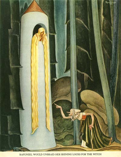
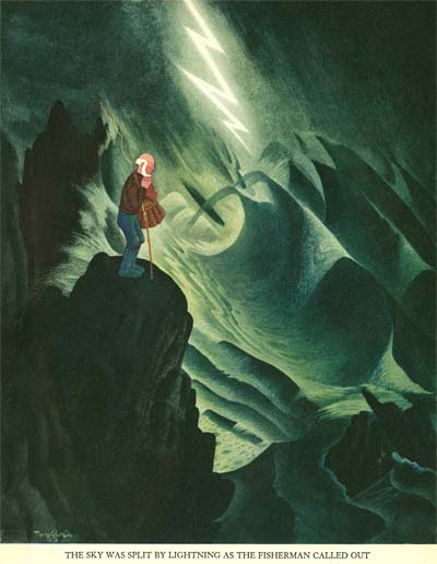
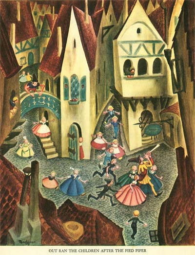
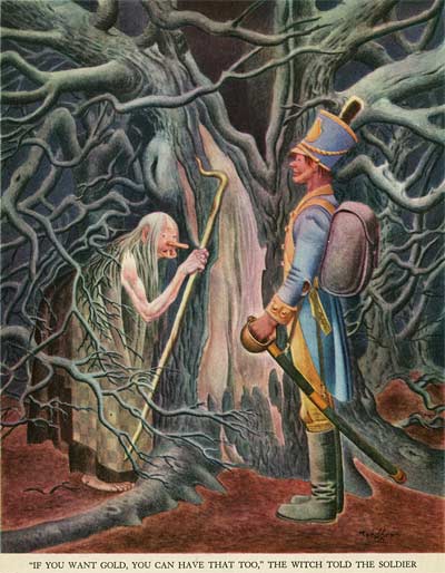
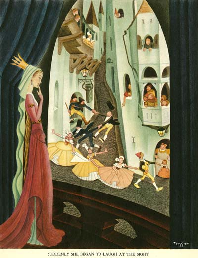
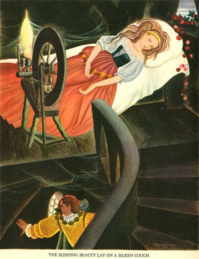
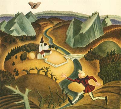
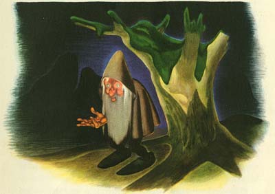
For inspiration, Tenggen goes all the way back to his roots… the work of his mentor, John Bauer. Here is one of Tenggren’s illustrations…
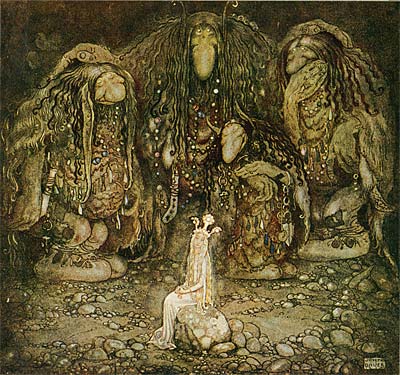
And here is one by Bauer from the Swedish Christmas annual, Bland Tomtar Och Troll…
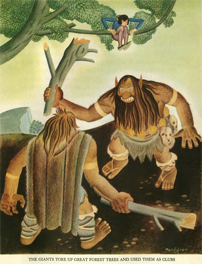
He also appears to be familiar with the work of his successor on the Bland Tomtar Och Troll series, Einar Norelius. Here is Tenggren…
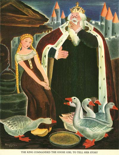
And here is Norelius…
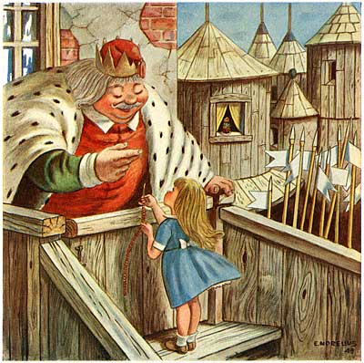
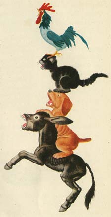
![]() But halfway through Tenggren’s Tell It Again Book comes a huge breakthrough in design. Instead of the full page plates, Tenggren begins to float his characters over the white of the page, wrapping the text around the compositions. Background elements are reduced to small islands on the page, rather than extending out to the edges of a square bounding box. When I first got this book, I wondered why Tenggren had changed format halfway through. Clearly one reason was to save time and streamline the work of producing so many illustrations for a single book. But there was an aesthetic precedent to it as well. The answer has been hanging on my bedroom wall since I was a little boy!
But halfway through Tenggren’s Tell It Again Book comes a huge breakthrough in design. Instead of the full page plates, Tenggren begins to float his characters over the white of the page, wrapping the text around the compositions. Background elements are reduced to small islands on the page, rather than extending out to the edges of a square bounding box. When I first got this book, I wondered why Tenggren had changed format halfway through. Clearly one reason was to save time and streamline the work of producing so many illustrations for a single book. But there was an aesthetic precedent to it as well. The answer has been hanging on my bedroom wall since I was a little boy!
Like Tenggren, my Grandmother was Swedish. In the early 1920s, she took my father to Sweden to visit his Grandparents. It was the only time he was able to meet them, since he lived in Peterborough, Canada, a very long sea voyage away from their farm in Goteborg, Sweden. My great grandparents gave my father a gift to take home with him to remind him of the visit- this Swedish folk art picture…
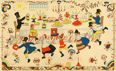
When I was born, my father gave it to me to hang in my bedroom, and it’s been there ever since. Notice the similarity between the forward pitched perspective, the staging of the characters in clear profile silhouettes, and the simple rendering of the figures over the white of the paper on this print and the Tenggren illustrations that follow…
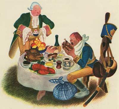
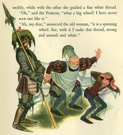
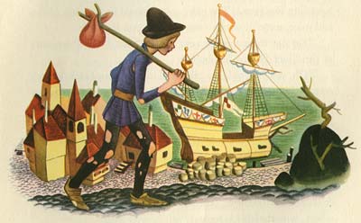
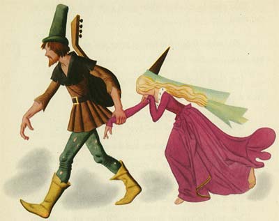
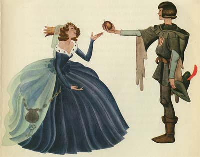
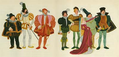
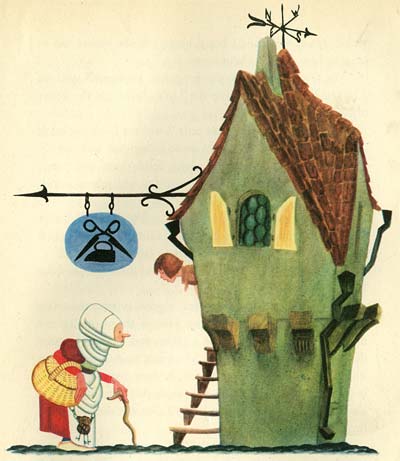
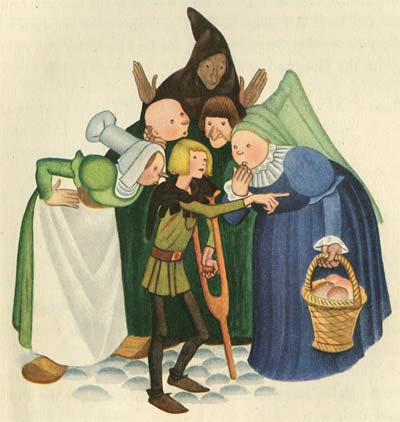
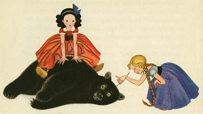
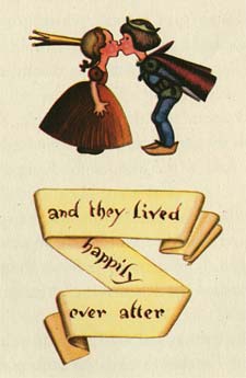
![]() Tenggren had discovered a way to simplify and refine his illustrations even further. Instead of busy backgrounds full of details, he used just enough information to place the characters, and focused his attention on composing the figures. Immediately after publishing this book, Tenggren produced The Poky Little Puppy, the book that was the model for the hundreds of Little Golden Books that followed over the next seventy years. By going back to his roots and synthesizing his Swedish cultural upbringing, Tenggren invented a style that now seems to us to be quintessentially American.
Tenggren had discovered a way to simplify and refine his illustrations even further. Instead of busy backgrounds full of details, he used just enough information to place the characters, and focused his attention on composing the figures. Immediately after publishing this book, Tenggren produced The Poky Little Puppy, the book that was the model for the hundreds of Little Golden Books that followed over the next seventy years. By going back to his roots and synthesizing his Swedish cultural upbringing, Tenggren invented a style that now seems to us to be quintessentially American.
This is a perfect example of how immigrant artists of all kinds suited their artistic voice to their new lives in the United States in the first half of the 20th century. Carlo Vinci’s Italian heritage resulted in a superhero mouse who sang opera. Bill Tytla’s Eastern European roots helped him summon a devil in Fantasia. And Milt Gross’ Jewish upbringing expressed itself in comic celebrations of the ethnic vitality of New York City.
The melting pot of American culture sure is rich with cartoons!
Stephen Worth
Director
Animation Resources
This posting is part of a series of articles comprising an online exhibit spotlighting Illustration.
Tuesday, January 29th, 2013
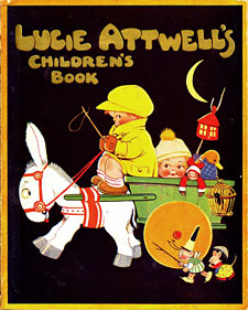
![]() There often seems to be a disconnect between the illustrators Walt Disney hired to do inspirational artwork for his films and the designs he actually ended up using. On Snow White, Disney hired the amazing painter, Gustaf Tenggren; but his instructions to him were to paint in the style of Arthur Rackham. For Peter Pan, he hired the illustrator David Hall, but the film itself doesn’t resemble his work at all. Instead, it’s actually closer to being a "Disneyfication" of Mabel Lucie Attwell’s illustrations for the 1921 edition of J. M. Barrie’s Peter Pan & Wendy.
There often seems to be a disconnect between the illustrators Walt Disney hired to do inspirational artwork for his films and the designs he actually ended up using. On Snow White, Disney hired the amazing painter, Gustaf Tenggren; but his instructions to him were to paint in the style of Arthur Rackham. For Peter Pan, he hired the illustrator David Hall, but the film itself doesn’t resemble his work at all. Instead, it’s actually closer to being a "Disneyfication" of Mabel Lucie Attwell’s illustrations for the 1921 edition of J. M. Barrie’s Peter Pan & Wendy.
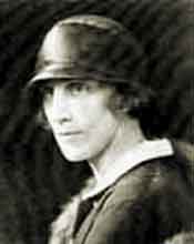
![]() Attwell was born in 1879 and received some education at the Regent School of Art and Heatherley’s School of Art in London, but she grew bored with her academic studies and dropped out to focus on her own interests… painting cherubic children and fairies. Her work wasn’t very warmly received at first by galleries and agents, but when her first batch of paintings sold out in three days, they became much more enthusiastic. Attwell illustrated greeting cards and children’s books, the most famous of which we are featuring today, Peter Pan & Wendy.
Attwell was born in 1879 and received some education at the Regent School of Art and Heatherley’s School of Art in London, but she grew bored with her academic studies and dropped out to focus on her own interests… painting cherubic children and fairies. Her work wasn’t very warmly received at first by galleries and agents, but when her first batch of paintings sold out in three days, they became much more enthusiastic. Attwell illustrated greeting cards and children’s books, the most famous of which we are featuring today, Peter Pan & Wendy.
Disney didn’t appropriate Attwell’s baby faced characters, but he did use some of the same details of costume and setting, and placed the emphasis of his visual storytelling on many of the same elements. Attwell’s designs lean a bit too heavily on formula, but there is a distinctive delicate appeal to her style. Enjoy.
Stephen Worth
Director
Animation Resources
This posting is part of a series of articles comprising an online exhibit spotlighting Illustration.