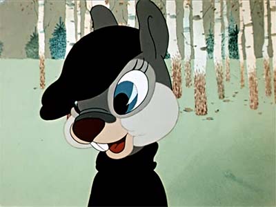
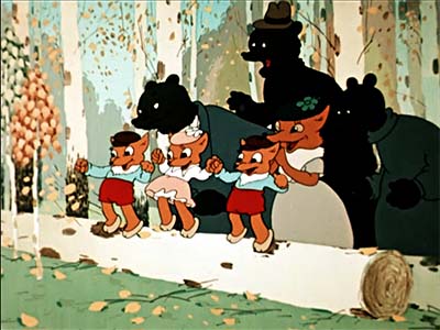
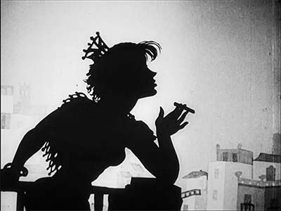
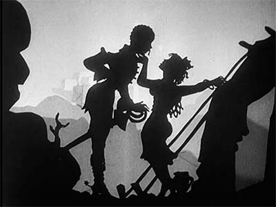
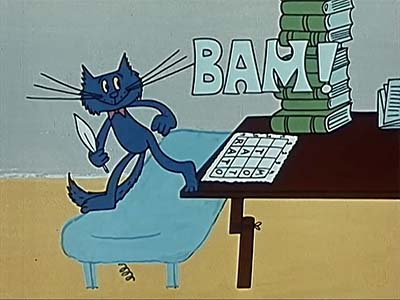
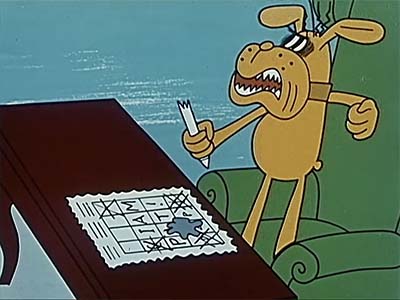
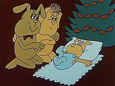
People who aren’t members of Animation Resources don’t understand how comprehensive our Reference Packs are. Over a couple of weeks, we are posting what each section of our current RefPack looks like. Today we are sharing the Early Anime section. If you are a member of Animation Resources, click on this post to go to the Members Only page. If you aren’t a member yet, today is the perfect time to join! Our current Reference Pack is one of our best yet, and General and Student Members get access to a special Bonus Archive with even more material from past Reference Packs.
What are you waiting for?![]()
JOIN TODAY!
https://animationresources.org/membership/levels/
JOIN TODAY To Access Members Only Content

Lately, Animation Resources board member JoJo Baptista has been researching the early history of Japanese animation. He has searched out video copies of 1960s anime to add to our Animation Archive. Over the past year, he has accumulated hundreds of hours of rare television programs. We will be will be sharing some of them with you in our Reference Packs. Our members have asked us to share complete films and publications with them, not excerpts, so we will be sharing complete half hour episodes with you. We don’t claim that everything here is great. But there are great bits. You can sift through them and discover the gems for yourself.
Hustle Punch
![]()
Curated by JoJo Baptista
![]()
Eps. 1 & 3 / Toei, Yasuji Mori (1965)
Download this article
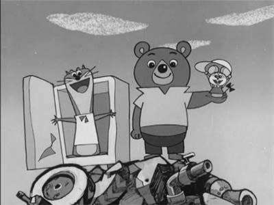
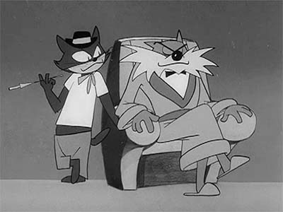
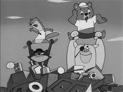
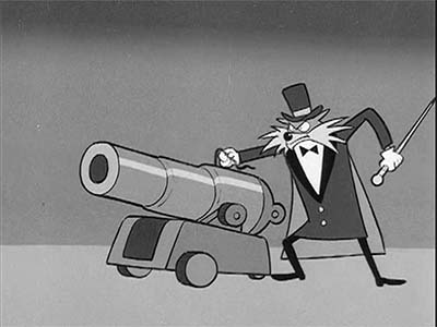
Hustle Punch first aired on November 1st, 1965. The main characters are three animals: Punch, a bear whose head is so hard he can break holes in walls with it or be hit on the head without injury; Touch, a girl mouse who uses her charm and size to her advantage; and Bun, which in English translates to "Boom" a weasel who is a crack shot with a slingshot. They live in a junkyard and fight the villains: Professor Garigari, a wolf who invents gadgets to steal and plunder the city; Black, a cocky cat who loves to shoot guns but has lousy aim, and Nu, a dumb pig with a soft spot for Punch and his friends.
Hustle Punch was created by Yasuji Mori, who directed The Little Prince And The Three Headed Dragon, which we featured in a previous Reference Pack, as well as illustrating children’s books. He was a senior artist at Toei and mentored many animators who went on to do great work, including Hayao Miyazaki (who worked on this series), Isao Takahata, Yasuo Otsuka and Yoichi Kotabe. Mori was responsible for the cute animal designs in several Toei features.
It seems that the Japanese animators who made this show had recently seen American television cartoons by Hanna-Barbara. Hustle Punch lifts designs and animation from The Huckleberry Hound Show and character design elements from Top Cat. In the title sequence there’s even a jazzy theme song, and a scene at 45 seconds of the car peeling out that directly references the title sequence of Huckleberry Hound. Also, at 4:05 in the first episode, there is a gag that appears to have been inspired by a Mike Lah scene in a Droopy cartoon. This series is unique because it looks more American than Japanese.
The first episode, titled "Throw Out The Trash" is the pilot episode that explains the basic premise of the show. The three animals live in an old broken down limousine in a junkyard. Professor Garigari’s mansion is right next door, and he sends his two henchmen over to assassinate the three friends to get them to move out so he can take over the property.
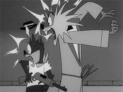
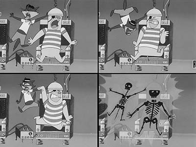
At 4:32 there are some nice smears in the animation and at 5:38 Black pulls out a pistol and Nu ties the trio up and throws them out into traffic on a busy street. (You’re not likely to see gags like that today!) Sprinkled throughout the show are nice poses and layouts, mixed in with efficient limited animation. One standout sequence is a bit at 17:00 where Black practices his "quick draw" technique in a mirror. Another good sequence involving gunplay and fireworks starts at 18:50. It finishes off at 21:15 with some electrocution gags involving an electric chair! Hanna-Barbara cartoons often leaned a bit too heavily on dialogue to tell the story. Even though there is a lot of dialogue in Hustle Punch, there’s plenty of visual action moving the story along.
The third episode, is titled "Black Benny’s Secret". It starts out with some fun crowd shots at 4:11. The designers clearly had a lot of fun defining each character in the crowd in this episode and organizing them into groups. I won’t point them out here, but this episode is full of simple animation touches that put across personality expressively without the need for elaborate animation. Even though I don’t understand Japanese, I can tell the attitudes of the bad guys when they argue at the table getting drunk on wine. But the highlight of this episode is the chase between the villains and the heroes which culminates with a cannon, an ambulance, and machine guns!
Like many Japanese shows of this era, the episode ends with a teaser for the next week’s show. Let me know if you’d like to see more of this unusual series.
I’ll have more early Japanese TV series to share with you in our next Reference Pack.
MP4 Video File / SD / 25:55 / 186 MB Download
MP4 Video File / SD / 25:56 / 217 MB Download
JOIN TODAY To Access Members Only Content
Animation Resources is one of the best kept secrets in the world of cartooning. Every month, we sponsor a program of interest to artists, and every other month, we share a book and up to an hour of rare animation with our members. If you are a creative person interested in the fields of animation, cartooning or illustration, you should be a member of Animation Resources!
It’s easy to join Animation Resources. Just click on this link and you can sign up right now online…
JOIN TODAY!
https://animationresources.org/membership/levels/
![]()
![]() Animation Resources depends on your contributions to support its projects. Even if you can’t afford to join our group right now, please click the button below to donate whatever you can afford using PayPal.
Animation Resources depends on your contributions to support its projects. Even if you can’t afford to join our group right now, please click the button below to donate whatever you can afford using PayPal.


