One of my favorite blogs is David Apatoff’s Illustration Art. David is one of the best writers on the subject of art that I’ve read online. He’s unique because he thinks like an artist and he’s concise, two characteristics that are rare when it comes to art criticism in the blogosphere.
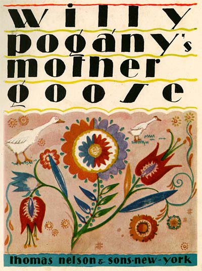
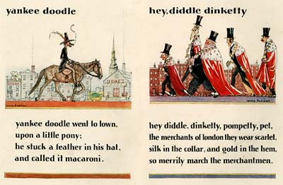
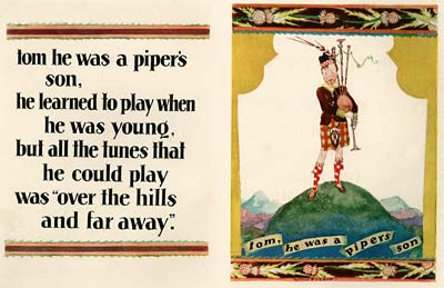
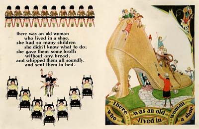
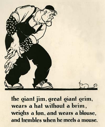
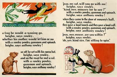
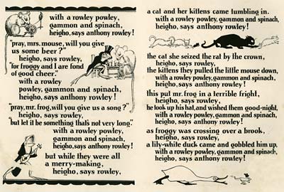
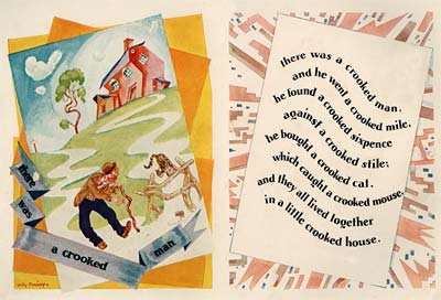
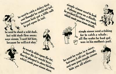
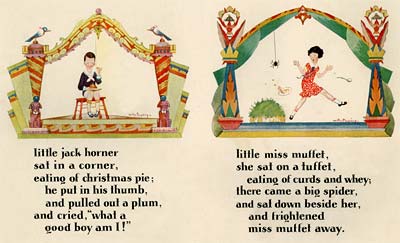
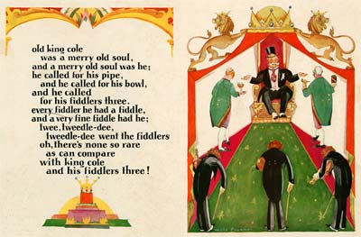
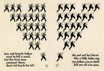
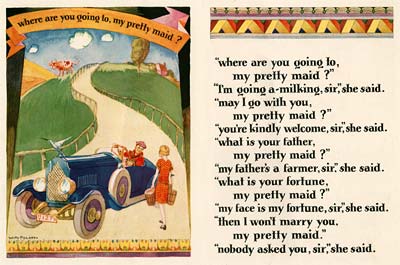
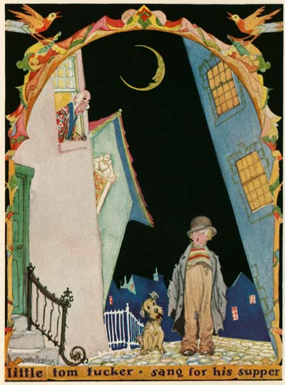
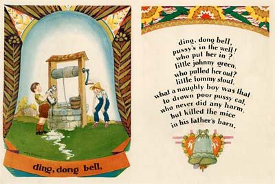
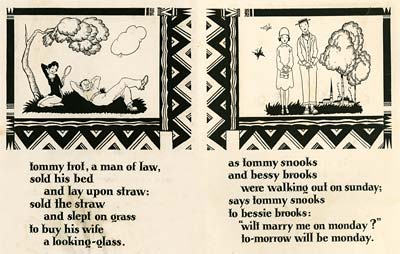
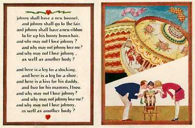
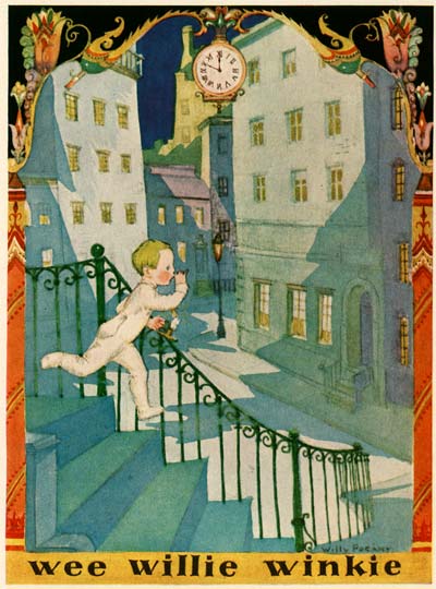
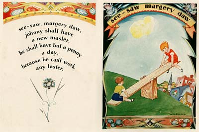
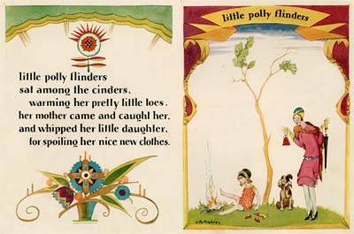
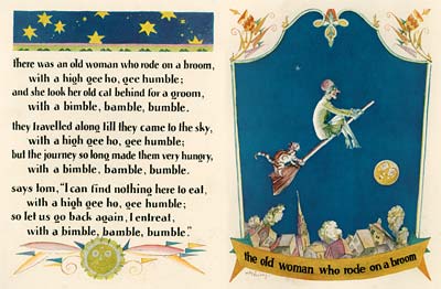
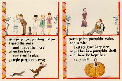
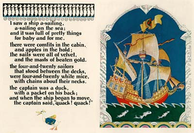
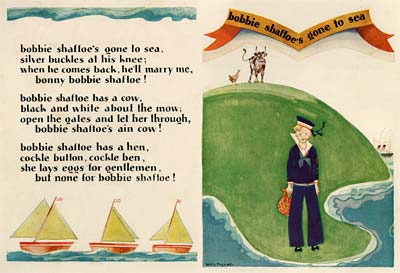
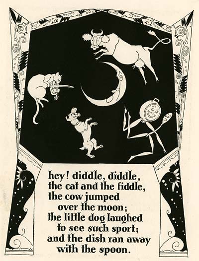
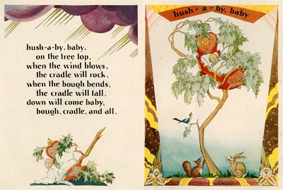
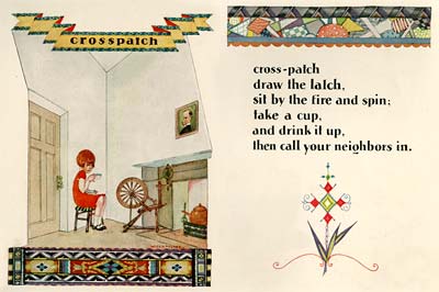
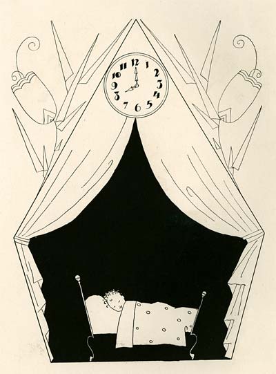
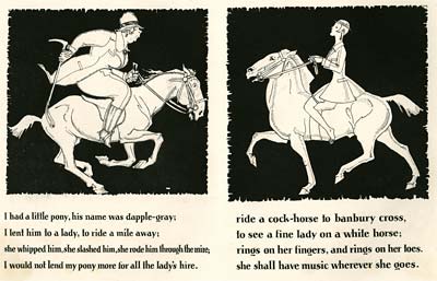
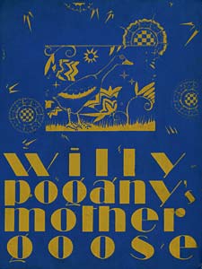
The other day, David posted about one of my favorite illustrators, Willy Pogany. (Read his post HERE.) You might recall that we featured Pogany on the Animation Resources site last Summer… (Willy Pogany’s Drawing Lessons) The post on Illustration Art discusses how much better Pogany’s work was when it was less embellished and more direct. I couldn’t agree more. I would add that it’s even better when it doesn’t take itself quite so seriously. A perfect example of Pogany at his absolute peak is a book that just happens to be my favorite illustrated children’s book, Willy Pogany’s Mother Goose.
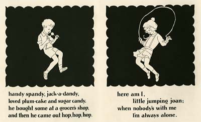
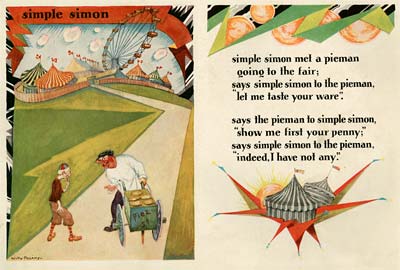
![]() I’m afraid that viewing this book on the web puts you at a distinct disadvantage. This is one of those books that expresses itself beyond just the images. The size and weight of the book, the feel of the paper, the proportion of text blocks and margins, and the counterpoint in the layout of opposing pages all contribute to the powerful impression this book makes on the reader. The best way I can describe the feeling of reading this book is that each turn of the page is like revealing a new surprise.
I’m afraid that viewing this book on the web puts you at a distinct disadvantage. This is one of those books that expresses itself beyond just the images. The size and weight of the book, the feel of the paper, the proportion of text blocks and margins, and the counterpoint in the layout of opposing pages all contribute to the powerful impression this book makes on the reader. The best way I can describe the feeling of reading this book is that each turn of the page is like revealing a new surprise.
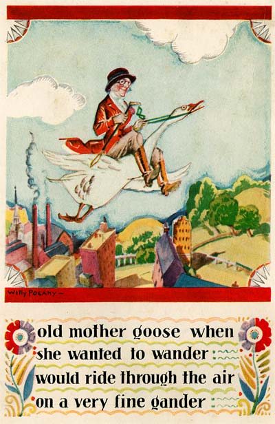
From a design standpoint this book was revolutionary, because in 1928 when it was first published, the norm for illustrated books was to have uniform text blocks filling the bulk of the pages with an occasional hand tipped and tissue protected color plate. Pogany breaks all those conventions and makes every single page a fully illuminated illustration. I think it could be argued that this is one of the very first modern children’s books. The watercolors are rendered quickly in a deceptively simple style, but they’re packed with a million clever design ideas and tremendous spontaneity.
I’m afraid this is one book that I can’t afford a clean first edition copy of. The copy I scanned was battered and worn. I’ve done extensive Photoshopping to remove smudges and creases from the many decades of abuse by tiny fingers, and I’ve done my best to maintain the relative scale and basic compositions of the page spreads. I hope you enjoy this book as much as I do.
One last image (racially insensitive)
Stephen Worth
Director
Animation Resources
This posting is part of a series of articles comprising an online exhibit spotlighting Illustration.


