People who aren’t members of Animation Resources don’t understand how comprehensive our Reference Packs are. Over the next couple of weeks, we will be posting what each section of our current RefPack looks like, starting today with the Featured section. If you are a member of Animation Resources, click on this post to go to the Members Only page. If you aren’t a member yet, today is the perfect time to join! Our current Reference Pack is one of our best yet, and General and Student Members get access to a special Bonus Archive with even more material from past Reference Packs.
What are you waiting for?![]()
JOIN TODAY!
https://animationresources.org/membership/levels/

Every other month, Animation Resources shares a new Reference Pack with its members. They consist of an e-book packed with high resolution scans and video downloads set up for still frame study. Make sure you download the Reference Pack before it’s updated. When it’s gone, it’s gone!
JOIN TODAY To Access Members Only Content
PDF E-BOOK
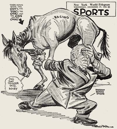
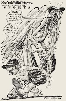
Willard Mullin Dailies 1941-1946
![]()
New York Daily World-Telegram
Download this article
![]() Before the era of live TV broadcasts with instant replay to capture every nuance of the action, low light photography for night games, and long telephoto lenses to capture the plays close up from a long distance, sports fans depended on the newspaper for their daily sports fix. Sports columnists rattled off play by play of the previous day’s games in great detail, and put the scores in context with complex statistics. But those were just words… the fella responsible for putting a face to the facts and figures was the sports cartoonist.
Before the era of live TV broadcasts with instant replay to capture every nuance of the action, low light photography for night games, and long telephoto lenses to capture the plays close up from a long distance, sports fans depended on the newspaper for their daily sports fix. Sports columnists rattled off play by play of the previous day’s games in great detail, and put the scores in context with complex statistics. But those were just words… the fella responsible for putting a face to the facts and figures was the sports cartoonist.
Today, only a tiny handful of sports cartoonists remain working, but in the post-war era, every paper had a great artist who filled the sports pages with caricatures, likenesses of famous figures in the news, and funny gags involving the team mascots. A few years ago, Richard Sandimir wrote in the New York Times…
They blended the skills of a caricaturist and the mind-set of a columnist. They were entertainers and ink-stained jokesters. They were newsroom denizens and deadline artists who churned out five or six cartoons a week that received prominent display. If they possessed power, it was that they drew players, owners and managers in ways that reporters could not with their words. Sports cartoons were usually more amusing and informative than critical, which reflected the times when the sports section was the fun-and-games department.
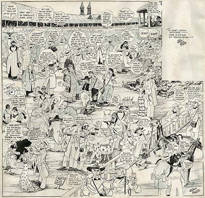
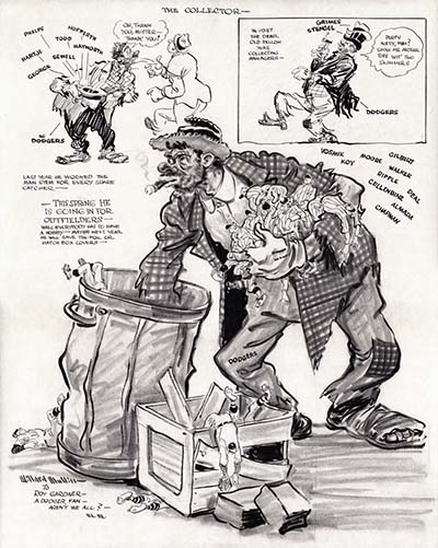
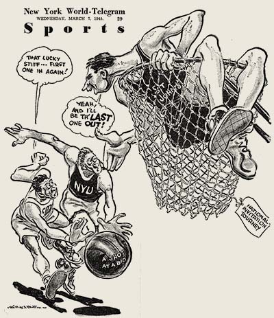
One sports cartoonist stood out above all the rest… Willard Mullin. In his twenties, Mullin worked for the Los Angeles Herald Examiner, but in 1934 he joined the staff of the New York World-Telegram where his work was syndicated across the country by the Scripps Howard News Services. He worked there until 1966 when he began drawing cartoons freelance for magazines and ads. He was widely published throughout his half century long career, with cartoons appearing in many publications, such as Colliers, Life magazine and Time, as well as numerous team programs and advertisements.
Mullin produced six cartoons a week, and they were printed large across a full page in the sports section. They usually were centered around the likeness of a famous athelete or a humorous depiction of a team mascot. Mullin was called upon to draw every form of animal as a team mascot, except perhaps elephants and donkeys, which were relegated to the editorial pages. He was famous for creating the character known as the Brooklyn Bum. Sporting a tattered and patched suit of clothes, a stub of a cigar and a big belly, the Bum perfectly represented the rough and tumble Brooklyn Dodgers.
Mullin was a genius at depicting the human form in motion. His characters seemed to spring off the page with life and vitality. Mullin’s characters ran the gamut from heroes to everyman characters. His influence extended far beyond the newspaper world to cartoonists like Jack Davis and the Disney animator John Sibley. For animators, Mullin’s sketches are a revelation because they appear to be already in motion. His knowledge of anatomy merged perfectly with the spirit of the action to create gesture drawings of the highest order. Best of all, his drawings are steeped in fun. They encapsulate the spirit of casual camradery shared by all of the sports fans in the bleachers on a sunny afternoon.
Between 1947 and 1952, Mullin created a comic book for Spalding which was given away to customers of sporting goods stores. We featured that in an earlier e-book. This time we are presenting daily comics from the 1940s, the absolute peak of Mullin’s career. These fragile scraps of newsprint were crumbling as we scanned them. Parts of the edges on some had chipped away. You’ll notice missing bits, but plenty of wonderful drawings remain intact. If you would like to see more of these, let us know.
Adobe PDF File / 124 Pages / 692 MB Download
JOIN TODAY To Access Members Only Content
Two Visions Of Prehistoric Times
![]()
Rite Of Spring From Fantasia (Disney/1940) / Bolero From Allegro Non Troppo (1976)
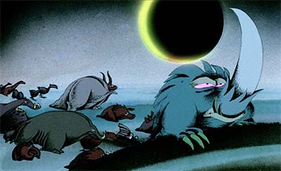
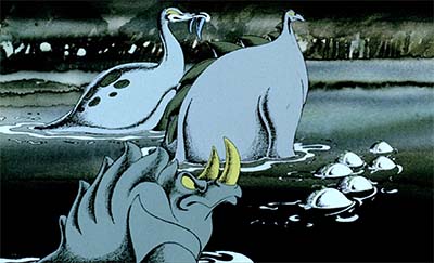
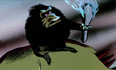
In this Reference Pack we’re sharing two video clips dealing with the same subject from two quite different feature films.
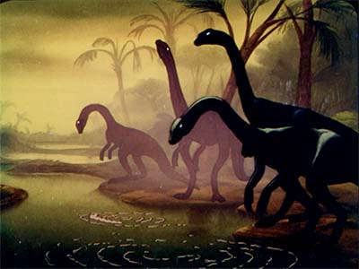
Igor Stravinsky’s “Rite of Spring” was a bold choice for Walt Disney’s “concert feature” Fantasia. When the work premiered as a ballet in 1913, audience members yelled for the music to stop. The discordant harmonies and primitive rhythms were shocking at the time. But conductor Leopold Stokowski championed the work having conducted its American premiere in 1922, and suggested it to Disney as a good choice for an animated segment. Disney listened to a recording of the piece and immediately thought of prehistoric animals. Stokowski worried that the piece might be too long, but Disney was sure that audiences would remain engaged with the primeval imagery his animation crew would come up with for it. The order of the segments were juggled around, angering Stravinsky, but now it’s hard to think of the music without picturing dinosaurs in your head.
Disney’s sound men and directors performed miracles with Stokowski’s colorful interpretation, breaking down each accent and rhythm and noting them on the timing sheets. When you watch "The Dance of the Adolescents" with its volcanic imagery, notice how precise the music synchronizes to the action. The animators throughout the opening sequences find action to precisely match the smallest details in the music.
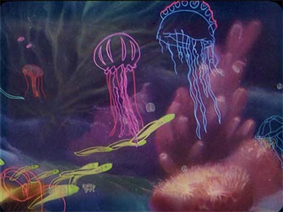
With a musical flourish a cloud wipes the screen and we’re underwater with single cell animals darting around. In Snow White, the animators knew that they needed to keep the action of the forest animals relatable to audiences who may never have seen a deer or turtle in person. So when Snow White pets a deer, it raises its head up to her hand to be petted just like a cat. The single cell animals sniff each other and run around in circles just like puppies.
Evolution is half-heartedly referred to with an animal evolving legs, but that isn’t the focus of this version of events. Perhaps it was safer to deal with each age separately, ignoring how they got from one to another to avoid complaints from creationists. But science is still on full display here. From beginning to end the environments and animals look real, not at all like an animated cartoon. Disney’s artists worked with paleontologists and were clearly influenced by the work of Charles Knight, a wildlife artist who worked with the American Museum of Natural History in the early decades of the 20th century to reconstruct the way the prehistoric animal skeletons on display may have looked when they were alive. His murals for Chicago’s Field Museum are extraordinary. If you aren’t familiar with King’s work, you should make a point to look him up online.
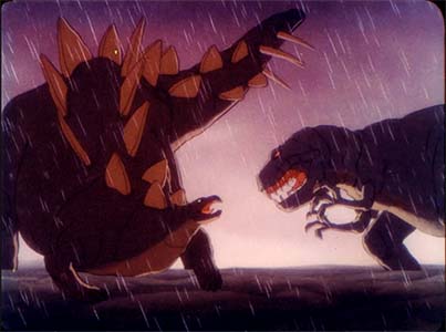
The meat of the segment comes in the middle with the dinosaurs. The long necked brontosauruses and swooping pterodactyls set the stage for a dramatic battle between a tyrannosaur and a stegosaurus. Woolie Reitherman animated a great deal of this, and at the time he was a specialist in conveying weight and large scale, having animated the dramatic finale with Monstro the Whale in Pinocchio. He uses live action reference from models in several spots. It’s most obvious when the tail of the stegosaurus drops and each blades droops in perfect perspective one by one. Color and effects of rain and lightning do their part to heighten the drama. The overall impression is overwhelming.
But the end of the sequence seems not as well thought out as the rest. The dinosaurs die in a drought like African gazelles and lions at a dried up water hole. This isn’t at all correct according to science. An ice age put an end to the dinosaurs, not a heat wave. The segment ends with the Earth as a hot barren world devoid of life, and the viewer is left thinking “What about me? What about people?” But the Disney artists concocted their own apocalyptic holocaust to end on a somber note that fits the music, even if it isn’t historically accurate.
Three and a half decades after Fantasia was released, Italian animator Bruno Bozetto undertook a feature length parody titled Allegro Non Troppo. The title translates to “Happy, But Not Too Happy” and the film faithfully follows that spirit. Consisting of six animated segments set to classical music, the mood of the film runs the full range of emotions, from light comedy, nostalgia and tragedy to pointed social and religious satire. Bozetto didn’t just illustrate the music the way Disney did, he used it to make a point.
Like Stravinsky’s "Rite Of Spring", Ravel’s "Bolero" was a controversial work at first. Conceived as a short ballet, Ravel pictured it as taking place in front of a factory with powerful machines pounding away in an even tempo. The piece starts quietly with just a flute and strings and repeats the same musical phrases over and over adding a little more of the orchestra with each round, culminating in the whole orchestra roaring out the same melody in the finale. Ravel wanted to see if he could create a work that consisted of the same melody repeated with gradually increasing dynamics. The piece has an unpleasant effect on some people. There’s a famous story about the premiere… After the performance, a woman shouted out that Ravel was mad. Ravel commented that she clearly understood the piece.
Musically, the piece is the exact opposite of Stravinsky’s "Rite". There really aren’t any details of rhythm or orchestration for animators to grab onto, just a lumbering, repetitive beat. But Bozetto grabs onto this beat with both hands and it becomes the heartbeat of the entire piece. Every action, accent and footstep falls on that beat. It propels the entire piece forward as an inevitable progression, which interestingly enough represents evolution much better than Disney’s "Rite" did.
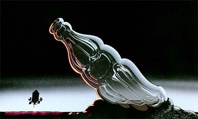
Starting out with a satirical gag- life on Earth starts with littering in outer space- the music starts and life emerges from the primeval ooze… or at least from high fructose corn syrup! Bozetto doesn’t just stick to the animals seen in museums, he creates his own creatures. They develop an edge that allows them to flourish for a time, only to be replaced by an animal that develops and even better edge on survival. As the music gradually swells in scale, so do the animals, until a parade of huge dinosaurs march across the landscape. It’s worth noting that the entire segment plays out from left to right. It looks as if Disney’s version might have been planned that way too, shifting to right to left with the entrance of the Tyrannosaurus Rex. But a single insert of the running dinos in the jungle breaks that pattern for some reason.
As the music starts to get frenetic, the parade is struck by a snowstorm, more accurately indicating what killed off the dinosaurs. The work builds in intensity to a climax, revealing the malefactor who is responsible for the destruction of nature. I’m not going to spoil the cartoon by telling you the ending here, but rest assured, it’s a much more meaningful and satisfying ending that Disney’s barren, sun-drenched ball in space ending.
There’s no point comparing them to decide which one is “better”. They approach the subject in totally different ways. Disney’s version is more experiential, a lot like a theme park ride. Bozetto’s version has meaning and satirical comment that leaves the audience thinking. Both are great. Take a look at the two films, analyze their techniques, and see what you can find in them.
MP4 Video File / HD / 23:19 / 812 MB Download
MP4 Video File / HD / 16:09 / 1.33 GB Download
JOIN TODAY To Access Members Only Content
Haven’t Joined Yet?
Check out this SAMPLE REFERENCE PACK! It will give you a taste of what Animation Resources members get to download every other month!
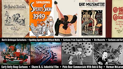
CLICK TO DOWNLOAD A Sample RefPack!
Animation Resources is a 501(c)(3) non-profit arts organization dedicated to providing self study material to the worldwide animation community. Every month, we sponsor a program of interest to artists, and every other month, we share a book and up to an hour of rare animation with our members. If you are a creative person interested in the fields of animation, cartooning or illustration, you should be a member of Animation Resources!
It’s easy to join Animation Resources. Just click on this link and you can sign up right now online…
JOIN TODAY!
https://animationresources.org/membership/levels/
![]()
![]() Animation Resources depends on your contributions to support its projects. Even if you can’t afford to join our group right now, please click the button below to donate whatever you can afford using PayPal.
Animation Resources depends on your contributions to support its projects. Even if you can’t afford to join our group right now, please click the button below to donate whatever you can afford using PayPal.


