John Kricfalusi’s blog, "All Kinds Of Stuff" continues to be the most information packed and eye opening animation resource on the internet. If you haven’t visited it lately, you’ll want to check out the series of posts John has been writing on the impact of UPA on animation. I guarantee that you’ve never heard these sorts of opinions anywhere else, and once you digest the concepts, you’ll never look at a UPA cartoon the same again.
- Wally Walrus vs. UPA Part One
- Wally vs. UPA 2: Stylized Cartoonists Take Their Skills For Granted
- Wally vs. UPA 3: Walt Craves Respect
- Wally vs. UPA Sidebar: Flat Stylized Cartoons I Like
- Wally vs. UPA 4: When Milquetoasts Rebel
- Wally vs. UPA 5: UPA Bred Worse Imitations
- Sidebar: Spumco Stylized Cartoons: 1990
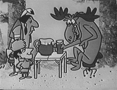
Here is just a sample of what John has to say…
If you don’t know cartoon history and you just grew up watching Cartoon Network, you might think that this flat stuff is something new and “hip”. It’s not. It’s much older than UPA, and the more graphic styles in cartoons before UPA didn’t come with the wimpy trappings. Because of our association with UPA’s beginnings, we assume that when we do something in a graphic style, we have to also carry over all the other attributes that came with UPA’s particular cartoon vision- the blandness, the wimpy world view, the snootiness.
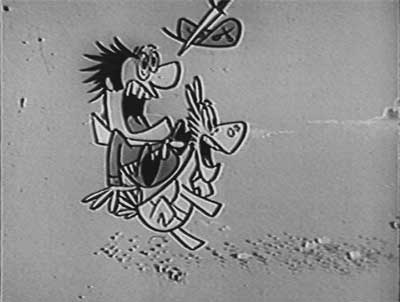
People usually don’t analyze or break apart the elements that make up something they like. If we like it we assume that every ingredient in it is equally good. Then when we develop our own styles, we copy the bad with the good. That’s what we need ANALYSIS for!
Like many artists, I have tons of influences. There are lots of things that inspire me. I try to figure out why they do and I break them down into their separate ingredients. I then decide which ingredients are the ones that are useful and discard the others that might have just come along with it, but don’t actually add anything. There are good things about UPA and Disney- Tex Avery combined them and added his own world view to them and made cartoons more entertaining than either style.
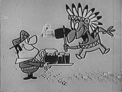
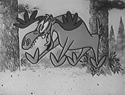
John’s comments cut like a sword through the “design for design’s sake” school of animation. He cites Tex Avery as the one cartoon director who was able to incorporate modern design sensibilities, while still maintaining the entertainment value and humor of classic cartoons. He’s dead right. This post reminded me of my favorite series of commercials… which were directed by Avery at Cascade studios and animated by Rod Scribner.
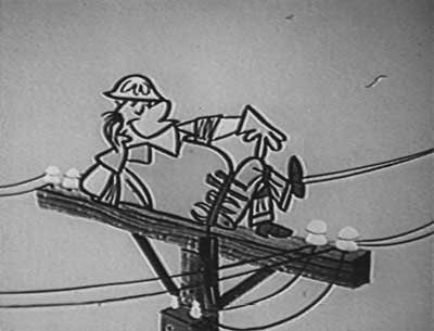
Not only is the character design modern in the "UPA style" but the movement has been stylized in a complementary manner. Why don’t the current "Flat" cartoons move like this?!
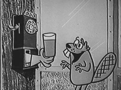
KoolAid Spots (Cascade/ca.1960)
(Quicktime 7 / 6.8 megs)
UPDATE: I was browsing through Cartoon Modern today, and I found a post that Amid did last Summer that perfectly encapsulates my thoughts about the importance of animation even in stylized cartoons…
The Importance of "Animation" in Animaton Design
One of the hardest things to get across when discussing animation design is that it’s not just about character designers, layout artists and background painters. The animator is a critical member of the design team….
The primary reason, in my opinion, that so much of today’s stylized animation rings hollow is because nobody ever follows through on the animation. Regardless of whether a show is animated traditionally overseas or if it’s done in Flash, most contemporary TV series creators think their job is done once they’ve created a pretty model sheet and slapped on a bit of color styling. These few stills illustrate however that model sheets are often the least important aspect of stylized animation– what the animator does with those designs is what truly counts.
Exactly! Great animators like Bill Littlejohn, Rod Scribner and Grim Natwick moved these kinds of designs in unique and stylized ways.
This post is causing quite a ruckus over at Michael Sporn’s blog. Check out Michael’s post titled Aaargh. In particular, read the comments. Here’s a real doozy…
Not everything has to look or move gorgeously to be good or artful. That’s one of the dumbest, scariest suggestions I’ve heard anyone make in animation circles.
Yow! Do people really think lousy animation is artistic?!
Cartoon Brew has jumped into… The Great UPA Debate. Will Finn (check out his great new blog, small room) writes…
I see Steve Worth’s point about Kool-Aid ads and such, where perfectly admirable work is overlooked because it wasn’t in the service of "Art witha a capital A". Animators who want to evaluate work on a technique level should be able to appreciate that wherever they find it and not just where the intelligentsia have enshrined it with a golden frame.
Let the debate continue!
Stephen Worth
Director
Animation Resources
This posting is part of the online Encyclopedia of Cartooning under the subject heading, Animation.
![]()
This posting is part of a series of articles comprising an online exhibit entitled Theory.

