Archive for the ‘bakshi’ Category

Tuesday, September 20th, 2016

Theory: Advice From Ralph Bakshi

Bakshi Art

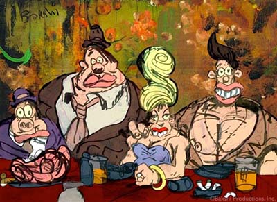
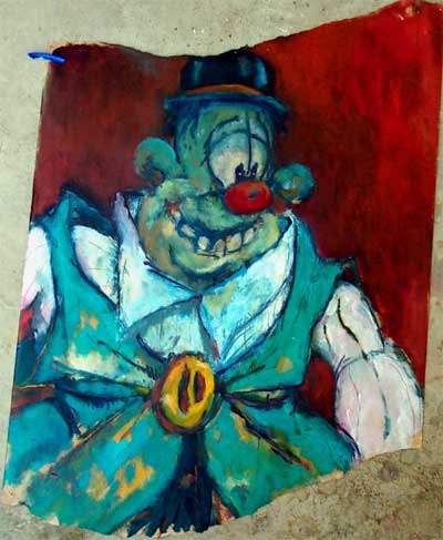
The paintings on this page are by Ralph Bakshi. (© Bakshi)
To see more of Ralph’s fine art, visit RalphBakshiart.com

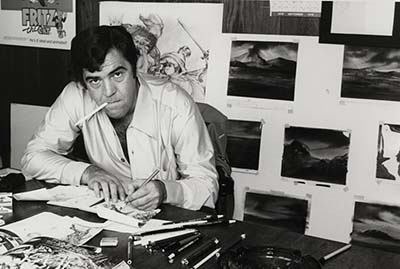
Ralph Bakshi is one of my best friends. Ralph has retired to New Mexico to paint, but he is still very much in touch with the animation scene today. After a bit of cajoling, I’ve persuaded him to speak to the animation community on Animation Resources. In this article, Ralph gives his viewpoint on the history of animation and points the direction that he thinks animation should take in the future. Whether you draw animation with a pencil or use a computer, I think you’ll find his comments to be important and inspiring. -Stephen Worth
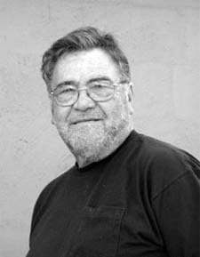
Ralph BakshiRalph BakshiBAKSHI SPEAKS TO CGI ANIMATORS

Frame to frame animation eventually came to a grinding end. I’m not sure which generation of young animators were at Disney redoing and relearning the tradition of making boring films and recreating cliched motion when it expired. Except for Jim Tyer, “Modern Animation” and Ralph Bakshi, animation was dying- while doing the same old thing. Big money and animators never really followed Bakshi, “Modern Animation” or Jim Tyer. They just rehashed its past.
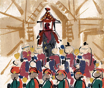
Engel at UPA

(Read Chuck Jones’ article on the failure of "Modern Animation")

UPA failed because it was nothing more than elitist designers trying to animate on museum walls. Content was unimportant to them, really. Matisse or Picasso were more important. Bakshi was hounded out of the business by controversy. And you’d be surprised how many animation directors at Terrytoons disliked Jim Tyer’s work because it didn’t look like Disney- or anything else for that matter. Terry kept him on because his weekly footage output was so large.
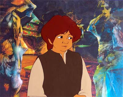
Bakshi's Lord of the Rings

(See the gallery of images from Lord of the Rings on RalphBakshi.com)

Lord of the Rings was done in rotoscope animation because rotoscope made it physically possible to do it. You couldn’t do Lord of the Rings in less than 25 years using traditional animation. Thirty years later- Wow! Along comes the computer… “We can do Disney story animation with another look and sell it back to audiences.” Of course, I would have used computers and motion capture if they had been around during my day. But I turned to Tolkien to try to change the kinds of stories animation told. My city films were being thrown out of theaters.

So, what’s the argument here? Unless hand-drawn animation finds new creative story approaches and new creative drawn motion exaggerations, it will look as it always looked at the end- faded and drawn. There’ll be no great interest for it either. Computer animation has the exact same problem. Computer animation will eventually grow old, just like hand-drawn animation, unless something new happens. It will fall into manneristic boredom if it continues to endlessly redo what’s already been done before. The success and the money will always follow the creative artists who take either of these two mediums and do something different with it.
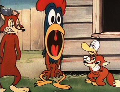
Jim Tyer Animation

A lot of people remember and love Jim Tyer’s animation today because he really did something different with hand-drawn animation. He didn’t follow the crowd.

BAKSHI ON 2D vs 3D

First of all, when it comes to controversy over 2D vs. 3D, I’m in no particular camp. I think computer animation is amazing. Some of the Japanese hand drawn animation I’ve seen is great too. But the discussion always comes down to the same one I always have with the young kids in the industry- the starving ones with mortgages to pay. When I see the end credits on big studio animated films, I’m floored by the amount of people it takes to finish a film. The cost to make the first 20 minutes of your modern animated feature would comprise the entire budgets of all of my first six films put together. Hard to believe but true!

Bakshi Art

It’s probably inconceivable to you guys, but I made my feature films with no pencil tests, no storyboards, no retakes, no color keys, no character designers, no special effects department, nothing, zip, nada- because we had to. (How I did that is another discussion altogether.) I was my own animation director- everything came to me. I flipped the drawings and gave the OK. God bless the professionalism of Irv Spence, John Sparey, Ambi Paliwoda, Virgil Ross, Manny Perez… all those guys who animated for me, because they’re the ones that made it all come alive.
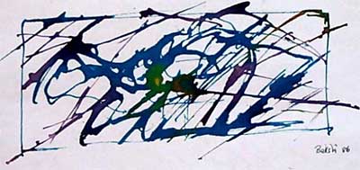
Bakshi Art

I’ll tell you a secret… Not having pencil tests was liberating for the animators who worked for me. They knew I was expecting creativity, not perfection. I wasn’t gonna be standing over the moviola looking at their tests saying, “raise that pinkie finger a little higher” or “fix that lip flap”. There was no room for retakes. Knowing that made them unafraid. No one was going to look over their shoulder and second guess them. They puzzled out the scene, expressed themselves through the character, and moved on to the next scene. You better believe- they loved it!
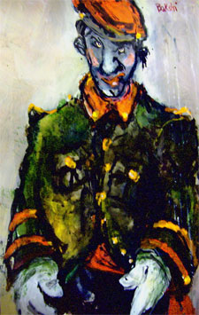
Bakshi ArtBakshi ArtWhen I was young, I had a dream- and a rage over Disney’s insistence that nothing worked on the big screen unless it was perfect- redone and reworked until it was flawless. I always thought the difference between my films and the Disney ones was the difference between rock n’ roll and a symphony. I love them both if the music is right. But a lot of spoiled animators claimed that I was ruining every young kid’s life with my rough animation- and that Terry-Toons and I were nothing. I didn’t listen to them, because I always felt that honesty, leaving the pack, telling stories that were part of the director’s personal life and not some merchandiser’s idea- all those things were more important than Disney’s insistence on perfect animation.

OK. Let’s talk animation. First of all, I want to talk to you drawing type animators…

When I hear 2D animators today talking about acting in hand-drawn cartoons, I ask, what kind of acting? Are you talking about the old fashioned acting that animators have always done? You know… the hand on the hip, finger-pointing, broad action, lots of overlapping action, screeching to a halt- all that turn-of-the-century old fashioned mime stuff. Is that what you’re talking about? Well, forget about it. If you’re gonna compete with computer animation, you better go all out and do something that’s totally different. Call it “new acting”. Blow the computer out of the water. Sure, Milt Kahl, Irv Spence, Bill Tytla and all those guys were great. Leave them alone. They’ve done their job. It would just seem old to do the exact same thing today. Find something new to call your own- something exciting as hell.
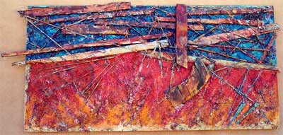
Bakshi Art

To you computer guys…

I’m supposed to scold you computer animators and tell you to think more like the hand drawn guys. Well, there’s no question hand drawn animation is different than CGI, motion capture or rotoscope, or even limited animation. Yes, computer animators CAN learn a lot from hand drawn if they know where to look. Maybe… maybe… maybe…

Some history- Early on, hand drawn was great- Fleischer’s Popeye, Jim Tyer, Freddie Moore, Rod Scribner, Bill Tytla, Johnny Gent… the direct, fresh stuff. But then suddenly, along came “real good animation” with all its complication, and the long painful looks, big shrugs and sighs, batting eyelashes, cutesy pie phony crap until you want to vomit… Overnight, all the old greats were forced to either kill themselves, stay drunk all the time, or quickly fade away. Animation got saddled with a bunch of boring, repetitive, old fashioned, dumb cliches. I am NOT going to tell computer animation to follow that road. Sure, computer animators should look at hand drawn animation to learn. But don’t get down on your knees. Don’t make the same mistakes hand drawn animation made at the end. Study the right stuff. There’s a hell of a lot more to learn from a Fleischer Popeye than there is from some “epic fantasy” like Prince of Egypt.
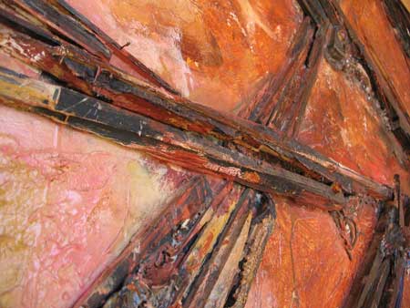
Bakshi Art

So I’m sitting in the theater watching a rat trying to cook some food. Now he’s trying to get out the window… I blink with amazement at the brilliance of your computer, but wait a minute… This is nothing more than a Disney film made with a computer! Your bosses must have MADE you do this. Where do you guys think you’re headed? Do you really think copying Disney films over and over isn’t going to get just as boring as the boring Disney films you’re copying? You’ve got all these great computers… show me something I haven’t seen a million times already. I have things in my head that the computer could do that would stun you. (But don’t worry. I got turned down by every studio in town.)
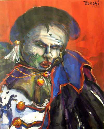
Bakshi Art

Listen. I’m talking to that bunch of you computer guys out there who want to crawl into a basement with a big stack of machines and kick ass- the guys who want to do something NEW and DIFFERENT. Don’t worry about the money. You’re not getting paid that much anyway. If your characters shake and spit the colors off in some scenes- great. It doesn’t matter. And if some of the textures jiggle a little, who cares? Back in the day, I heard animators critique the animation in my films as being “too ruff”. Well, we didn’t like it all either- but we LOVED what we were making- Fritz the Cat, Heavy Traffic, Coonskin, Hey Good Lookin’, Wizards- thirty years later and they’re still playing worldwide, because they were honest and rugged. The animation didn’t take away from the movie like the slick stuff I see in hand drawn animation at the end. Something REAL is always better than something realistic.
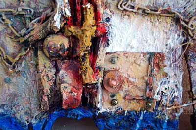
Bakshi Art

There are no sides here, only techniques. The important thing is to do something more than just sell dolls and hamburgers, or get the best table at some bullshit restaurant. Stop crying. Go out and do something. Starve to death if you have to. It’s honorable.

Go buy my book. Read more. Learn more. Get mad at me again.

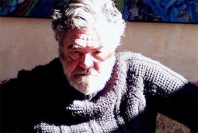
Old Man Ralph

© Bakshi Productions
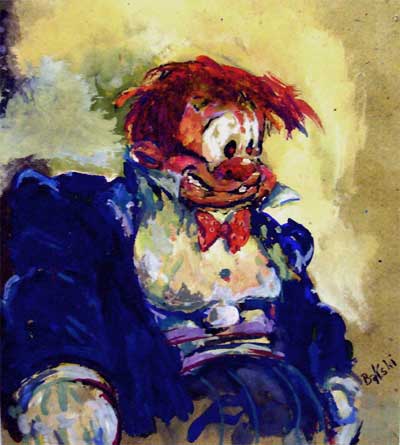
Bakshi Art

Ralph Bakshi

Several years ago at the San Diego Comic-Con, I had the honor of hosting an interview with Ralph Bakshi. He had some important things to say to the animators in the crowd. Watch Ralph take my question and hit it out of the park…

Many thanks to the Bakshi family for their helpfulness and generosity, and to our fantastic videographer, JD Mata.

Feel free to embed the YouTube on your own website. Spread the word! Educators may download a higher resolution copy of this video to burn to DVD for viewing in their classroom.

Read the comments about this video at YouTube, Cartoon Brew, CGI Society Part One, CGI Society Part Two, Animation Nation and Weirdo’s blog on Newgrounds.
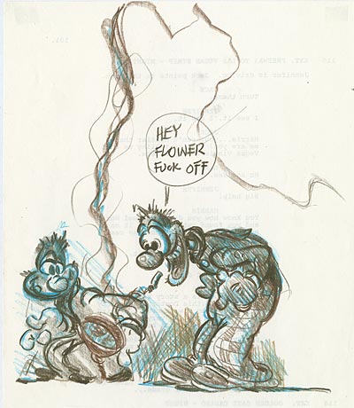
Ralph Bakshi
Visit Ralph’s web page… RalphBakshi.com.
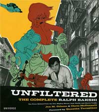
Buy Me At AmazonUNFILTERED: The Complete Ralph Bakshi isn’t one of those "art books" with postage stamp sized pictures floating in oceans of tasteful white space and huge text blocks of scholarly blather that crowds out the images. It’s just pictures, pictures and more pictures… along with just enough text to put them in context. The book is organized to show Ralph’s career from his earliest days at Terry-Toons, to his groundbreaking features, to his revolutionary TV work, to his most recent fine art paintings. Even if you think you know all there is to know about Bakshi, this book will grab you by the lapels and shake you and show you things you’ve never seen the likes of before. Click through the link to pick up the Bakshi book at Amazon.

Stephen Worth
Director
Animation Resources

Animated CartoonsAnimated Cartoons

This posting is part of the online Encyclopedia of Cartooning under the subject heading, Animation.
TheoryTheory

This posting is part of a series of articles comprising an online exhibit entitled Theory.

FacebooktwitterredditpinterestlinkedinmailFacebooktwitterredditpinterestlinkedinmailby feather

Thursday, October 29th, 2015

LET ME TELL YA ABOUT RALPH BAKSHI…

…the voice boomed out around the entire hall. The legendary MGM animator, Irv Spence had just been handed the Winsor McCay Award for lifetime achievement in animation. Without saying a word, he set the trophy back on the podium and strode out to the lip of the stage, where he addressed the audience hollering at the top of his lungs…

LET ME TELL YA ABOUT RALPH BAKSHI…

A nervous chuckle spread throughout the crowd of professional animators in attendance.

BAKSHI IS AN ARTIST… AN ARTIST! AND THERE ARE TOO FEW REAL ARTISTS IN THIS BUSINESS DAMMIT!

Irv Spence
Irv Spence

I was just a kid volunteer at that time, standing in the back row, but Spence’s words shocked me. What did he mean? A few years later, I was lucky enough to find out, working as Ralph’s right hand man on his last animated feature. I remember Ralph talking about Spence. “Spence is an old lion, Stevie, and old lions deserve respect.” I could tell that Ralph respected Spence a great deal. I also have tremendous respect for old lions myself. Today, I get to do what Spence did, and I couldn’t be more delighted.

LET ME TELL YA ABOUT RALPH BAKSHI…

Ralph Bakshi
Several years ago at the San Diego Comic-Con, I had the honor of hosting an interview with Ralph Bakshi. Now, you’ve probably seen this video before, but watch it again. This “old lion” has something important to say to the kid animators in the back row. Watch Ralph take my question and hit it out of the park…

Here we are seven years later, and something amazing has happened. Ralph took his own advice and gathered together a small group of people, got a computer and made his own film. Not just any film. A film that looks and moves and sounds and feels like no other film ever made before. He made a film that could never be made at the big studios. He made a personal film where each and every frame reflects his own artistry and point of view.

It’s called “Last Days of Coney Island”, and if you haven’t ponied up the four bucks to watch it yet, watch it now with Ralph’s words at the 2008 Comic-Con fresh in your mind.

Last Days of Coney Island

Last Days of Coney Island at Vimeo

This film is doubly important, not just because it’s a great film, but because of what it represents… This is a put up or shut up moment… an old lion issuing a challenge for young animators. Ralph didn’t just share his years of experience and offer sage advice, he went out and did it himself to prove it can be done.

Ralph has done that throughout his career. In the late 60s animation was dying from rehashed ideas and complete lack of passion for the art form. The work was being shipped overseas to studios who cared even less than the studio shipping out the work. Animated features had become an animal devouring itself… remakes of remakes of remakes. Every feature looked just like the last one. Sound familiar?

Last Days of Coney Island
Ralph Bakshi

Enter Bakshi… He grabbed onto the art form with both hands and banged out pictures that were personal. He told stories that spoke about issues that were real and relevant. Ralph found great animators like Irv Spence who had animated the same old cats and mice for decades, and he offered them the chance to reinvent themselves as ARTISTS creating something NEW and EXCITING. He did the same thing for the “Saturday Morning Ghetto” in the early 80s. He led the way, encouraging artists in the field to take back their art form and make it something REAL. For a while other people followed his lead, but ultimately, everything slid back into the comfort of corporate franchises and well marketed mediocrity.

The difference between Ralph and everyone else in animation is that Ralph doesn’t just sit back and complain about how lousy TV animation is and how every animated feature looks exactly the same as the last one, he goes out and PROVES that it’s possible to do much, much more.

Well, he just proved it again.

Last Days of Coney Island
Ralph Bakshi

Seven years ago, Ralph told all of us to go out and use computers and a small, tight group of talented partners, and make our own films with our own fresh ideas. Today, Ralph has debuted his film on Vimeo to prove he’s not just blowing hot air.

Here comes your kick in the pants… Seven years later, where is your film? Consider “Last Days of Coney Island” your wake up call to get started on something for yourself. Show the audience something new… something of yourself… something REAL.

Ralph is an artist… Compare “Last Days of Coney Island” to what other great animators have done in their late 60s and 70s. You know what I’m talking about… I don’t have to name the names. The tired old men treading the same old paths, just not as confidently or with nearly as much passion. When some people get old, their art gets old with them.

Not so with old lions like Spence and Ralph. BE A YOUNG LION DAMMIT!

Many thanks to the Bakshi family for their helpfulness and generosity, and to our fantastic videographer, JD Mata for capturing this important interview.

FacebooktwitterredditpinterestlinkedinmailFacebooktwitterredditpinterestlinkedinmailby feather

Friday, January 9th, 2015

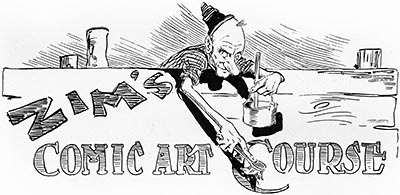
E-Book: Zim’s Correspondence Course in Cartooning and Caricature Volume 1

Every other month, members of Animation Resources are given access to an exclusive Members Only Reference Pack. In January 2015, they were able to download this wonderful e-book of the first volume of Eugene Zimmerman’s Cartooning Course. Our Reference Packs change every two months, so if you weren’t a member back then, you missed out on it. But you can still buy a copy of this great e-book in our E-Book and Video Store. Our downloadable PDF files are packed with high resolution images on a variety of educational subjects, and we also offer rare animated cartoons from the collection of Animation Resources as downloadable DVD quality video files. If you aren’t a member yet, please consider JOINING ANIMATION RESOURCES. It’s well worth it.


CLICK to Buy This E-Book


Members Only Preview

FOREWORD By Ralph Bakshi

I grew up in a time, in the middle of the 20th century, when most drawings in cartooning- magazine gag panels, comic strips and animation– were all formula. The same funny character shapes were repeated over and over again. This was called "having a great style".

I didn’t realize that a great part of the history of cartooning had been lost until my wife Elisabeth and I stumbled across this complete set of Eugene Zimmerman’s cartoon course at an estate sale. Subsequently, and with great enthusiasm, I ran around from one book store to another looking for old copies of Judge and Life, the magazines that Zim had drawn for fifty years earlier.

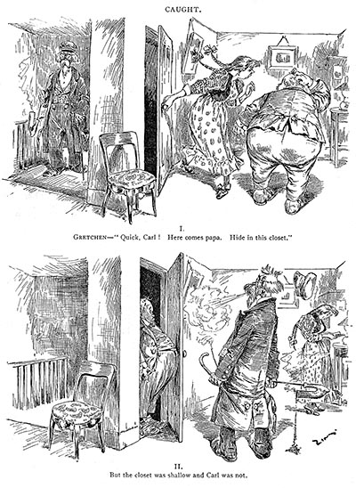
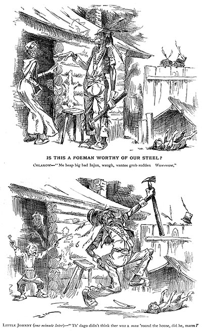
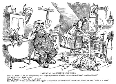
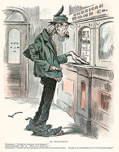
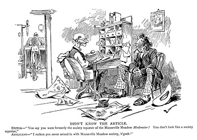
The thing that made Zim so great was that like all great artists, he had no formula for drawing. He thought about each drawing as it related to life and situation, then caricatured it. He didn’t have a simple cartoon formula to explain everything. He searched for the individual truth of the moment. At all times, his cartoons are hilariously funny and ring true. We recognize the event, the person, his age, social standing and ethnic type immediately. This is what makes his cartooning great.

Zim caricatured all of the people that we know so well. They were just like the people I grew up with in Brooklyn. His characters make me roar with laughter and appreciate all of our individual humanity. Zim’s drawing of objects– a shoe, a can, a pot, a chicken, a chair– come alive in his drawings. Each object has its own unique personality, just like his characters. To Zim, everything is funny and real at the same time.

So here is Zim’s cartooning course. How lucky can you get?

Ralph Bakshi March, 2009


CLICK to Buy This E-Book


Members Only Preview

INTRODUCTION by Stephen Worth

A century has passed since he hit his artistic peak, and perhaps because of that wide gulf, it is impossible to discuss the work of Eugene “Zim” Zimmerman without discussing the issue of race. The result of this is that Zim’s pioneering body of work has been largely misunderstood, or worse yet, completely erased from the history of cartooning.

In his introduction to ZIM: The Autobiography of Eugene Zimmerman (1988), Walter M. Brasch quotes Dr. Charles Press, professor of political science at Michigan State University. Press, the author of a book titled, The Political Cartoon, describes Zim’s work as…

…the kind of comic art where the last panel shows someone’s feet up in the air with the big word “plop!” It is at its most typical, characteristic of “correspondence school art.” The artist simplifies by offering clichés– “here is the way you draw a shoe, here is the way you draw an ear.” The clichés extend beyond the characters as well. Not only are the Jew and the Black drawn as stereotypes, but so are the English gentleman, etc. They all look like figures out of an unimaginative central casting.

Brasch attempts to explain why Zim has been forgotten…

By holding minorities up to ridicule, Zim had held all Americans up to ridicule– the minorities for the comic humor, the others for having allowed it. In an effort to cleanse a nation’s history, perhaps America deliberately tried to bury its past– and that included all art by all writers who used the stereotypes, even if much of their work was nonracist.

Members Only Preview

It’s obvious why critics and historians have swept Zim under the rug— they see only the ethnic gags on the surface of Zim’s cartoons. They don’t see the keen observation, artful exaggeration and underlying humanity that makes a Zim cartoon so much more than just a simple joke based on racial differences. This is understandable for a historian whose principle focus is on social issues. But the surprising thing is that most artists and cartoonists have forgotten about Zim as well.

Overviews of the history of cartooning routinely begin with Wilhelm Busch and Thomas Nast in the 1860s, then jump forward to the introduction of newspaper comics with Outcault’s “The Yellow Kid” thirty years later. The decades between yawn like a black hole in the timeline. One might be led to believe that nothing much of importance took place in the interim. But the truth of the matter is, there were many great cartoonists and illustrators who lived and worked during that forgotten time— Joseph Keppler, A. B. Frost, Frederick Opper, Bernhard Gillam, James Montgomery Flagg, T. S. Sullivant and Eugene Zimmerman. These artists laid the foundation for everything that followed.

Members Only Preview

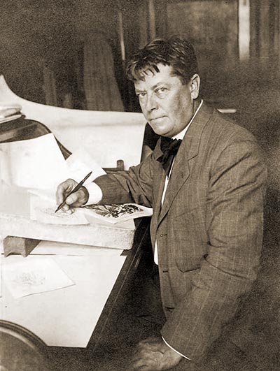
I first encountered Zim’s art in a bound volume of Judge magazines dating from shortly before the United States entered World War I. By this time, Zim had already left the Judge staff to work freelance from his home in Horseheads, NY and his contribution to the magazine was minimal. His cartoons consisted of tiny characters slipped into the margins of the columns, much like Sergio Aragones’ doodles in Mad magazine many decades later. But even tiny and simplified, the vitality of his characters leapt off the page at me. It was clear that here was an artist worth investigating.

I began combing the online resources and used bookstores, but it was difficult to find information. However, when I mentioned Zim to my friend, Ralph Bakshi, his voice boomed through the telephone— “ZIM! Ha! Ha! You found Zim! I was keeping him as my secret!” Ralph explained that he had stumbled across a copy of Zim’s cartooning course in the late 1960s, and kept it close at hand as he created his first few animated features— Fritz the Cat (1972), Heavy Traffic (1973), and most importantly, Coonskin (1975). Ralph had kept his interest in Zim to himself all those years, but now he enthusiastically shared his thoughts with me, and allowed me to digitize rare material from his library. The puzzle pieces began to come together to reveal the true genius of this overlooked master of the art of caricature.
Members Only Preview

Caricature consists of equal parts observation and exaggeration. Zim was adept at both. In his autobiography, Zim tells a story about one of his outings to find subjects to caricature…

When the instantaneous camera was invented, the Judge Company bought one as an experiment, or perhaps took it in exchange for advertising. It was in the form of a stiff false vest front covered with suiting, at the time fancy vests were in vogue. The camera was a flat, nickel-plated circular affair with a revolving plate capable of holding eight pictures and which operated automatically when the shutter closed. It was intended as a detective camera. You could approach a person and, with one hand in your trousers pocket, pull a string which led into the pocket, operating the shutter.

Hamilton and I were slumming for character studies one day and experimenting with the new little plaything. The first human to strike our fancy was an aged woman scavenger whose upper part was buried in a barrel of rubbish, with the rear elevation conspicuously aimed at us. After taking a couple of preliminary shots, we desired a study of the face as well, so Hamilton told me to get ready, and let out a tremendous yell. The woman jumped clear of the barrel. I pulled the string, got her face and quickly left the neighborhood, followed by a whole paragraph of the most exquisite profanity that ever warbled from the throat of a filthy bird.

Members Only Preview

The level of specificity of detail in the clothing, architecture and attitudes of the characters in Zim’s cartoons reveal that he wasn’t just recycling clichés or stereotypes, he was drawing upon keen observation of the world he saw around him. Then, as now, the most exaggerated and interesting characters resided in the poorer neighborhoods, and in the 1890s, New York City contained a particularly wide palette of character types to study.
Before Zim entered the scene, caricature was reserved for the powerful and well-to-do. The cartoons in Life magazine featured men in tuxedos and top hats and women seated on sofas in palatial sitting rooms. All of the humor was contained in the caption, and the formulaic artwork was based more on an abstract concept of “good taste” than it was on anything remotely real. Puck magazine generally focused on politicians and public figures, taking a hard-hitting approach to current events. But Zim looked to the common man for inspiration. His work reflected the dynamic nature of the American melting pot better than any other artist of his day.
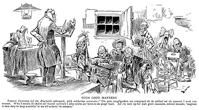
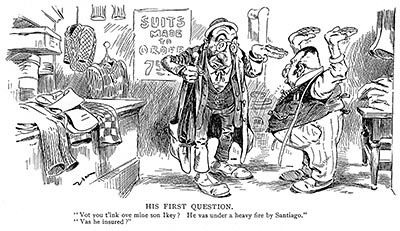
Zim exaggerated the ethnic differences he saw in the Irish, Black, Jewish and other immigrant neighborhoods of New York, but he didn’t just apply a stereotypical formula to his caricatures. Looking at Zim’s detailed images of everyday life among the various ethnic groups, one is struck by the amount of individuality among the characters. Each person is a unique personality, exaggerated to enhance his own peculiar characteristics.

Members Only Preview

There is an important distinction to be made between clichéd stereoptyping of ethnic groups and the sort of observational caricature that Zim excelled at— the difference is honesty. Although the gags and dialogue occasionally strayed into routine formulas, Zim’s drawings never did. In his cartooning course, Zim spoke about the constraints sometimes placed upon him by the editorial staff…

An artist is not always the father of the joke attached to his drawing. Very often, an art editor accepts an idea or suggestion which is without a picture; thus the artist is requested to make a drawing to correspond with the idea. Now it may happen that the art editor and the artist differ in their conception of humor and inasmuch as the art editor’s opinion predominates in this case, the artist proceeds to illustrate the joke as directed.

The general public, while not aware of these facts, lays all the blame on the artist, and the artist must cheerfully accept the public’s condemnation. It has been my custom in such cases to insert a lot of interesting detail to make the drawing as catchy as possible, in order to hide the inferior quality of the joke.

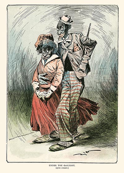
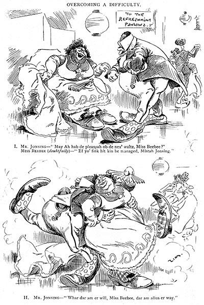
A likely example of this sort of thing is a cartoon from the January 1896 issue of Judge’s Library. A black couple out for a night on the town are shown “under the gaslight” on 27th street…

Members Only Preview
Armand (who has just proposed)— “Pore liddle honey,
yo’ looks blue! I’s ‘fraid yo’s cold.”
Pauline— “Dat ain’t cold, Gawge. Dat’s blushes!”

Zim makes no attempt to literally illustrate the gag— there is no blue cast to the blush on the girl’s cheeks. Instead, he pours all of his powers into capturing a moment. The boy, a dandy, has a cane tucked casually in his pocket and a hat perched on his head at a jaunty angle. His body is posed in such a way that we can discern the proud way he walks. The girl looks up to him shyly with an admiring glance out of the corner of her eye. The wind blows through her skirt, and the boy’s hand wraps around the girl’s waist holding her close.

But the most interesting detail isn’t obvious on first glance… the boy’s trousers are decorated with an American flag. Cartoonists at this time didn’t treat the flag lightly— its use served a specific purpose. Zim is depicting this Black couple as a typical American boy and girl out on a date. When you consider that Blacks had been slaves just few decades before, this simple image takes on a wider significance. Zim’s cartoon documents how Blacks at the time were making their first entry into mainstream American society. The silly gag sits below the frame in the dialogue, completely irrelevant to Zim’s eloquent image.

Zim didn’t ridicule his subjects; he caricatured them. The point of caricature is to use humor and exaggeration to illuminate truth. The fact that he made fun of so many types of people reveals that he held no special animosity against any particular group. He poked fun at everyone equally. And although he exaggerated the surface differences between people, he always kept his focus on portraying the essential truth at the core of his caricature.

Members Only Preview

In his last “how to” cartooning book, How To Draw Funny Pictures (1928), Zim sums up his philosophy of caricature like this…

When you see a haughty person, do not be deceived into believing that it is some great man or famous woman out for a walk. More likely it is some fickle waitress or a pool hall loafer who won $3.00 in a crap game or inherited $47.60 from a dead aunt. Or possibly it may be some haughty clerk out showing off the latest dollar-down-and-dollar-a-week clothing. The really great are never haughty. My work and travels have brought me into contact with the great and near-great in all lines of endeavor— presidents and movie actors, authors and artists, Buffalo Bill and Bryan, Edison and Lindbergh— they were all hearty and unassuming.

Greatness makes one tolerant. Great men are not ashamed to stop on the street and talk to the man in overalls. They recognize the bond of friendship between the common people and themselves. The social sheik who feels above talking to a mere laborer is fooling only himself.

Take this little sermon to heart and treat every man as your equal; it will help you to get ahead. How truly the Bible says, “The greatest among you shall be the servant of all.”


Members Only Preview

In our “politically correct” times, it is easy to look at the surface details of Zim’s cartoons and miss the humanity that courses through them just under the surface. Zim’s Correspondence School of Cartooning, Comic Art & Caricature is more than just lessons in how to draw. It’s a philosophy of what it means to be a cartoonist.

My purpose for compiling this book is to serve two purposes… First, I want to shine a spotlight on a forgotten artist whose work helped to lay the foundation for the whole history of cartooning. Secondly, I want to encourage current artists to consider Zim’s philosophy and apply his keenly observed honesty to their own work.

I would like to thank Ralph Bakshi, the Horseheads Historical Society, and the dedicated crew of volunteers at the Animation Resources for their invaluable assistance. I hope you find this book to be useful.

Stephen Worth
Director, Animation Resources
March, 2009

Members Only Preview


CLICK to Buy This E-Book


Not A Member Yet? Want A Free Sample?

Check out this SAMPLE REFERENCE PACK! It will give you a taste of what Animation Resources members get to download every other month!

Sample RefPack


JOIN TODAY To Access Members Only Content


FacebooktwitterredditpinterestlinkedinmailFacebooktwitterredditpinterestlinkedinmailby feather