Archive for the ‘dulac’ Category

Tuesday, July 11th, 2023

Illustration: Dulac’s Poe and Tanglewood Tales

Dulac Poe

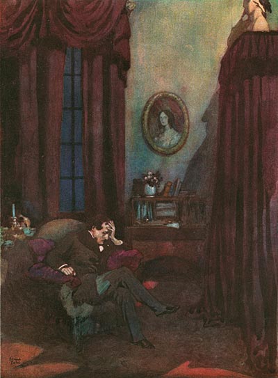
The Raven

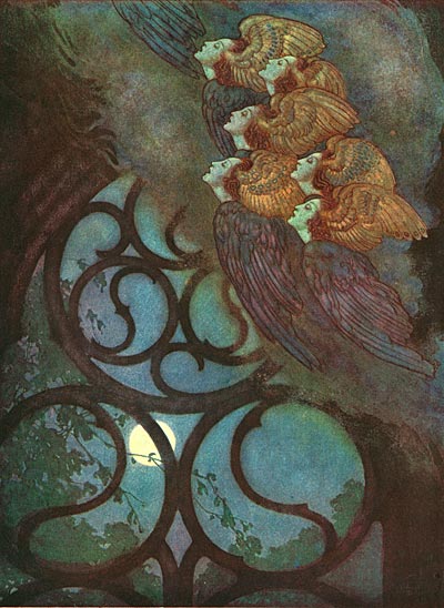
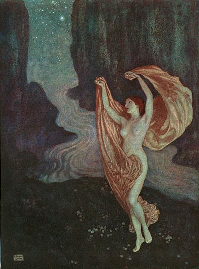
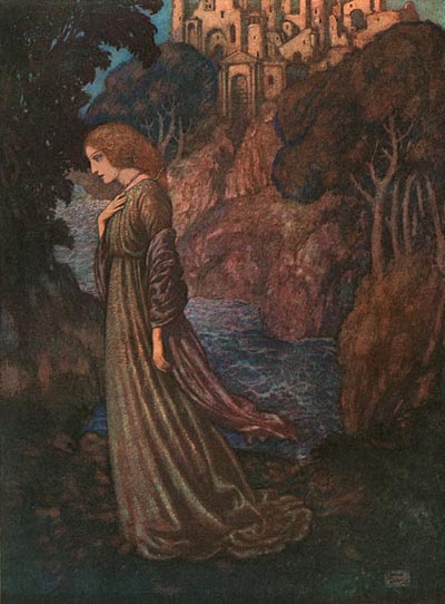
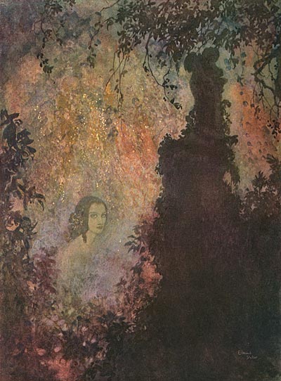
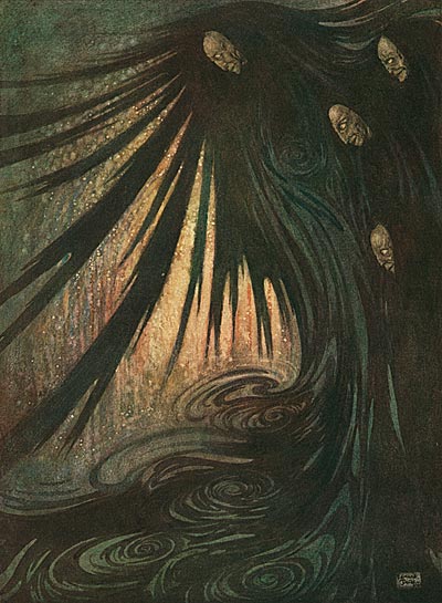
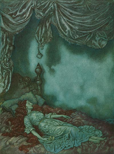
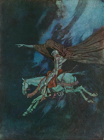
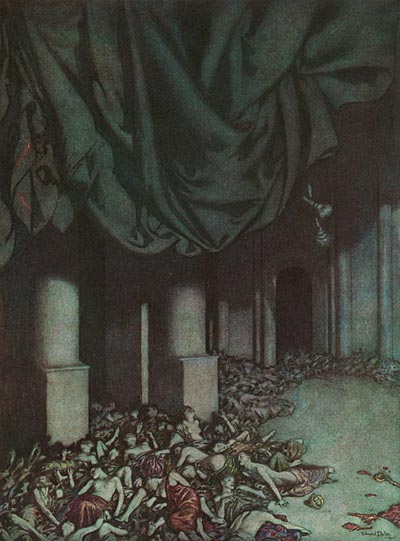
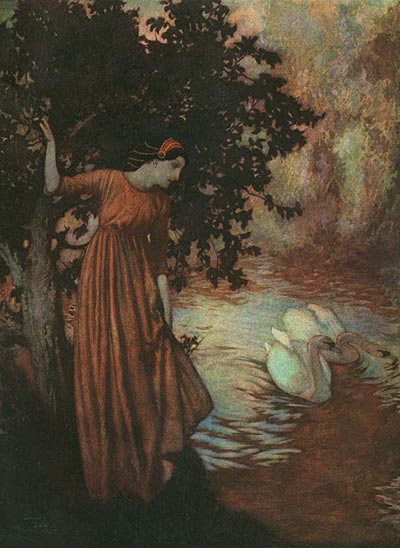
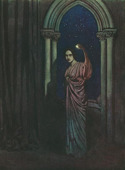
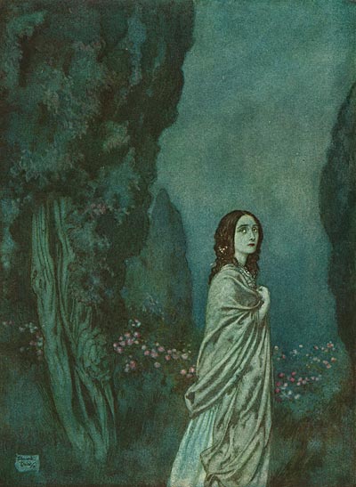
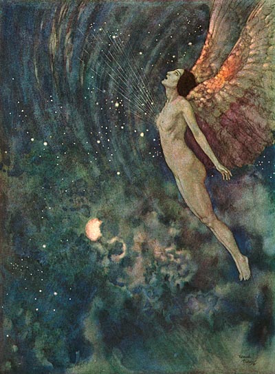
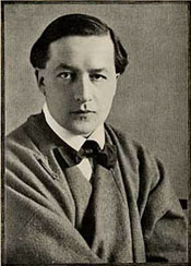
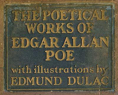
Edmund DulacEdmund DulacIn the golden age of storybook illustration, there were two artists who led the field… Arthur Rackham and Edmund Dulac. Both of these artists were prolific, but of the two, Dulac was the most stylistically versatile. Today, we digitized one of Dulac’s most unique books, The Poetical Works of Edgar Allen Poe (1912).

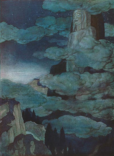
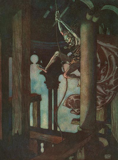
Dulac took full advantage of the printing technology of his day to create images full of deep shadow, inviting the viewer to peer into the details in the darkness. Note for instance the figure in The Raven. His body falls into the shadow across the chair and rug, defined only by the cool shadowy colors of his trousers against the warm ones of the background. Dulac’s images perfectly capture Poe’s dark, melancholy moods, as well as the cosmic, dreamlike situations of poems like Israfel. Light is used to great effect with eerie, otherworldly uplighting in To One In Paradise, cool moonlight through an open window in The Sleeper, and a pinpoint light source in To Helen.

One of the genres of storytelling that has been rarely employed in animation is gothic horror. Looking at these images, it’s clear that animation would be capable of creating a dark, sinister world even more vivid than could be ever be created in live action.
Dulac Poe

Dulac Poe

The Bells

Dulac Poe

The Bells

Dulac Poe

To One In Paradise

Dulac Poe

Lenore

Dulac Poe

To Helen

Dulac Poe

The Haunted Palace

Dulac Poe

The Sleeper

Dulac Poe

Eldorado

Dulac Poe

The Conqueror Worm

Dulac Poe

To The River

Dulac Poe

To Helen

Dulac Poe

To – –

Dulac Poe

Israfel

Dulac Poe

Dreamland

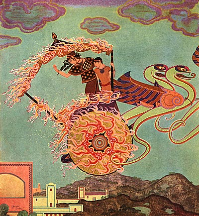
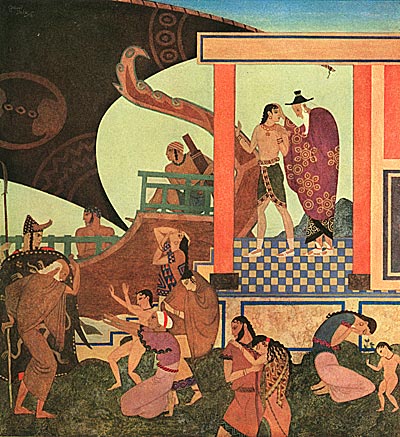
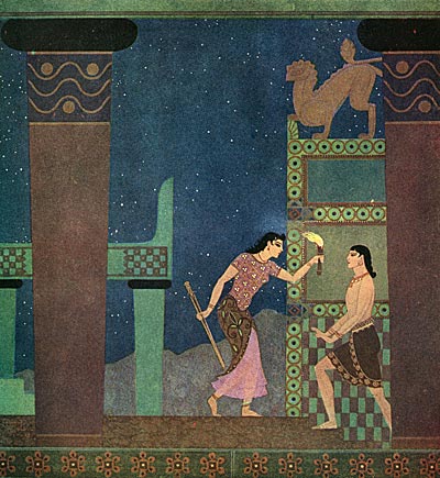
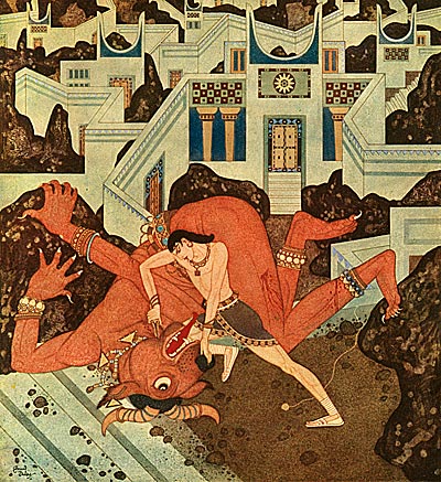
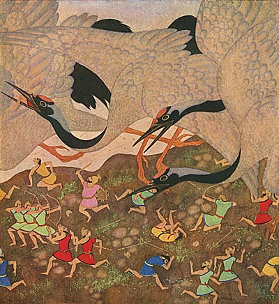
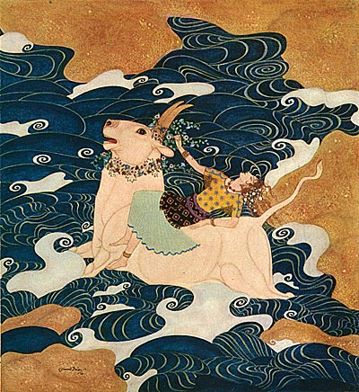
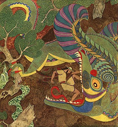
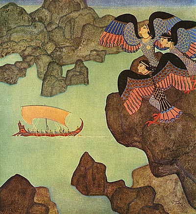
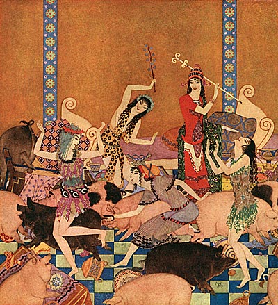
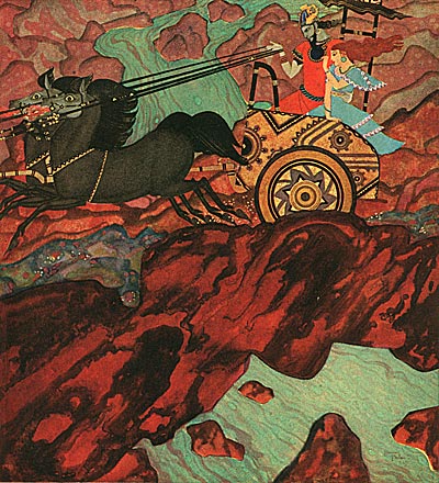
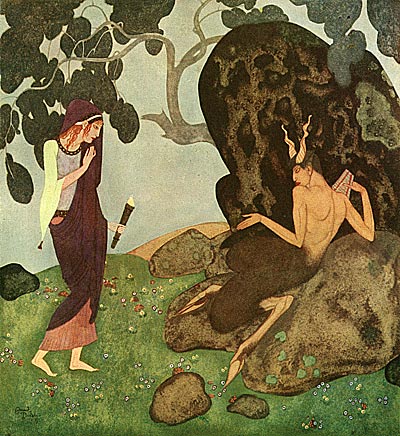
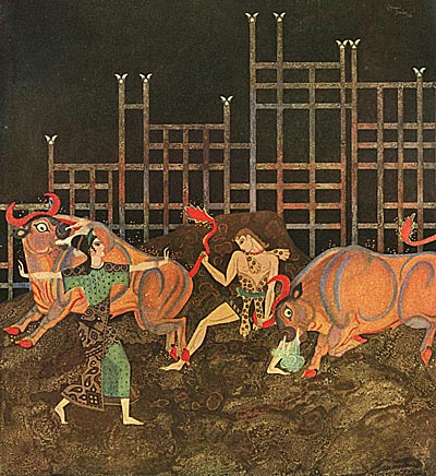
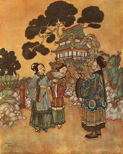
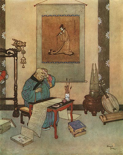
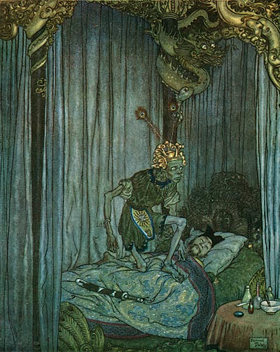
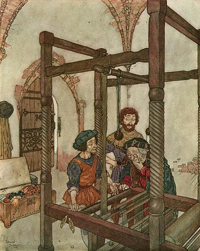
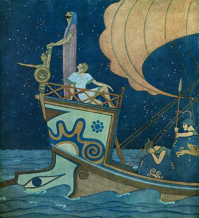
If you compare these images to Dulac’s last great illustrated book, Nathaniel Hawthorne’s Tanglewood Tales, you will notice a radical shift of style. Just like Gustaf Tenggren reinvented his painting style between his early work on Bland Tomtar Och Troll and the Golden Books series, Dulac’s style underwent a transformation from the classic illustration style of artists like Arthur Rackham and Howard Pyle to a style influenced by Persian illuminated manuscripts and oriental design.

Edmund Dulac's Tanglewood Tales

Edmund Dulac's Tanglewood Tales

Edmund Dulac's Tanglewood Tales

Edmund Dulac's Tanglewood Tales

Edmund Dulac's Tanglewood Tales

Edmund Dulac's Tanglewood Tales

Edmund Dulac's Tanglewood Tales

Edmund Dulac's Tanglewood Tales

Edmund Dulac's Tanglewood Tales

Edmund Dulac's Tanglewood Tales

Edmund Dulac's Tanglewood Tales

Edmund Dulac's Tanglewood Tales

Edmund Dulac's Tanglewood Tales

Edmund Dulac's Tanglewood Tales

A friend of mine asked me a question that a couple of his acquaintances had asked him about Animation Resources… "Why aren’t there more posts of material from animation?"

It’s a valid question. There are two reasons… First of all, animation is primarily about movement. In order to convey that, it requires movie files. Unfortunately, at this point, we can’t afford the bandwidth to provide a lot of streaming video. At some point, when the project has grown a bit, we hope to be able to do that.

The second reason cuts to the heart of what Animation Resources is intended to accomplish. We aren’t trying to create a trade school program in animation to teach people how to animate- That’s beyond the scope of what we can do here. The purpose of the Archive is to provide inspiration… to supply material that will help artists see and create in a different way. Inspiration for animation doesn’t have to come from animation itself. Real life, illustration, fine art, music and great literature can all inspire animation.

American animation celebrated its 100th Birthday in 2006. But in all that time, the way an animated film looks hasn’t been explored nearly as fully as it should have been. From a design standpoint, cartoons have always been very imitative… In the 1930’s dozens of characters looked like Mickey Mouse. Today, the main characters of animated features all look about the same. There’s no reason why this has to be the case.

The purpose of the reference material I’m providing isn’t to give you, the artist, a "cop file" that you can duplicate in your own work- It’s to help break down the essence of animation design… caricature, anthropomorphism, stylization, color, pleasing shapes, expression, etc… so you can incorporate those elements into your own work, and create new ways of seeing for those of us in the audience. Referencing illustration and print cartooning is a much better source for that sort of thing than referencing other animated films.

A truly great artist can’t keep working in a single style. They have to evolve and grow. I hope the images I’m posting here in this blog help you along to break new ground in how an animated film can look.

Stephen Worth
Director
Animation Resources

IllustrationIllustration

This posting is part of a series of articles comprising an online exhibit spotlighting Illustration.

FacebooktwitterredditpinterestlinkedinmailFacebooktwitterredditpinterestlinkedinmailby feather

Tuesday, June 20th, 2023

Illustration: Dulac’s Hans Christian Andersen

Dulac Andersen Fairy Tales

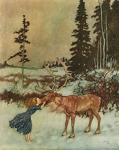
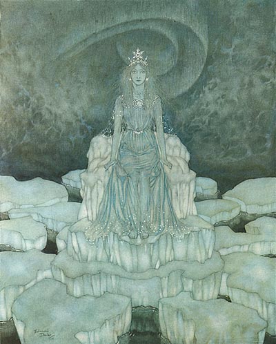
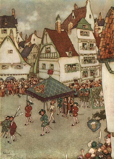
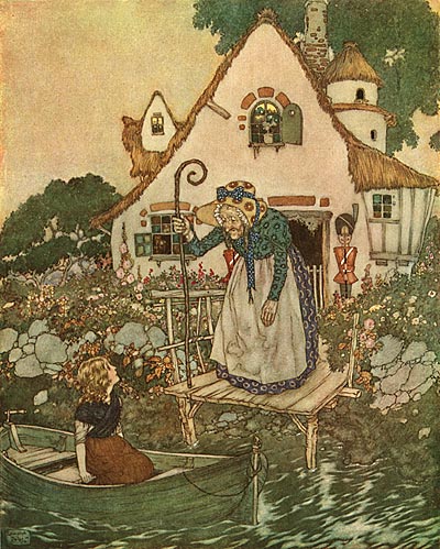
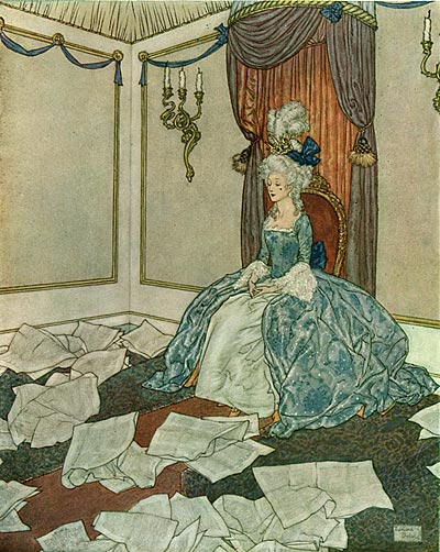
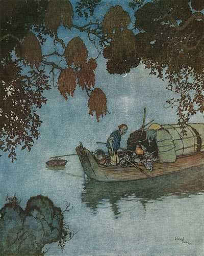
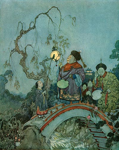
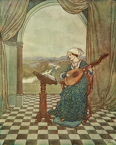
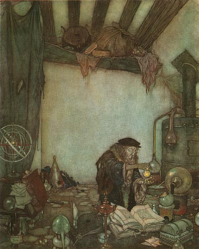
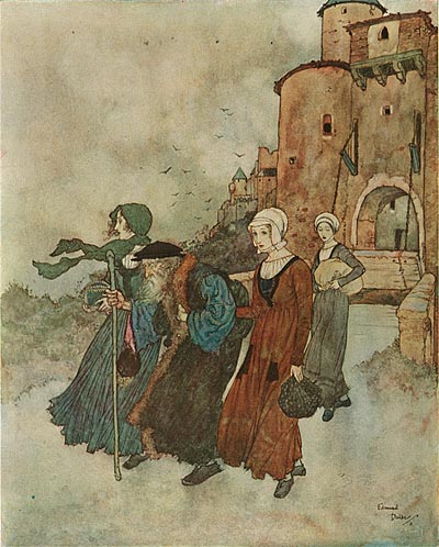
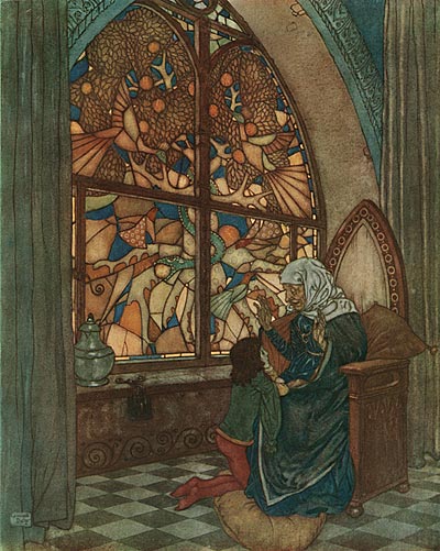
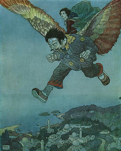
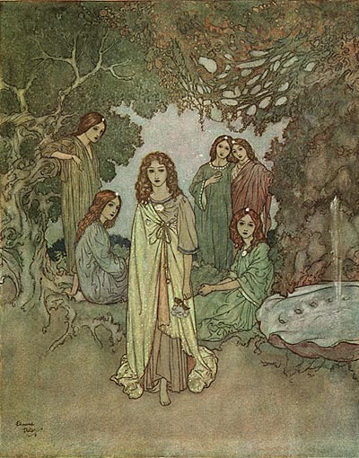
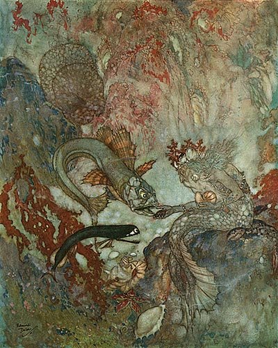
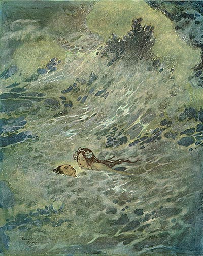
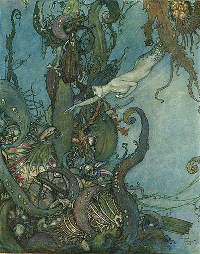
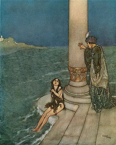
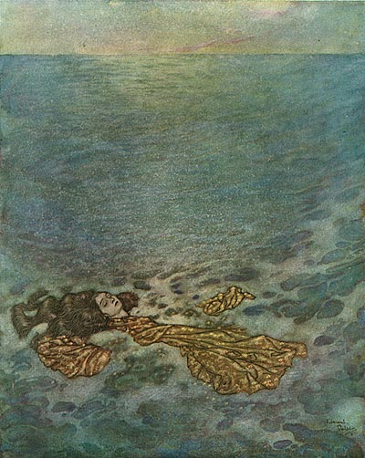
The invention of chromolithography at the end of the 19th century opened up a new world for book illustrators. It was no longer necessary for illustrators to limit the number of colors and focus on high contrast line work. The printing press was now capable of reproducing oil paintings and watercolors with all of the richness of the original artwork. This resulted in an explosion of illustrated books around the turn of the century, and made superstars of the artists who created them.

Dulac Andersen Fairy Tales

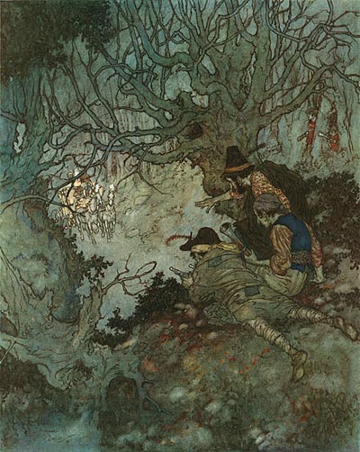
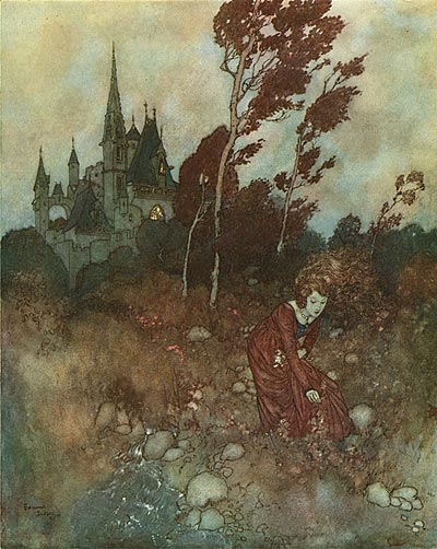
One of the most striking aspects of vintage book illustrations is the use of color. In our memory, our impression of these beautiful images is made up of rich and vibrant hues, but if we analyze the way color is actually being used, we realize that the color harmonies are very subtle, with small brilliant accents used to direct the eye, and careful attention to the rendering of form, texture and lighting effects.

Dulac Andersen Fairy Tales

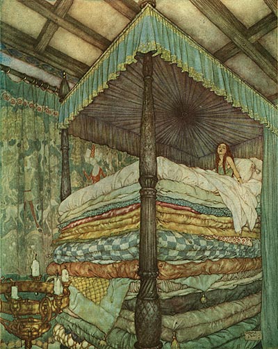
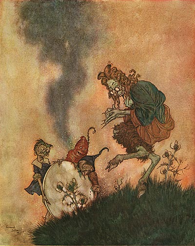
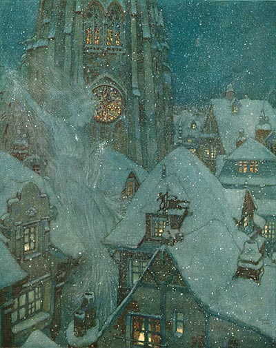
Art is all about beautiful contrasts, and so is the use of color… warm colors against cool colors, light ones against dark ones, large areas of color against small ones… Edmund Dulac was a master at juggling these contrasts to create a pleasing color scheme from a muted palette. Some of the pictures in today’s post are almost monochromatic, with a variety of shades and shapes defining the image. Others have a variety of hues all around the same value. Dulac is constantly varying the way he handles the lighting and color to convey the feeling of the story.

Dulac Andersen Fairy Tales

Collecting golden age illustrated children’s books can be a difficult and frustrating process. It’s hard to know just how many color plates a book should have. First editions might have had thirty or more color plates; but with each subsequent reprinting, the number might have been reduced to twenty, twelve, eight or four. Modern reissues might contain all of the plates, but the color balance and detail in the reproduction is usually nothing like the original. First editions are always the best, but they can be very costly, selling for as much as a thousand dollars or more for a volume in good condition. For the past twenty years, I’ve been collecting these books… on a budget. I look for damaged bindings or torn text pages that will reduce the value. As long as the illustrations are all present and in good condition, I don’t care how beat up the rest of the book is.

Dulac Andersen Fairy Tales

For a long time, I’ve been wanting to get ahold of an original printing of Edmund Dulac’s most famous book, Andersen’s Fairy Tales. However, the cost of first editions with all 28 plates was prohibitive. The other day I was searching through abebooks.com and with some clever search terms, I discovered that there was a German printing of Andersen’s Fairy Tales that contained all of the plates I was looking for. Since it was in German, the price was a fraction of what an English or American first edition would cost. Needless to say, I didn’t hesitate! Here are the scans…

Dulac Andersen Fairy Tales

Stephen Worth
Director
Animation Resources

IllustrationIllustration

This posting is part of a series of articles comprising an online exhibit spotlighting Illustration.

FacebooktwitterredditpinterestlinkedinmailFacebooktwitterredditpinterestlinkedinmailby feather

Wednesday, November 10th, 2010

Biography: Edmund Dulac

This posting is a stub. You can contribute to this entry by providing information through the comments link at the bottom of this post. Please organize your information following the main category headers below….
Birth/Death

Occupation/Title

Bio Summary

Early Life/Family

Education/Training

Career Outline

Comments On Style

Influences

Personality

Anecdotes

Miscellaneous

Filmography

Honors

Related Links

Bibliographic References

Contributors To This Listing

To make additions or corrections to this listing, please click on COMMENTS below…

FacebooktwitterredditpinterestlinkedinmailFacebooktwitterredditpinterestlinkedinmailby feather