Archive for the ‘simplicissimus’ Category

Wednesday, August 24th, 2022

Theory: Olaf Gulbransson And The Magic of Drawing

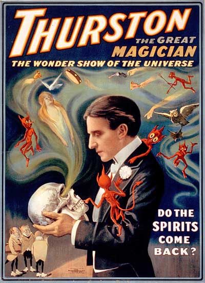
Magic Poster

The average person who looks at a drawing doesn’t see the thought process that goes into creating it. He just sees the image. If you don’t understand the principles that go into organizing a piece of art, the act of drawing appears to be magic. That’s why moronic displays like this continue to amaze non-artists…

Any artist knows what’s going on here. The performer has simply memorized a formula that he’s playing back along with plenty of empty flourishes and simulated drama. No thought process is going on. It’s just spitting out a predetermined image in a way that impresses people who have no clue about how real paintings are created. It’s just a simple magic trick, and it’s only amazing if you don’t know how the trick is done.

Stage magic is an art form, not unlike drawing and painting in some ways. The difference between mediocre magicians and great ones isn’t the cleverness of their “tricks”… it’s the quality of their application of the fundamental techniques of magic. These principles are organized to create a convincing illusion. Here is a wonderful example of that concept in action, by the brilliant magician, Teller…

Teller’s partner, Penn Jilette narrates the fundamental principles of magic that Teller is employing to create a magical illusion of normalcy. The average person viewing these actions on the street might not see anything out of the ordinary; but when we know what’s going on, it becomes amazing. Knowing how the trick works makes the magic more amazing, not less. That’s REAL magic.

The audience is as much responsible for the effectiveness of the illusion as the performer. A skilled magician leads the viewer through a series of actions which set up a certain expectation. When something completely different happens, it seems like magic. But without the expectation, the magic would dissolve into simple random occurrences. In this next clip, Penn & Teller reveal all their secrets and still manage to create a mystifying illusion. We can see how it’s being done with our own eyes, but Penn & Teller’s compelling direction of the action and our own expectations are so strong, we’re still surprised.

It isn’t the trick… it’s the skill with which the fundamental principles are applied to create an illusion. Truly great drawing is like that.
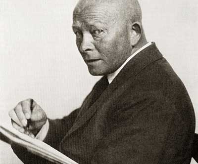
Olaf Gulbransson

I’m going to introduce you to one of the most magical cartoonists who ever lived. Odds are, you’ve never heard of him. His name was Olaf Gulbransson, and he was a cartoonist for the German satirical magazine Simplicissimus between the early years of the 20th century and the second World War. I’ll have more biographical information on him in a later post. But today, I want to get straight to showing you his amazing drawings.

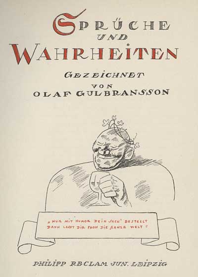
Gulbransson’s sketches are simple line drawings… but they are deceptively simple. The images have been refined down to a few quick lines, but their simplicity and directness masks a depth of thought and planning that is almost superhuman. Here are a few sketches from Gulbransson’s Spruche und Wahrheiten (Sayings and Truisms) from 1939.

Olaf Gulbransson

Olaf Gulbransson

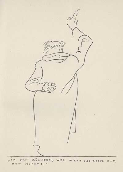
In art, he who is not the best is nothing.

In the cartoon above, notice how a single line defines the right cuff, elbow, arm, shoulderblade and fabric tension. It is very difficult to depict a strong pose from the rear- especially when draped in a long heavy coat. But Gulbransson pulls it off dramatically in a few sweeping lines.

Olaf Gulbransson

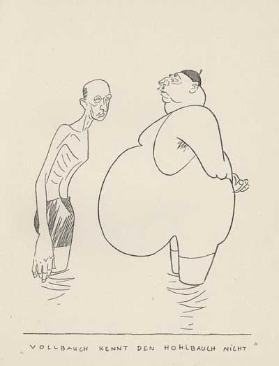
The full belly does not recognize the empty belly.

He is a master of exaggeration and caricature.

Olaf Gulbransson

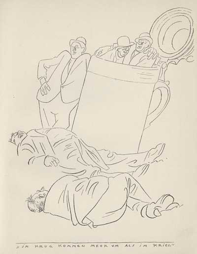
More die in the bottle than the war.

Notice how he depicts the weight of the bodies lying on the ground, along with the pull and drape of the clothing covering them. The characters are grouped into a visual hierarchy, directing the eye from the foreground up to the drunks inside the stein at the top. Even though the shapes are open and plain, the volumetric structure is clearly defined. Some artists would render an image like this out with hatching, shading and lots of detail, but Gulbransson pulls it off with a remarkable economy of line.

Olaf Gulbransson

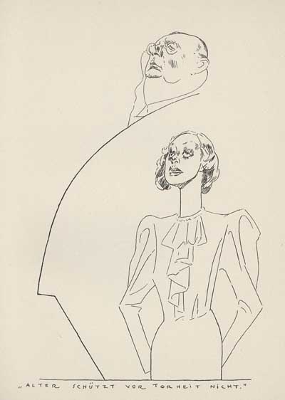
There’s no fool like an old fool.

A single line defines a silhouette, frames a character and leads the eye through the composition. The specific attitude of the characters and the stark contrast between their sizes enhances the irony of the caption.

Olaf Gulbransson

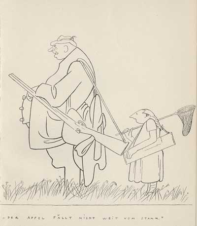
The apple doesn’t fall far from the tree.

Look at all those appealing organic shapes! Again, the contrast in scale puts across the humor in the caption.

Olaf Gulbransson

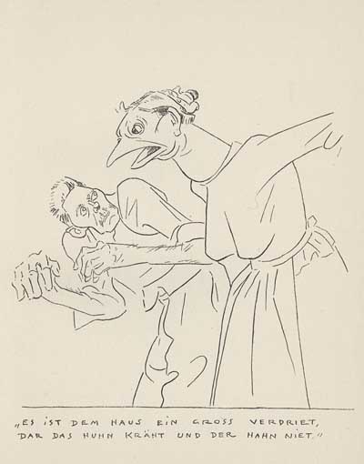
In the home, usually the chicken crows and the rooster clucks.

Complementary lines of action, solid drawing, specific attitudes, strong poses, beautiful negative spaces, clear silhouettes…

Olaf Gulbransson

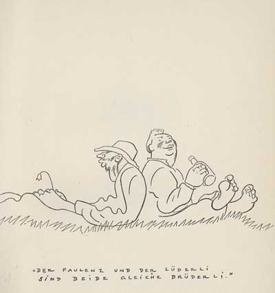
The lazy and the idle are like brothers.

…rhythmic line, texture, personality…

Olaf Gulbransson

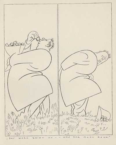
A man is judged by his actions.

…clear staging, line of action, flowing shapes…

Olaf Gulbransson

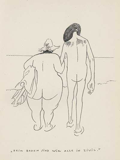
When we bathe, we’re all equal.

…keen observation of real life, contrasts…

Olaf Gulbransson

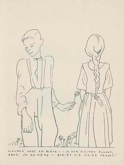
The bloom must fade in time, but in the mind, the fruit never withers.

…and sophisticated interaction defining the relationship between characters. Gulbransson could do it all- sometimes he did it all in a single brilliant drawing like this one!

Olaf Gulbransson

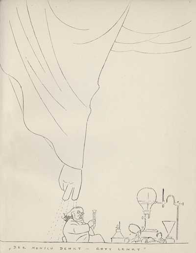
Man thinks. God leads.

His compositions are powerful and unique…

Olaf Gulbransson

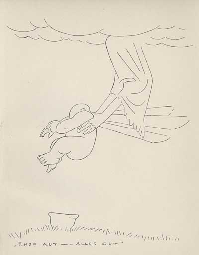
All’s well that ends well.

…and he has a clear point of view. Who else would depict life’s end with an angel lifting a baby off a chamber pot?!

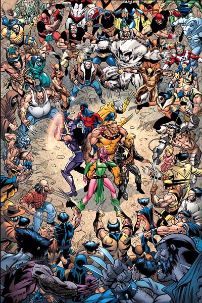
mess of characters

The average person loves detail and complexity. It makes them feel like they’re getting their “money’s worth” from a drawing. But to me, putting everything across with simplicity is even more amazing. The artist can’t hide behind details piled upon details, shading and cross hatching. His idea is presented naked and clear for the world to see. It’s like Penn & Teller doing the cups and balls with transparent cups. Real magic.

Stephen Worth
Director
Animation Resources

TheoryTheory

This posting is part of a series of articles comprising an online exhibit entitled Theory.
Magazine CartoonsMagazine Cartoons

This posting is part of the online Encyclopedia of Cartooning under the subject heading, Magazine Cartoons.

FacebooktwitterredditpinterestlinkedinmailFacebooktwitterredditpinterestlinkedinmailby feather

Friday, March 24th, 2017

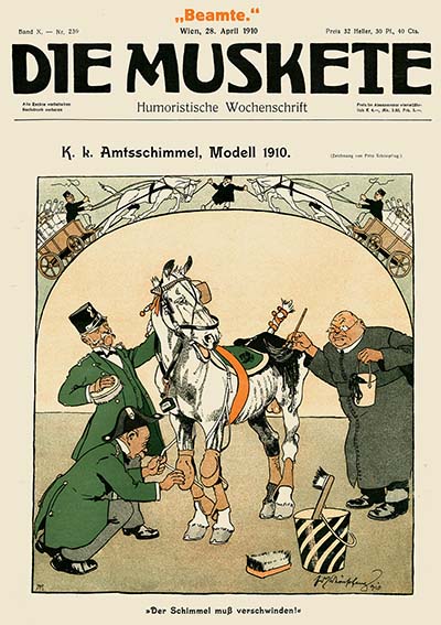
REFPACK015: Download An Amazing E-Book On The German Caricature Journal Die Muskete


REFPACK 015
Download Page
March-April 2017

MEMBERS LOGIN To Download E-Book

JOIN TODAY To Access Members Only Content

Every other month, members of Animation Resources are given access to an exclusive Members Only Reference Pack. These downloadable files are high resolution e-books on a variety of educational subjects and rare cartoons from the collection of Animation Resources in DVD quality. Our current Reference Pack has just been released. If you are a member, click through the link to access the MEMBERS ONLY DOWNLOAD PAGE. If you aren’t a member yet, please JOIN ANIMATION RESOURCES. It’s well worth it.

PDF E-BOOK:
Die Muskete

Die Muskete
Download Page
Volume 10 Nos. 236-252 (April-July 1910)

Die Muskete During the 19th century, society had a totally different relationship with cartoons than we do today. Beginning with artists like James Gillray and George Cruickshank in early decades of the century, cartoons were seen as serious business. They crystalized the image of the rich and powerful in the minds of the masses, and even Kings and religious leaders were forced to take notice of their impact. The pen truly had become “mightier than the sword”.

With the dawn of the 20th century, the lives of people were changing. The modern world was emerging, and with it came pressures brought on by technology, new forms of government, colonialism and war. The gloves were off– cartoonists no longer limited their satire to Kings and religious leaders. They wielded their power to satirize by skewering everyone and everything around them– religion, ethnicity, the rich as well as the poor, and the power that the government held over the public. Cartooning became a powerful tool for changing hearts and minds, as well as disseminating nationalistic propaganda. The conflicts that these new challenges created began building to a head, and it would eventually result in “The Great War”, World War I.

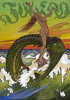
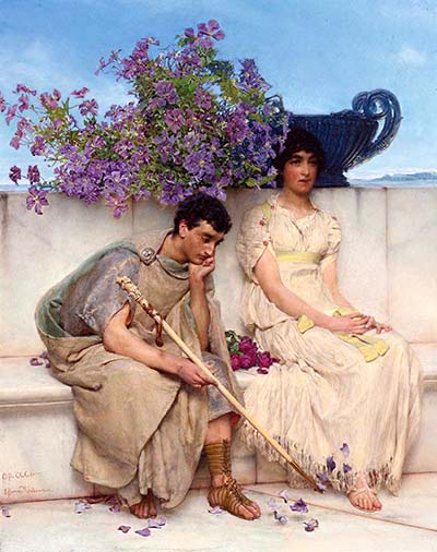
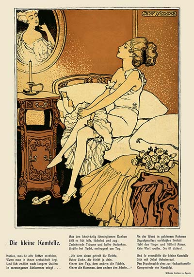
Die Muskete But even though it was a difficult time politically, the world was experiencing a renaissance in the arts. There were two principle styles during this period: Historicism and Art Nouveau. Historicism was an ecclectic style which embraced neo-classical forms and themes. The subject matter consisted of idealized imagery of ancient Greece, mythological and historical tableaux, or exotic locales in faraway lands. The other popular style was Art Nouveau. In Germany, it was known as Jugendstyl (Jugend Style), named after Jugend, one of the most famous arts magazines of the day. Art Nouveau was based on craftsmanship and hand work. It rebelled against the machine-made look that was taking hold in graphics and consumer products in the early industrial age. It did this by putting the hand of the artist at the forefront and incorporating lush organic patterns derived from nature. These two styles were represented in all forms of art, from architecture to interior design, to ceramics, fabrics, fashion, sculpture, illustration… and even cartooning.

Die Muskete
An example of Historicism by Lawrence Alma-Tadema

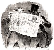
Die Muskete Technology wasn’t altogether as bad a thing for the arts as the Art Nouveau movement believed though. Lithography in the 19th century was beginning to enable the mass production of high quality images, exploiting new printing techniques to produce art magazines and satirical caricature journals. The oldest of these caricature magazines was the French weekly, La Charivari, which began publication in 1832. The title referred to a folk custom where peasants would perform a mocking, off pitch serenade accompanied by a cacophony of banging on pots and pans to shame adulterers, cuckolds, widows who planned to remarry before the proper period of mourning had passed, or to encourage reluctant sweethearts to marry. It was an apt reference, because La Charivari was host to a cacophony of highly critical satirical articles chastising the moral standards of the time, as well as scathing caricatures of famous people.

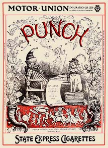
Die Muskete In less than a decade, La Charivari had made so much of an impact that similar publications started springing up all over Europe. In 1841, the British publication, Punch: The London Charivari was established. Before this time, the word “cartoon” had a different meaning– it was only used to describe a preliminary sketch for a painting. But in 1843 there was an exhibit of “cartoons” for proposed murals in the House of Parliament, and Punch suggested that its satirical drawings would make even better murals in the lawmaker’s halls. The term “cartoon” was applied to the humorous drawings in Punch, and the term has stuck ever since.

Over the next few decades, satirical magazines flourished all over the world. La Rire (The Laugh) and L’Assiette au Beurre (Man & Beast) began publication in France in 1894 and 1901 respectively. Italy had several humorous journals in addition to La Charivari, most notably Il Lampioni (The Street Fights). In Germany, Fliegende Blatter (Flying Leaves) was founded in 1845 along similar lines to Punch, and Kladderasdatsch (Scandal) followed two years later. The art of caricature spread as far as Argentina with the magazine Caras y Caretas (Faces & Masks) in 1898.

Meanwhile in America, cartoonist Thomas Nast was exerting great power, lampooning the corruption of the Tammany Hall politicians in the pages of Harper’s Weekly. The “New World” was ready for some “Old World” satire, so in 1871, German immigrant Joseph Keppler founded Puck magazine in the image of Punch. A decade later, some of the key artists at Puck defected from the publication to establish Judge as a conservative alternative to the more liberal Puck. (For more information, see the third volume of our e-book series on Eugene “Zim” Zimmerman’s cartooning course).

Die Muskete

Die Muskete But arguably, the greatest of all of the satirical caricature magazines came from Munich, Germany. While Jugend (Youth) magazine provided a more respectable image based on Art Nouveau, the opposite extreme was represented by Simplicissimus (Simpleton). Simplicissimus was the most audacious and daring magazine of the day, lampooning the stiffness of officers of the military, class divisions, loose social morals and inevitably, powerful political leaders. Its reckless determination to offend destined it for trouble, and it didn’t take long.

In 1898 Kaiser Wilhelm objected to a caricature of himself on the cover of Simplicissimus. He shut down the magazine, forced its publisher to flee to Switzerland, and threw the cartoonist, Theodor Heine in jail. Like a phoenix, Simplicissimus soon sprang up again, but it continued to have legal troubles with the government and religious leaders until the Nazis came to power in the mid-1930s. The Nazis despised everything that the magazine stood for, but they didn’t shut Simplicissimus down. They purged it of the Jewish employees and weeded the ranks of its most radical writers and artists. They succeeded in blunting its impact considerably, a blow from which the magazine never recovered. Simplicissimus ceased publication at the end of World War II, and was re-established for a while in the mid-1950s, but by that time it was pale shadow of its former self.

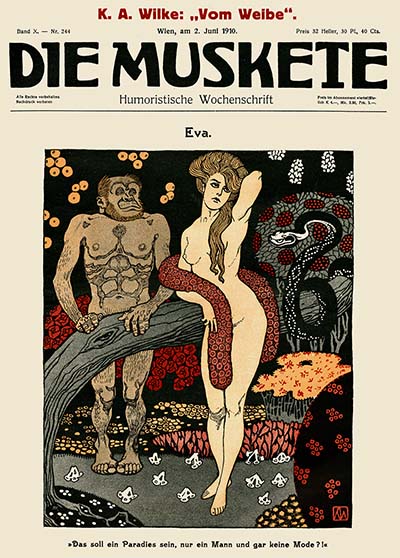
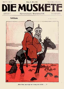
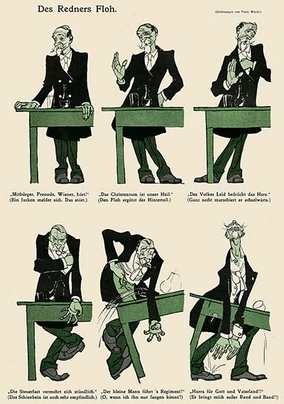
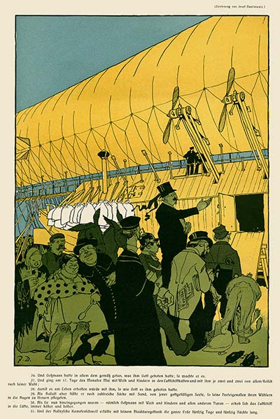
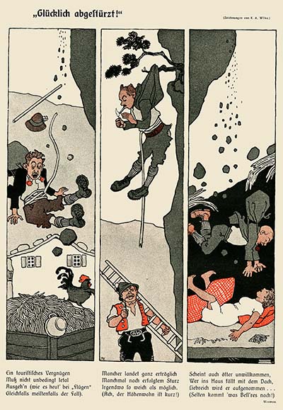
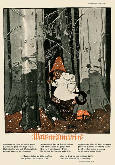
Die Muskete The center of the arts in this region was Vienna, Austria, so it is natural that a great caricature magazine would come from that city– Die Muskete (The Rifle). The principles behind Die Muskete were initially quite different than either Jugend or Simplicissimus. It was a humorous “men’s magazine” aimed at military officers and veterans. It still made fun of bureaucratic excesses, military inefficiency, social mores, the battle of the sexes, and religion, as well as political corruption, while remaining steadfastly loyal to the Emperor of Austria. The staff consisted entirely of local artists like Fritz Schönpflug, Karl Wilke and Franz Wacik. Each one brought something different to the table. Schönpflug specialized in military caricature, gently poking fun at the men who made up a large part of Die Muskete’s subscriber base, Wilke excelled at drawing pretty girls with a nouveau flair. And Wacik specialized in a wide range of fantastic subjects- strange creatures and fairy tale settings. Working along side them were the political cartoonist Josef Danilowatz, fashion artist Heinrich Krenes, and the brilliant caricaturist Carl Josef. These artists were well matched as a team to provide a variety of images and approaches. During World War I the focus of Die Muskete shifted from being a humor magazine to being a magazine for soldiers in the trenches. The tone became more political and the focus shifted to demonizing the enemy. But the level of artistry remained at a high level until many of the original team of artists began to leave the magazine in the mid 1920s.
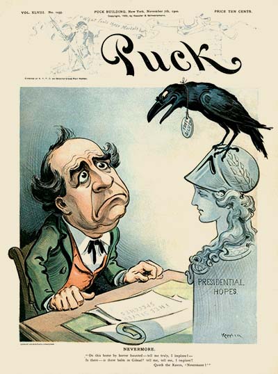
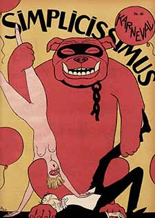
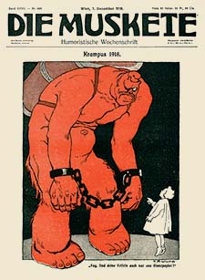
It’s important to remember that in the heyday of caricature journals, the artists didn’t identify strictly as cartoonists. For instance Franz Wacik was a designer for the theater, he painted frescos and murals, and he illustrated children’s books. Most of the cartoonists at Die Muskete were ne artists as well as being cartoonists, and this is typical of of their contemporaries at other caricature journals. There’s a lot to learn from these talented artists. I hope you find this e-book useful.

Die Muskete

This e-book file is set up for printing on 8 1/2 by 11 three hole punch paper, and is optimized for high quality display on tablets and high resolution computer monitors. Thanks to JoJo Baptista for sharing his collection of these rare magazines with us.

REFPACK015: Die Muskete Vol. X
Download Page
Adobe PDF File / 299 Pages / 943 MB Download


MEMBERS LOGIN To Download E-Book

JOIN TODAY To Access Members Only Content


Die MusketeDie MusketeDie MusketeDie Muskete

Die MusketeDie Muskete


MEMBERS LOGIN To Download E-Book

JOIN TODAY To Access Members Only Content


Not A Member Yet? Want A Free Sample?

Check out this SAMPLE REFERENCE PACK! It will give you a taste of what Animation Resources members get to download every other month!

Sample RefPack

FacebooktwitterredditpinterestlinkedinmailFacebooktwitterredditpinterestlinkedinmailby feather

Thursday, November 18th, 2010

Biography: Olaf Gulbransson

This posting is a stub. You can contribute to this entry by providing information through the comments link at the bottom of this post. Please organize your information following the main category headers below….

Birth/Death

Occupation/Title

Bio Summary

Early Life/Family

Education/Training

Career Outline

Comments On Style

Influences

Personality

Anecdotes

Miscellaneous

Filmography

Honors

Related Links

Bibliographic References

Contributors To This Listing

To make additions or corrections to this listing, please click on COMMENTS below…

FacebooktwitterredditpinterestlinkedinmailFacebooktwitterredditpinterestlinkedinmailby feather