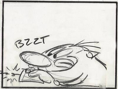
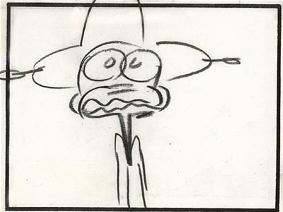
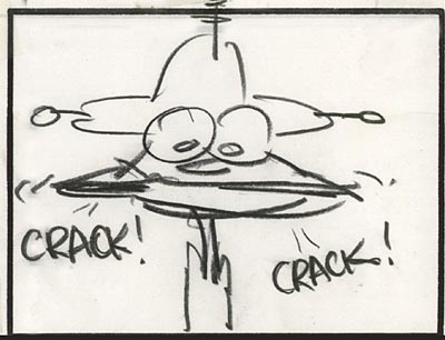
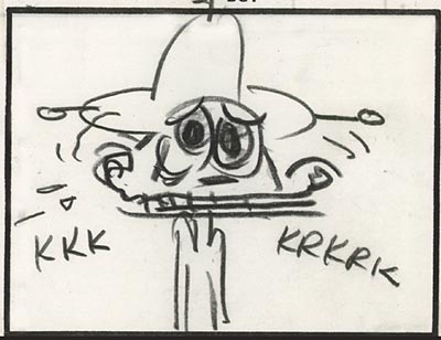
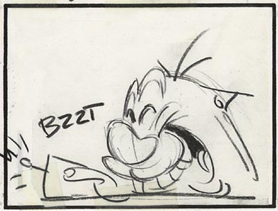
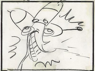
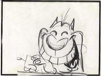
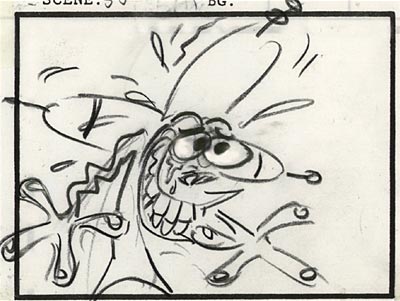
Meet The Stars of the Flintstones
by John Kricfalusi (from The Flintstones laserdisc set)

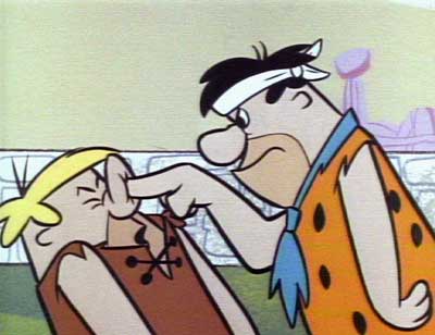
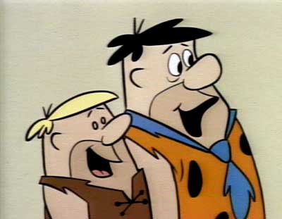
When I grew up, I used to watch "The Flintstones" in syndication every day and I began to notice that the characters would look different in each cartoon. I eventually figured out that they must have been drawn by different animators, each of whom had their own individual traits.

Comic book nerds like me have always been able to tell the difference- say, between a Steve Ditko Spiderman and a Todd McFarlane Spiderman; but in animation, the tendency for most studios is to force all the artists to try to draw the characters the same way. This is called drawing "on model".

Ed Benedict, who designed the Flintstones is really mad that all the animators drew the characters in their own style, or "off model". Luckily for us, Hanna-Barbera didn’t have time to have the animators learn to draw the characters before they started animating!

I love cartoons where you can tell the animators apart. Bob Clampett’s Warner Bros. cartoons are like this. And so are the early Hanna-Barbera cartoons. The tricky part is figuring out what names belong to what drawing and animation styles! "The Flintstones" when it runs in syndication, has a stock set of credits on the end of each episode. They list four animators. And, if the names ever agree with the persons who actually animated a particular episode, it’s sheer coincidence. And get this… In the early days of Hanna-Barbera, one animator would animate a whole 25 minute cartoon by himself!

So, this is what we’ve done for the likes of you- Henry Porch (my sound editor) and I have assembled clips of each animators’ work so you can finally figure out who’s who! I know that each and every one of you is licking your lips in anticipation as one of life’s more succulent mysteries is about to disrobe and reveal its undergarments for you. –John Kricfalusi
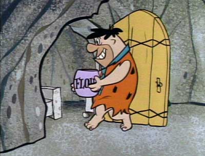
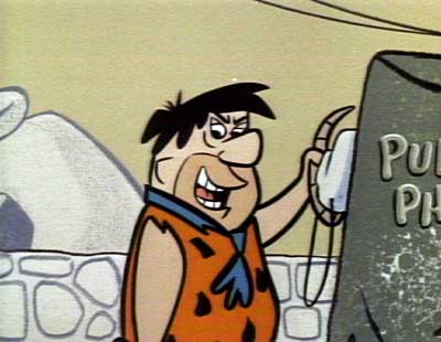
KEN MUSE

Click on the image to see a movie of Ken Muse scenes.
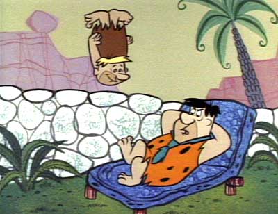
Ken Muse’s style is easy to spot when you see it, but hard to describe in words. That’s why we put the clips together! An obvious trait of his is the way he draws Fred’s eye bags. The line under his eye is parallel to it. Also, he draws upside down smile lines. He generally puts less expressions and poses into his cartoons than the other animators do. He’s sort of the bland one, although some of the coolest drawings ever of the Flintstones are in "The Swimming Pool". Check out Fred driving his car in the beginning of the cartoon. Or Fred lying down and staring out the window. This is before he got used to drawing the characters and began drawing "on model". Muse worked on Tom & Jerry before Hanna and Barbera opened up their own studio.
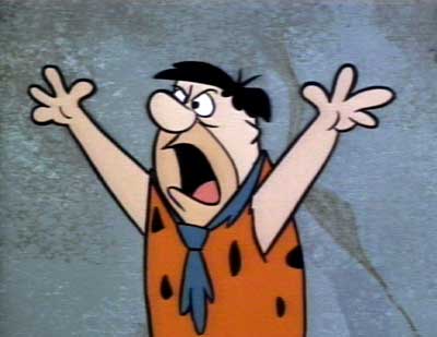
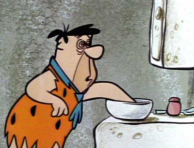
DON PATTERSON

Click on the image to see a movie of Don Patterson scenes.
Don Patterson is a very funny animator. He loves to do wacky walks and runs and goofy eye takes. He never seems to repeat expressions and actions. He custom designs his work to match what’s going on in the story. He draws the characters "off model" when they need to act. He sometimes give the characters "Smurf eyes"- the two eyeball whites joined into one. Patterson came from Walter Lantz’s studio, where he animated Woody Woodpecker and Wally Walrus and all your other favorites.
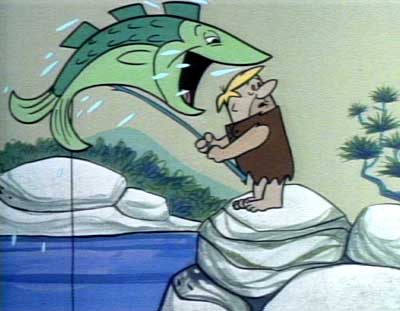
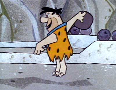
CARLO VINCI

Click on the image to see a movie of Carlo Vinci scenes.
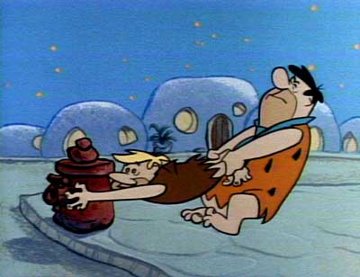
Carlo Vinci is the master of Flintstone. He handles him clean, smooth, without shame. Here’s how to spot him… Carlo loves drawing crooked poses with the characters’ appendages- the head, the hands, the pelvic girdle- all pointing different directions. Keep your eyes peeled for socially unacceptable (in some circles) wrist actions. He likes to flip the wrist around- have the hand up, then flip down, then twist around, fingers wiggling, taking turns sticking up- it’s truly a joy to watch.
He utilizes the butt generously. Remember the old Yogi Bear cartoons? The ones where Yogi bops up and down to bongo beats? That’s Carlo. He’s always thinking of you. In Carlo’s hands, Fred’s butt is a sensative emoting creature. He also draws quite a few meaty expressions on the characters, whereas some other animators are stingy with their expressions.
Carlo came from Terrytoons, where he animated for about 30 years. He did Gandy Goose, Mighty Mouse, Heckle and Jeckle and all your favorite New York cartoons. His specialty was singing and dancing. Hey, get this! Carlo met young Joe Barbera back in the ’30s at Terrytoons and taught him how to animate. Carlo did great stuff for Terrytoons, but I think he was made for Hanna Barbera. His animation style combined with Ed Benedict’s designs created a whole new entertainment experience. Count on Carlo to deliver a quality package to you.
Read more about Carlo Vinci
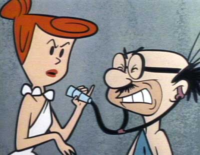
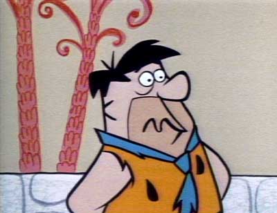
GEORGE NICHOLAS

Click on the image to see a movie of George Nicholas scenes.
George Nicholas draws really well. When I was a kid I’d see his cartoons and say. "There’s the good artist." He’s the one who draws really solid, almost "pretty" designs. He’s also great with the girls. He makes them look cute and sexy. Another Nicholas trait is he likes to have the tongues flop around in his characters’ mouths. Like Carlo Vinci and Don Patterson, he custom designs new expressions and poses to fit the characters’ moods according to how they feel in the context of the story at each particular instant. This is unlike many animators, who strictly draw their expressions off the model sheets. This model sheet approach is what most cartoons use today, which is why everything looks and feels so generic now. The characters always make the same expressions, rather than act according to the situation.
Mark Kausler, the world’s greatest animator, says, "Nicholas has the richest, fullest looking dialogue animation on the early Flintstones shows. Instead of using just a straight up and down ‘head bob’ formula, he varies it by shaking the head ‘yes’ and ‘no’ to the mood of the dialogue accompanied by a shrugging gesture. He also uses a special sarcastic head rotation in perspective for some lines. He uses a unique ‘beady eyed’ expression on his characters, drawing tiny pupils in Fred’s eyes when he’s getting an idea or when he’s hypnotized by something. He draws big, fat fingers on Fred’s hands, especially in pointing gestures, like in the Frog Mouth episode."
Before Hanna-Barbera, George worked for years at Disney, where he animated for Charles “Nick” Nichols’ Pluto unit.
ED LOVE

Click on the image to see a movie of Ed Love scenes.
Ed Love’s most obvious trait is his real cool "upside down curly mouths". Watch when his characters talk. The mouth is also a little bit to the side. His action style is very ‘springy’. Mark Kausler says it’s because he ‘slows out’ of everything. That’s hi-falutin’ animator talk. He has a way of making limited TV animation look like full animation by the way he does his timing. It’s very smooth.
Before Hanna-Barbera, Ed had a quite varied career. His first animation job was on Disney’s first color cartoon- "Flowers and Trees". He animated Mickey getting stomped on by brooms in "Sorcerer’s Apprentice". He animated for Tex Avery in the early 40s on "Screwball Squirrel", "Red Hot Riding Hood" and other classic cartoons. From the mid to late ’40s, he worked for Walter Lantz. He animated a Woody Woodpecker cartoon, "Drooler’s Delight" completely by himself.
In the early 50s, he did commercials for Ray Patin. A really cool one was for General Mills’ Corn Kix. Ed animated the Kix Man, who is made of corn balls. He animated the Trix kids before there was a Trix Rabbit. He animated some of Hanna-Barbera’s best commercials from the late 50s and early 60s- the Kelloggs’ cereal commercials starring Huck, Yogi, Quick Draw and all your other wonderful cartoon pals.

Recently, John Kricfalusi has been elaborating on these musings at his blog, All Kinds of Stuff. Check out these posts…
Pluto Animator Animates The Flintstones- George Nicholas
>The Flintstone Flyer- Carlo Vinci Part One
The Flintstone Flyer- Carlo Vinci
I Want You To Love Carlo Vinci
Carlo Vinci Dancing
Ed Benedict 1912-2006

Stephen Worth
Director
Animation Resources


 by
by 
