Archive for the ‘storyboard’ Category

Tuesday, November 12th, 2024

Story: Louise Zingarelli’s Cool World Storyboards

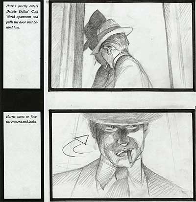
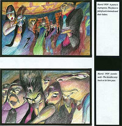
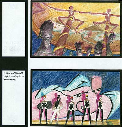
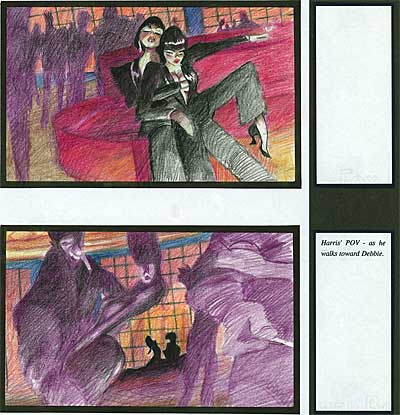
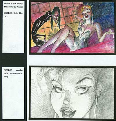
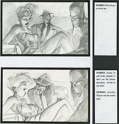
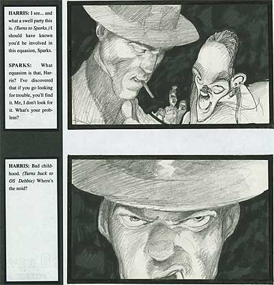
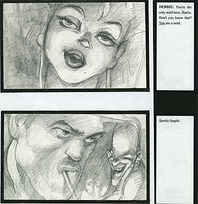
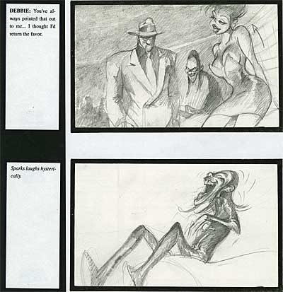
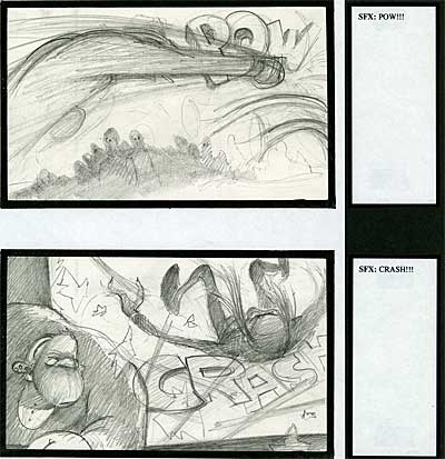
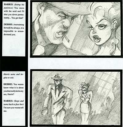
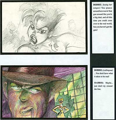
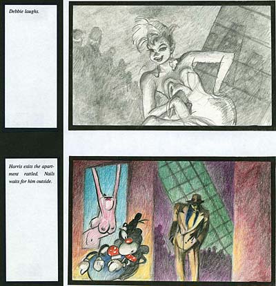
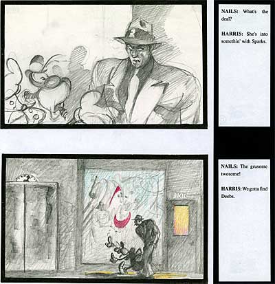
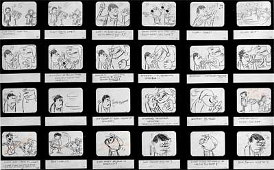
Louise ZingarelliLouise ZingarelliToday, we digitized a section of storyboard from one of the biggest disappointments in recent times, Ralph Bakshi’s Cool World. This film could be the poster child for devastating executive interference. Paramount bought a hard-R, gritty, sexy, noir horror/thriller from Bakshi and proceeded to revise it into a low-rent Roger Rabbit aimed at teenagers. By the time the film was completed, it bore little resemblence to Bakshi’s original concept. But I’m not going to talk about that sorry story today… Instead, I’m going to tell you about an artist who worked on Cool World who you might not know about, but should… Louise Zingarelli. Louise was a very good friend of mine, and I’d like to share my personal take on her along with this section of storyboard that vividly illustrates her amazing talents.

Louise Zingarelli
Louise Zingarelli

Louise Zingarelli was the toughest individual I’ve ever met… and one of the sweetest. If she loved you, man! she REALLY loved you. If she hated you, Boy! you better watch out.

"Hate" isn’t a strong enough word for what Louise felt if she didn’t like someone. She had a special word for it… SKIEVE. To skieve something was to hate it to the point of physical revulsion. Louise skieved REAL GOOD. She skieved lots of things… parking tickets, Canadian animators, dentist appointments, Jesse Jackson and even Charles Soloman.

Louise Zingarelli
Louise Zingarelli

Charles made the mistake of criticizing Louise’s scenes in The Chipmunk Adventure in the L.A. Times. He wrote that they were "heavily dependent on the crutch of rotoscoping". When she read that, Louise flew into a rage. She hollered, "There wasn’t a single frame of roto in the whole goddamn picture! I didn’t use a CRUTCH! I used my HEAD, which is more than I can say for Charles friggin’ Soloman!" Louise brewed and fumed about that article for years, and finally got her chance for revenge at Grim Natwick’s 100th birthday party. When Charles got up to speak, Louise made a noise like a leaky radiator. The Canadian animators on the other side of the room picked it up, and pretty soon she had the whole place going. Charles never knew what hit him.

Louise Zingarelli
Louise Zingarelli

Louise always reminded me of the tomboy girl in Our Gang- the one who was small, but when her big brother got picked on by the neighborhood bullies, she would roll up her sleeves and wipe the floor with them. Louise was short, but if she was coming at you with THAT look in her eye, you’d swear she was ten feet tall.

Louise Zingarelli
Louise Zingarelli

Louise hated a lot of things, but she saved special hatred for "The Business"… those words would come out of her mouth dripping in vitriol. "THE BIZZZZZZNESSSSS!" You would need a rug doctor after she said it to clean up all the slime. If Louise knew I was writing about her here in a blog read by people in "the business", she would kick my ass all the way to hell and back.

Louise Zingarelli
Louise Zingarelli

Now I don’t want to make Louise sound like an unpleasant person. On the contrary, she was one of the most thoughtful and considerate people I ever met. I spent many evenings at her house, sharing in her gracious hospitality. She made the most amazing chicken in her Weber grill, and she taught me the value of keeing a bottle of good Russian vodka in the freezer, "just in case". If Louise loved you, you never had the chance to doubt or forget it. She loved just as passionately as she hated.

Louise Zingarelli
Louise Zingarelli

Louise was a great artist. She could paint with Prismacolors like nobody else. She would build up layers of colors that glowed on the paper. Her characters had an indefinable sense of "ugly-cute"… never cloying, always real. Some animators complained, saying her character designs were unanimatable, but by the time they ended up on the screen, her unusual shapes and true to life personality gave them extra life.

Louise Zingarelli

Louise was the fastest artist I ever met. On Cool World, she single handedly laid out all the girl scenes, keying out the poses until they almost animated. Her average footage on layout was over seventy feet a week.

At Bagdasarian, we shared an office. I think I was the only person who ever survived sharing an office with Louise. One day, I gave her an incidental character to design. She sat around sipping her coffee and smoking casually. I finally asked her if she was going to get around to doing the drawing, because the deadline was looming. She said, "Here’s a good bet. Get your watch out. I’ll design this character in one minute. You take the sketch to Ross for approval. I betcha two bits he not only approves it, he says he LOVES it." "You’re on!" I said.

So looking at my watch, I called out, "Ready… set… GO!" Louise just sat there smiling at me. I said, "Time has started." She nodded and set her cigarette down… smoothed out her paper… "Twenty seconds." I called out. She sat down and set in to work on the drawing. Her pencil flew over the paper- beautiful sweeping lines, completely original shapes. She finished the character with time to spare and tore it off her pad. I took the sketch next door to Ross’ office. He was on the phone, so I left it on the corner of his desk and went back to Louise. She was smiling like a Cheshire Cat. A couple of minutes later, we heard from the other side of the wall, "FAAAABUUULOOUSS!" Louise casually raised an eyebrow and quietly said, "Pay up."

Louise Zingarelli

After Cool World wrapped, Louise moved back to her hometown of Chicago. I heard from her a couple of times, but we lost touch. I later found out that she had moved back to Laguna Niguel and was undergoing kemotherapy for cancer. She fought it as bravely as all of her other battles, and for a short time it seemed like she had licked it. But it came back hard. She was very ill at the end. For weeks she lay in a coma. She was so private about her battle, her best friends didn’t know she was gone for a month afterwards. She chose to spend her last days quietly with her cats painting at the ocean.

I owe Louise big time. She championed me when I was just starting out in animation, and she never wavered in her faith in me. She was a great friend and I miss her a lot.

Stephen Worth
Director
Animation Resources

Animated CartoonsAnimated Cartoons

This posting is part of the online Encyclopedia of Cartooning under the subject heading, Animation.

THIS IS JUST THE TIP OF THE ICEBERG!

Animation Resources has been sharing treasures from the Animation Archive with its members for over a decade. Every other month, our members get access to a downloadable Reference Pack, full of information, inspiration and animation. The RefPacks consist of e-books jam packed with high resolution scans of great art, still framable animated films from around the world, documentaries, podcasts, seminars and MORE! The best part is that all of this material has been selected and curated by our Board of professionals to aid you in your self study. Our goal is to help you be a greater artist. Why wouldn’t you want to be a member of a group like that?

Membership comes in three levels. General Members get access to a bi-monthly Reference Pack as well as a Bonus RefPack from past offerings in the in-between months. We offer a discounted Student Membership for full time students and educators. And if you want to try out being a member, there is a Quarterly Membership that runs for three months.


JOIN TODAY!
https://animationresources.org/membership/levels/

FREE SAMPLES!

Not Convinced Yet? Check out this SAMPLE REFERENCE PACK! It will give you a taste of what Animation Resources members get to download every other month! That’s 560 pages of great high resolution images and nearly an hour of rare animation available to everyone to download for FREE! https://animationresources.org/join-us-sample-reference-pack/

Sample RefPack

PayPalAnimationAnimation Resources depends on your contributions to support its projects. Even if you can’t afford to join our group right now, please click the button below to donate whatever you can afford using PayPal.


FacebooktwitterredditpinterestlinkedinmailFacebooktwitterredditpinterestlinkedinmailby feather

Tuesday, December 12th, 2023

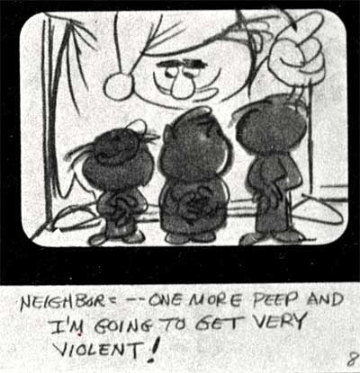
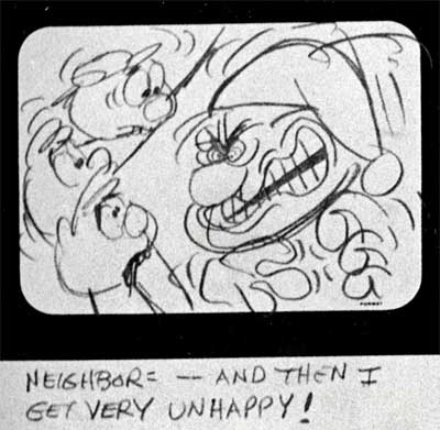
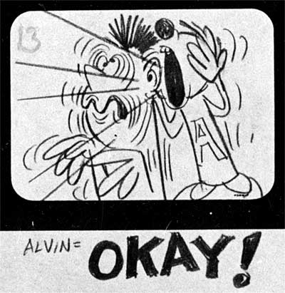
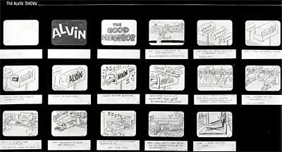
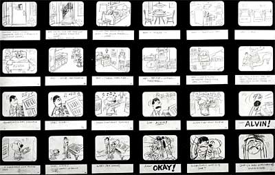
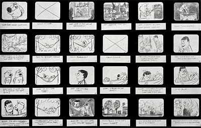
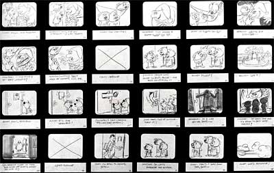
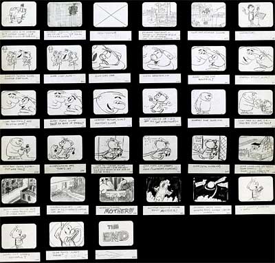
Story: Alvin Show Pilot Board

Alvin Show Pilot Board

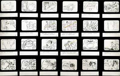
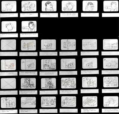
This is a very special post. Here is the complete storyboard to the pilot cartoon for The Alvin Show (1961). This is the board that Format Films and Ross Bagdasarian Sr. (aka: David Seville) used to pitch the show to the networks. It was probably done by Disney/UPA storyman, Leo Salkin. Salkin was the Associate Producer on the series and handled a lot of the story duties, working side by side with Bagdasarian to develop both the Chipmunk and Clyde Crashcup cartoons.
Alvin Show Pilot Board

I know that this might look like a checkerboard on your screen at this resolution. I made an extra effort to make the large size images big enough for you to read clearly, so please click on the pages and take the time to sit down and read this from beginning to end. I think you’ll be amazed at how well it plays in your head. It’s like you’re watching the cartoon.

Alvin Show Pilot Board

The drawings are simple, yet funny and expressive. Note how the compositions frame the action clearly, without clutter. Many current TV shows repeat the same oblique two-shot setups over and over. But this board keeps things interesting through clever staging and cutting.This is truly a model for television storyboard artists to follow. Enjoy!

Alvin Show Pilot Board

Stephen Worth
Director
Animation Resources

Animated CartoonsAnimated Cartoons

This posting is part of the online Encyclopedia of Cartooning under the subject heading, Animation.

FacebooktwitterredditpinterestlinkedinmailFacebooktwitterredditpinterestlinkedinmailby feather

Thursday, September 14th, 2023

Story: Writing Cartoons Part Four- The Rough Board

Cartoon Story The Rough Board

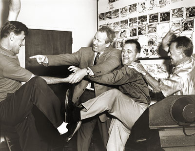
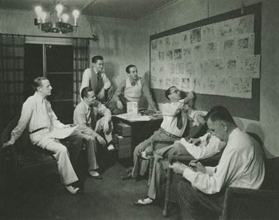
Woolie Reitherman, Bill Peet, Ken Andersen and
Ham Luske tussle during a story meeting for
"101 Dalmatians" (via Michael Sporn’s Splog.)

When we left off last time in our series on cartoon writing, the gag sessions had led to the establishment of an overall structure and continuity. The random threads of ideas had meshed into the framework of a story with a beginning, middle and end. Today, we are going to look at how that bare skeleton outline was fleshed out for the first time in rough storyboard form. But first, a little bit about the relationship between the story men and the rest of the animation staff…

In the photo above, you see story man Bill Peet rough-housing with designer Ken Anderson and directors Woolie Reitherman and Ham Luske. Unlike today, when a cartoon scriptwriter rarely if ever ventures into the artists’ domain, golden age cartoon writers interfaced with a large chunk of the animation staff on a daily basis. As we discussed in the first couple of articles in this series, animators were on hand at all story meetings to suggest sequences of action that would lend themselves to funny animation. But at Disney, the influence of the animation staff on the story went even further than that…

INSPIRATIONAL ART

Cartoon Story The Rough Board

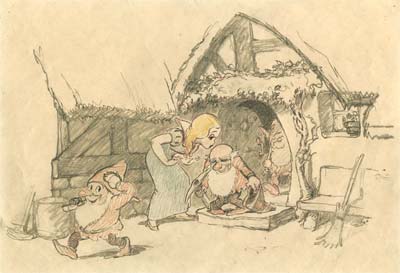
Disney employed a special crew of artists whose sole duty was to visualize the ideas being tossed out for consideration during the story meetings. They established the key setups in the film. The drawing above is a very early inspiration sketch from Snow White and the Seven Dwarfs. It was drawn by one of Disney’s greatest concept artists, Albert Hurter. At the time this sketch was created, the character designs hadn’t yet been finalized, however Hurter was called upon to determine the best way to stage the scene. If you compare this sketch to the scene as it appears in the film, you’ll see how closely Hurter’s background details were followed by the layout department.

Hurter’s drawings acted as “setups” for many of the scenes in Snow White. They established the space the characters inhabited clearly, so the storyboard artists didn’t create the space randomly one scene at a time. For example, compare the Dwarfs’ cottage or Roger and Anita’s living room in 101 Dalmatians to the house in Tom & Jerry cartoons. The individual shots in the Disney cartoons all fit within a specific space, while in many of the Tom & Jerry cartoons, the house is just a random assemblage of baseboards, potted plants and pictures hanging on the walls. Nailing down the setups before the storyboard is done helps the artist envision the space from different angles.

Cartoon Story The Rough Board

Concept artists would also experiment with the overall design approach. In the "Dance of the Hours" sequence from Fantasia, it was decided to contrast different design motifs for each of the various times of day… the morning section consisted of static horizontal and vertical lines, the afternoon was made up of ellipses, the evening was represented by S curves, and in the example above by James Bodrero from the night sequence, zig zags predominated.

Cartoon Story The Rough Board

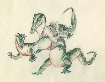
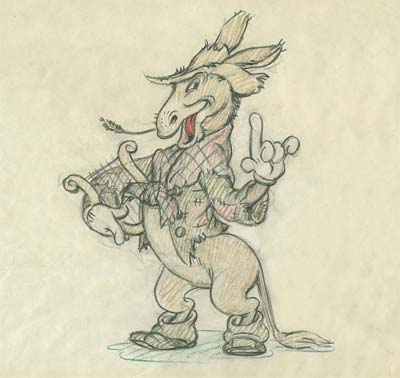
As the story progressed, the cast of characters would come into focus. Artists would be assigned to establish and refine the way each of the characters looked. This example is a design by Grim Natwick for an unmade Silly Symphony based on the Aesop’s Fable, "The Three Musicians of Bremen". Joe Grant was charged with the task of creating a character design department at Disney. His crew would establish the design of the characters and provide the artists with model sheets of the characters in various attitudes and from various angles.

All of the designs from the conceptual artists would filter back to the story department, where they were pinned up on the boards and incorporated into the story sketches as the project progressed. I’ll have more on that in the next article in this series.

THE ROUGH STORYBOARD

The technique of drawing out stories in sketches goes back to the earliest days of animation. It probably evolved out of newspaper comics. Here we have a thumbnail storyboard from around 1927 by Grim Natwick from Bill Nolan’s Krazy Kat studio. Unlike most storyboards, this one reads top to bottom instead of left to right.

Cartoon Story The Rough BoardCartoon Story The Rough Board

The basic story of this board is as follows…

Krazy Kat is spending a quiet evening at home with his wife, who is listening to the radio. Krazy sneaks away to call his girlfriend and crawls into the phone and through the wires to meet her at the "Flaming Youth" nightclub. They dance to the music of the hot jazz band, and as the tempo speeds up, the whole room joins in a wild dancing frenzy. Krazy begins swinging his girlfriend around the dance floor. It is revealed that the music is being broadcast on the radio and Krazy’s wife is listening in. The station announcer mentions that Krazy Kat is on the dance floor, and the wife stomps down to the nightclub to confront him. Just as the song reaches its climax, the wife enters and bops Krazy over the head with a bass fiddle.

Grim told me that the earliest form of storyboard he ever saw was at Hearst’s International Film Service studio. The director, Gregory LaCava would doodle out the story in rough thumbnail form straight ahead as a comic strip. Then he would mark the scene cuts, assign an approximate length to each scene, and take a pair of scissors and cut the panels up into sequences to hand out to the animators. This technique probably had its origins even earlier at the Raoul Barre studio, where LaCava trained to animate. The interesting thing about the Krazy Kat storyboard pictured above is that by 1927, the technique was well enough established that stock storyboard paper was printed up with the boxes ready to be filled in.

Writing Cartoons

In the early 30s at Disney, the technique was perfected by Webb Smith, who suggested drawing the panels on individual sheets of paper and pinning them up on cork boards. This made it simple to insert or delete panels, and allowed the storyboard artist to see the visual flow of an entire sequence at once.

At Disney, the boards evolved as the sequences developed, but at Warner Bros, there were two iterations of storyboards for each cartoon- the first draft thumbnail board and the final director’s board. The thumbnail board was the storyboard artist’s first pass at the story. He was free to work out the basic gags, staging and cutting, without having to deal with drawing the poses “on model” or putting a lot of detail into the backgrounds. At this stage, dialogue was just a general suggestion- it wasn’t locked down until the director had input on the board. That way the dialogue would be a natural outgrowth of the action, instead of the action being driven by the dialogue.

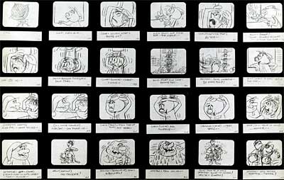
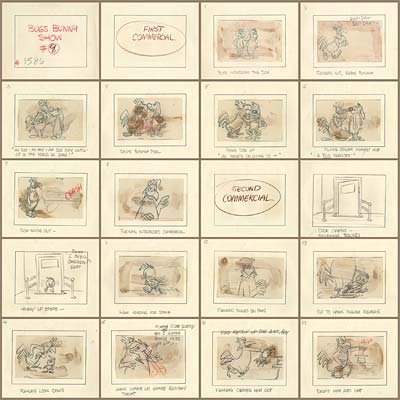
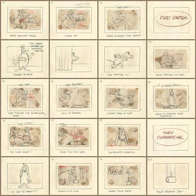
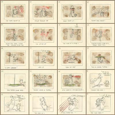
Here is an example of a thumbnail board by John Dunn from the Bugs Bunny Show (1960)…

Cartoon Story The Rough Board

There are a couple of interesting things we can deduce from this board. It appears that the panels with the glue stains were boarded first. They probably represent Dunn’s first thoughts on gags for the story. He then went back and expanded the introductions to the sequences and the transitions in and out of the commercials. Dialogue for some sections is indicated by placeholders. (ie: "Foghorn introduces commercial.", "Foghorn cons hawk.") These lines would be written once the action of the cartoon was all approved. At this stage, only the dialogue needed to sell the gag was necessary, and even that could change as the board developed. The end of this board is quite choppy. It’s likely that more development was done on the final gags before the board was ready to go into production. At this early stage, the scene numbering for production tracking had not yet been established. Scene cuts might still be moved or eliminated as the board evolved. So the numbering on the panels is simply a page number to keep the drawings in order.

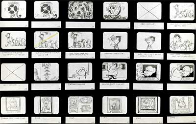
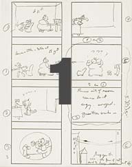
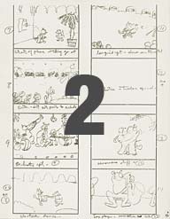
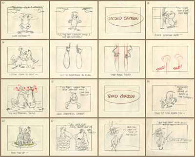
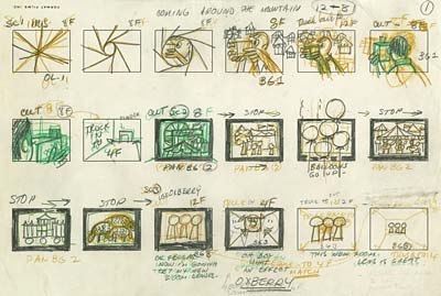
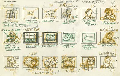
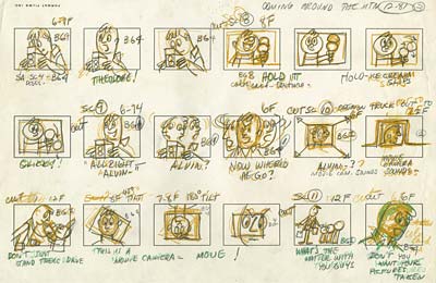
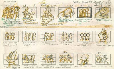
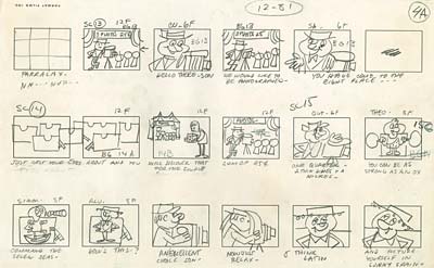
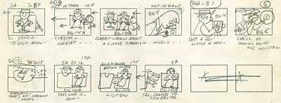
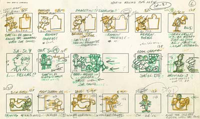
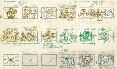
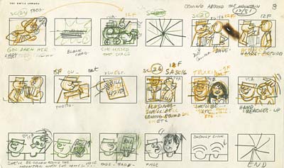
Here is an example of a thumbnail board from Format Films’ The Alvin Show…

Bob Kurtz was a story man at Format, and he tells me that this board was most likely drawn by one of the directors as a quick reference to help him organize the scenes. Notice how he juggles different sorts of shots to create a visual rhythm. The animation on this show was extremely limited, so contrasts in design were needed to make up for it…

Cartoon Story The Rough Board

It appears that page five required some revision, but the pre-printed paper made it difficult to juggle the order and number of panels. The artist was forced to completely redraw every panel on the page, wasting time and losing some of the spark of life in his thumbnails in the process. Also note the pasteover at the bottom of page seven and the numerous erasures throughout the board.

Cartoon Story The Rough Board

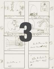
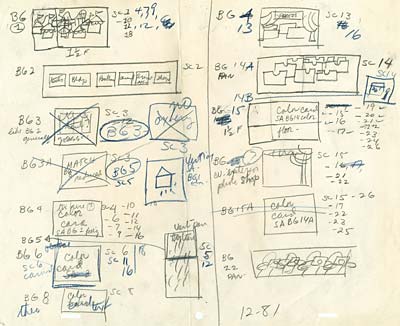
This particular board has an interesting last page. The Director planned out the shots very carefully to allow background paintings to be reused in multiple shots. This saved money and allowed the background painters more time to paint the establishing shots. Very clever!

Sometime in the early 1960s, the technique of storyboarding took a huge step backwards. Instead of using Webb Smith’s more flexible cork board and push pin system, story artists went back to drawing out the action on stock printed paper with three to six boxes printed on it. This made it difficult to insert or delete panels. Why did they abandon a system that worked well for one that didn’t?

The next article in this series will deal with the pitch…

Stephen Worth
Director
Animation Resources

INSTRUCTIONINSTRUCTION

This posting is part of an online series of articles dealing with Instruction.

FacebooktwitterredditpinterestlinkedinmailFacebooktwitterredditpinterestlinkedinmailby feather