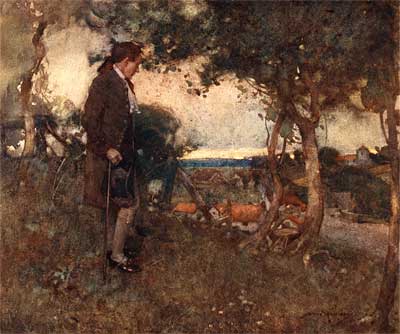
You probably have never heard of William Lee Hankey, but he was a pioneer in the field of illustrated books at the turn of the century. Hankey was one of the first illustrators to paint to suit the newly invented four color offset printing process. He would paint loose and wet, and would press fabrics into the washes to create textures. This book, "The Deserted Village" was one of the first big successes using these techniques. It led to a boom in illustrated books during the teens and twenties, which we have documented in our posts on Arthur Rackham, Edmund Dulac and Gustaf Tenggren. (See the link to the Illustration Exhibit at the bottom of this post for examples of their work.) Hankey was an expert in printing technology. But that wasn’t all. He was first and foremost, an artist.
As I was scanning this book, something came up that I need to address. I hope you’ll bear with me as I take a little time out to rattle your cage and remind you of something very important.
LISTEN UP!
![]() The other day, I happened across a thread in an internet forum for CGI animators. The thread was titled, "Why aren’t animators artists?" The title made me do a double take. I was surprised to find people debating a question that to me seems patently ridiculous. I take it for granted that people realize that animation is an artform with close ties to the traditional arts of drawing, painting and sculpture. It’s always a shock to find that there are people working in the field who don’t see the link.
The other day, I happened across a thread in an internet forum for CGI animators. The thread was titled, "Why aren’t animators artists?" The title made me do a double take. I was surprised to find people debating a question that to me seems patently ridiculous. I take it for granted that people realize that animation is an artform with close ties to the traditional arts of drawing, painting and sculpture. It’s always a shock to find that there are people working in the field who don’t see the link.
I started to wonder whether the readers of this blog understand the intent behind the material that we post here. We’re not just presenting "pretty pictures" to inspire in some sort of vague manner. We intend for this material to be used and applied to everyday work. We don’t get a lot of feedback from this website. Other animation blogs get hundreds of comments on each post, but we rarely get any comments at all. I don’t know why that is. But I certainly hope it isn’t because people are taking a passive attitude to the resources all of us at Animation Resources are working so hard to provide.
Normally, I let the artwork create its own context, but today, I specifically want to address CGI animators to remind them that this site is NOT strictly for 2D animators. CGI animators can learn as much from this stuff as the guys with the pencils. I’m going to pick a few examples and show you what I mean. It’s time to start thinking like an artist!
WHAT CAN AN ILLUSTRATED BOOK THAT IS OVER A CENTURY OLD TEACH SOMEONE WORKING IN COMPUTER ANIMATION?

In 1909, this book was a technological marvel. It used brand new printing processes to bring color and life to the text blocks that had dominated book design for centuries. It can show us how to do the same today using modern storytelling technology if we look closely. For instance…
AVOID EXCESSIVE DETAIL
Too often, artists and animators mistake detail for quality. Rendering out every leaf on every tree, every pore on every inch of skin, every single blade of grass or shock of fur may be an entertaining exercise for retentive types, but all that detail is nothing more than gilding the lilly- distracting from the main point of the design.
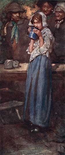
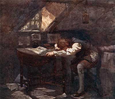
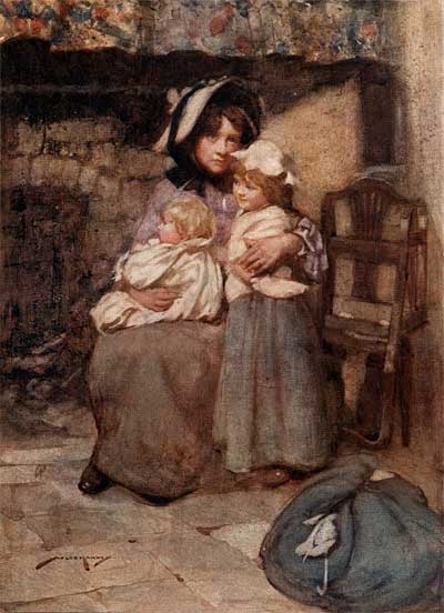
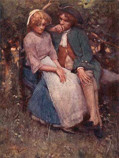
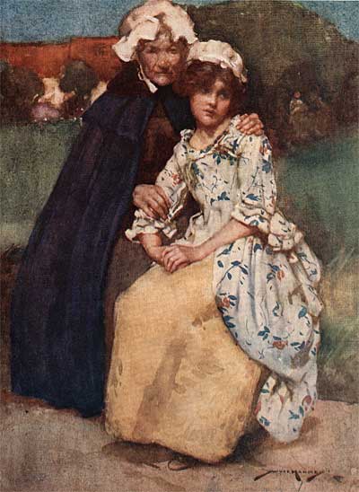
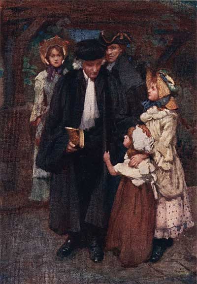
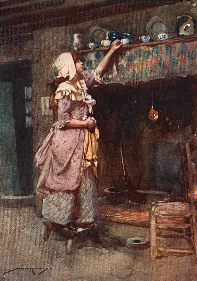
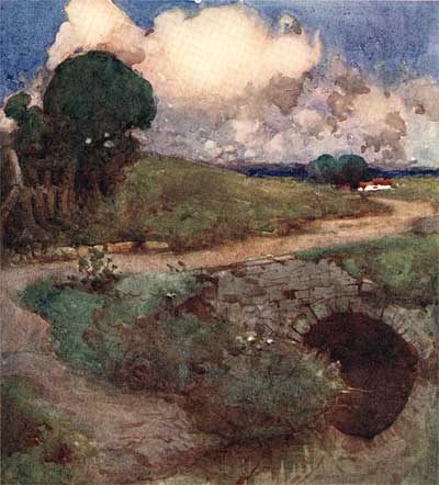
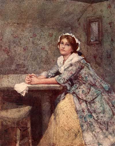
Notice how Hankey focuses your attention on the important parts of the composition by rendering those out, while leaving unimportant background information very loose. The choice of colors clearly defines light and shadow, and the carefully balanced values hold the background together as a frame for the subject of the image. Click on these to see them larger and you’ll be surprised to see just how loose the rendering is on the girl’s dress and the background foliage.

COMPOSE SHOTS ON A HUMAN SCALE
Too many CGI features are set in environments that are completely out of scale to the characters. Rooms are the size of convention halls and gardens are as big as football fields. Everything is wide open, with very little variety to the depth or contrasting perspectives of the structures. Camera angles on wide shots are staged from 20 feet in the air, much higher than a real human perspective. This makes everything look like model railroad sets instead of like real environments.
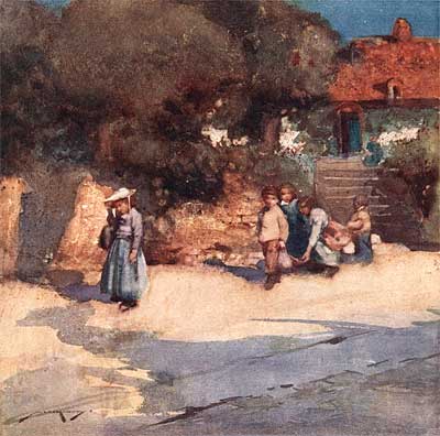
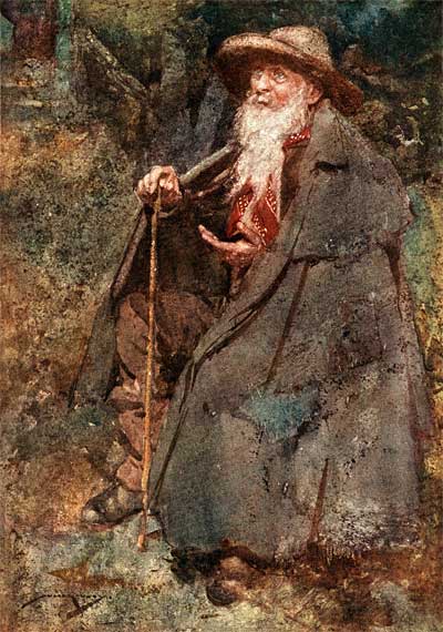
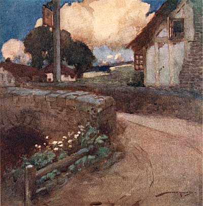
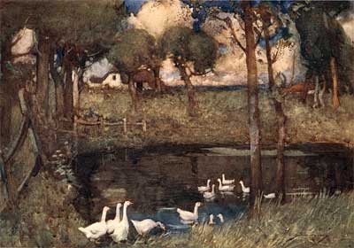
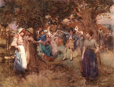
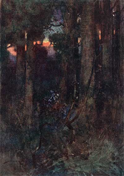
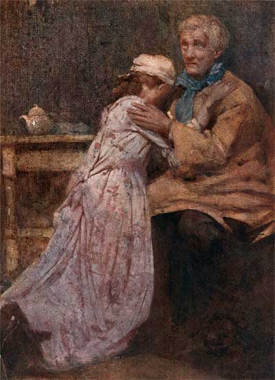
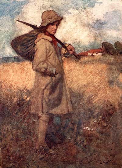
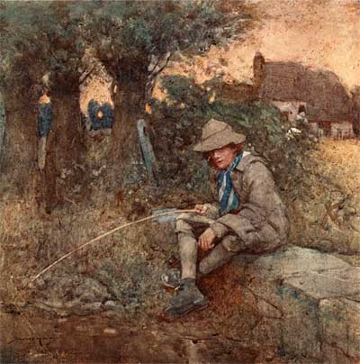
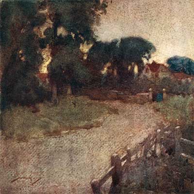
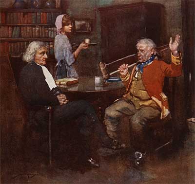
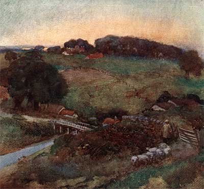
The way to lay out a background is through skillful composition and a range of different sizes of forms. Look at how Hankey creates a zig-zag perspective on the first image, layers of contrasting shapes and textures on the second, and divides the last example to frame three separate simultaneous actions beautifully.
COMPOSE GROUPS OF PEOPLE CAREFULLY
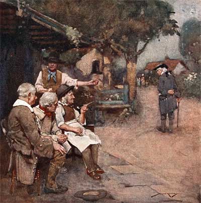
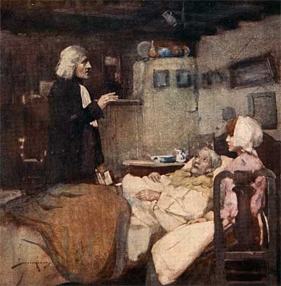
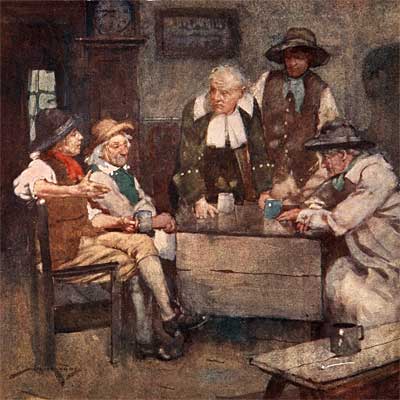
Check out these amazingly expressive tableaux by Hankey. Each one defines the personality and situation of each individual character in relation to all the other characters, while directing the eye cleverly through the image from one main focal point to the next. Notice how the characters are grouped to reflect their relationships to each other.
Just try to find a grouping like this in current animation! Characters are almost always staged obliquely, lined up like a chorus line or in perfect half circles in front of the camera- sitcom style. If you search through the films of great directors like Chaplin, Hitchcock or Welles, you’ll never find flat setups. The dynamics of group relationships are never revealed in what the characters say- it’s always in how they are arranged visually.
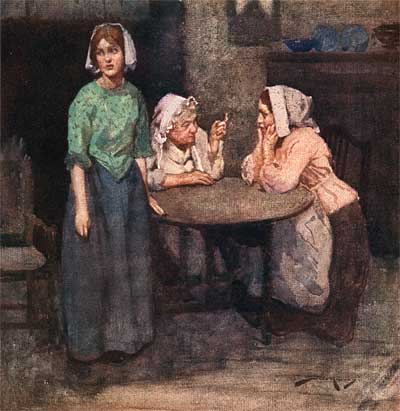
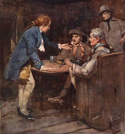
CREATE MOOD THROUGH UNIQUE COMBINATIONS OF COLORS
John Kricfalusi recently discussed how important unique color harmonies are to animation in his blog, All Kinds Of Stuff. He makes the point that colors "straight out of the tube"- lime green, purple, orange, etc.- are not nearly effective as hues with non-mathematical mixes of colors… colors that don’t have names.
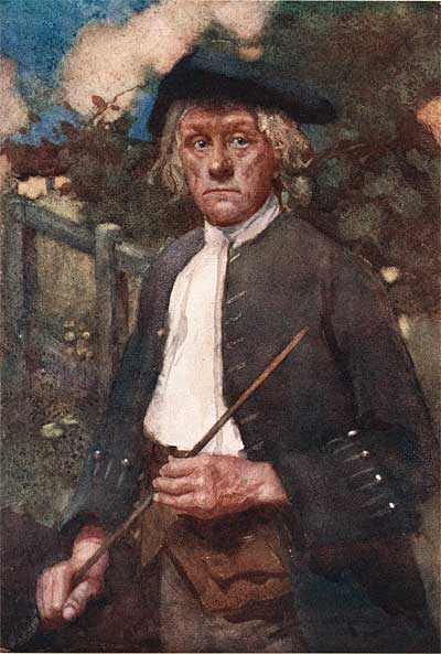
For instance, what color would you call the street in this first example? Pure colors are best used in small areas to create interest and direct the eye, like with the sea green door on the house in the second one. Sometimes the best color harmonies involve muted colors to create a mood, as in the third example here. The colors tell you exactly what is going on in the scene. In fact, each of the three characters is surrounded by an unique set of colors that reflects his or her attitude.
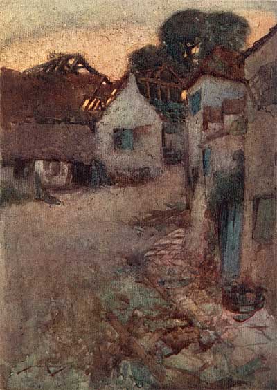
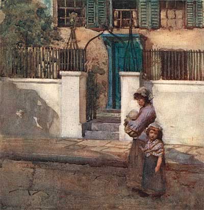
USE THE CHANGING LIGHTING OF THE TIME OF DAY FOR EMOTIONAL IMPACT
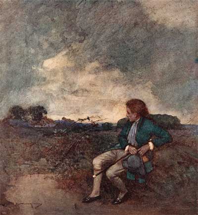
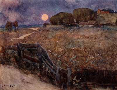
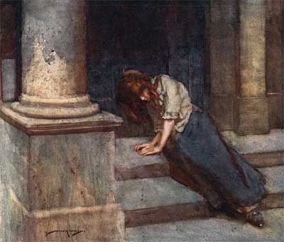
Life doesn’t always happen at high noon on a Summer day. Neither should the action of an animated film. Disney knew this. Check out "Lady and the Tramp". The dramatic scenes with the rat approaching the baby’s crib are heightened by the deep shadows of night. The "Bella Note" sequence depicts an entirely different kind of night. The climactic action at the end takes place on a stormy night. Think about how the changing light of the times of day can add impact to your scenes, just like the light depicted in these illustrations by Hankey.
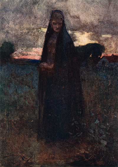
CREATE CHARACTERS BY OBSERVING LIFE
The most obvious power of animation to entertain is its ability to caricature life, yet amazingly, observation is exactly what is lacking in character design in current CGI movies. Every day, a million great personalities are all around you who have never been seen in animation- just go to your local coffee shop or shopping mall with your sketchbook. You won’t be able to get all the great characters down on paper fast enough.
So why do we get the same old stereotypical cool dude, smartass sidekick, long-suffering parents, goofy fat kid, and "independent minded pretty girl who doesn’t know how pretty she really is" in every doggone movie? I keep hearing people say that story is the most important thing in animation. Well, that’s a lie. Personality is at the core of all great animation. Don’t plug and play with iconic characters and architypes. OPEN YOUR EYES AND OBSERVE! SHOW THE AUDIENCE SOMETHING REAL!
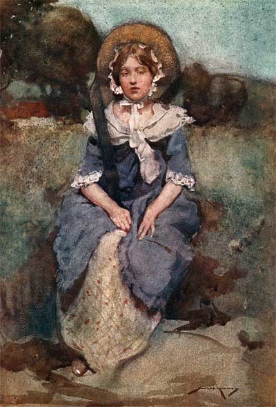
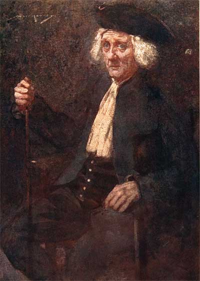
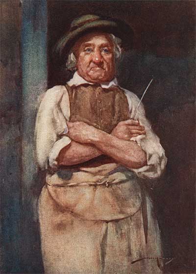
POSE CHARACTERS EXPRESSIVELY
This is CGI animation’s cardinal sin. Gestures and body positions NEVER reflect a character’s unique personality. Every character scrunches their mouth to one side and looks upwards when they think- they all lower their eyebrows and narrow their eyes the exact same way when they’re angry- they all throw their hip to one side and lean their head when they’re petulant…
This is "formula acting". If we were talking about the performance of a human actor instead of a grizzly bear or raccoon, it would be called "BAD acting". Formulas don’t tell you anything about the character, yet entire movies are performed by rote. Don’t believe me? Take any of the recent CGI movies, whether they involve animals invading backyards or escaping zoos, rodents in European restaurants, superhero terrapins or prehistoric sloths- and count the number of times the characters deliver dialogue with that meaningless, stock- hands out to the side, palms up, up and down movement on every accent- sort of gesture. What the heck does that gesture mean? It’s just water treading because the animator is too lazy to think of a gesture that actually expresses something.
Now look at the last image in this group- the one with the fella sitting next to the girl. Even his feet tell you what he’s thinking! Every pose in an animated film should be that expressive. There’s no excuse for stock poses or actions.
An animator isn’t just moving a complex polygon through space- an animator creates a performance from a succession of still poses. That’s the job of an artist and anyone doing that sort of work needs to THINK like an artist. As you browse through this the rest of the images in this post, if you just "look at the pretty pictures" without thinking about what makes them work, you might as well be off shopping or playing video games. This website is a tremendous resource, but it won’t help you if you expect it to work passively by osmosis.
Print the stuff in this blog out. Put it in binders. Analyze it. Categorize the concepts. Make notes. Talk about your ideas with your fellow artists. Apply these ideas to your work.
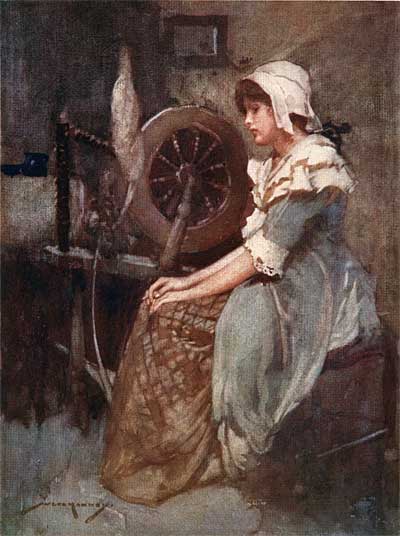
Here are a few more illustrations from this great book. Can you see the principles we discussed above in these images? What other ideas do they give you?
Stephen Worth
Director
Animation Resources
This posting is part of a series of articles comprising an online exhibit entitled Theory.
This posting is part of a series of articles comprising an online exhibit spotlighting Illustration.
THIS IS JUST THE TIP OF THE ICEBERG!
Animation Resources has been sharing treasures from the Animation Archive with its members for over a decade. Every other month, our members get access to a downloadable Reference Pack, full of information, inspiration and animation. The RefPacks consist of e-books jam packed with high resolution scans of great art, still framable animated films from around the world, documentaries, podcasts, seminars and MORE! The best part is that all of this material has been selected and curated by our Board of professionals to aid you in your self study. Our goal is to help you be a greater artist. Why wouldn’t you want to be a member of a group like that?
Membership comes in three levels. General Members get access to a bi-monthly Reference Pack as well as a Bonus RefPack from past offerings in the in-between months. We offer a discounted Student Membership for full time students and educators. And if you want to try out being a member, there is a Quarterly Membership that runs for three months.
JOIN TODAY!
https://animationresources.org/membership/levels/
FREE SAMPLES!
Not Convinced Yet? Check out this SAMPLE REFERENCE PACK! It will give you a taste of what Animation Resources members get to download every other month! That’s 560 pages of great high resolution images and nearly an hour of rare animation available to everyone to download for FREE! https://animationresources.org/join-us-sample-reference-pack/
![]()
![]() Animation Resources depends on your contributions to support its projects. Even if you can’t afford to join our group right now, please click the button below to donate whatever you can afford using PayPal.
Animation Resources depends on your contributions to support its projects. Even if you can’t afford to join our group right now, please click the button below to donate whatever you can afford using PayPal.


