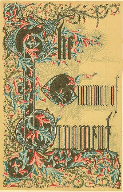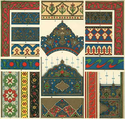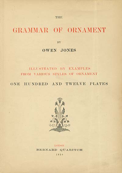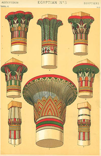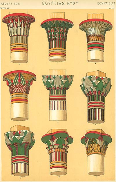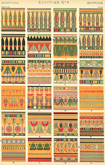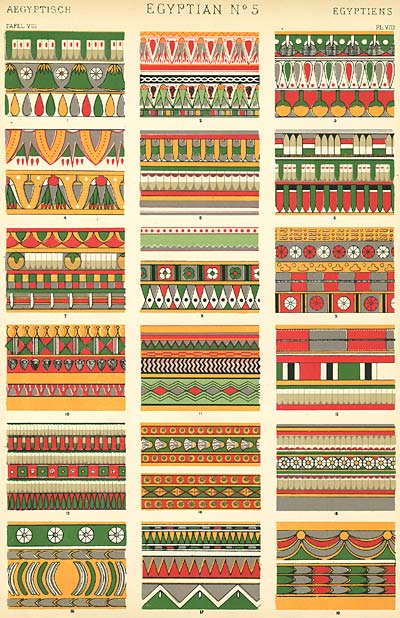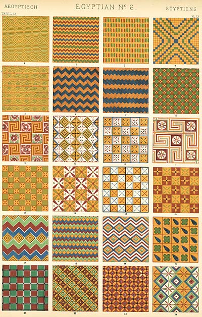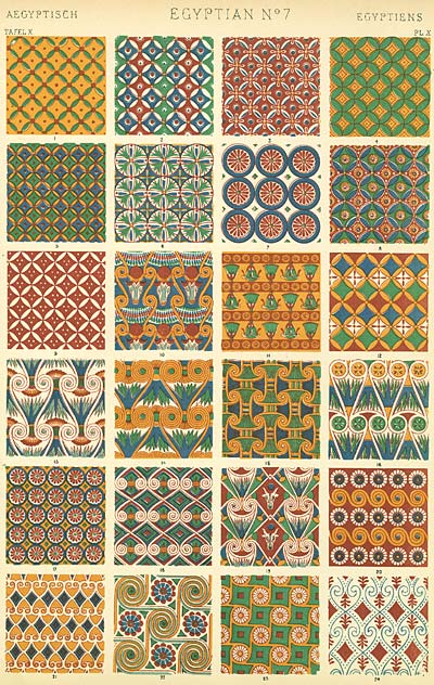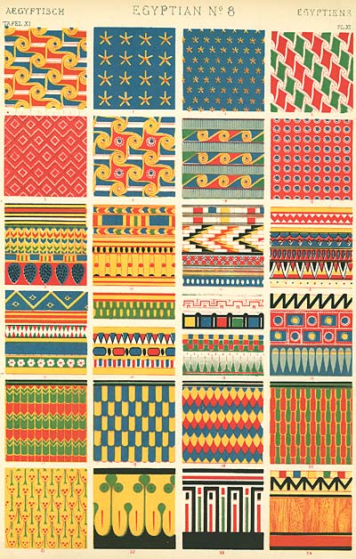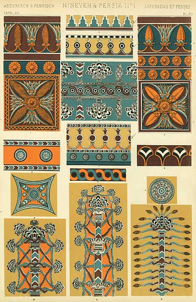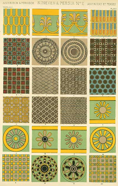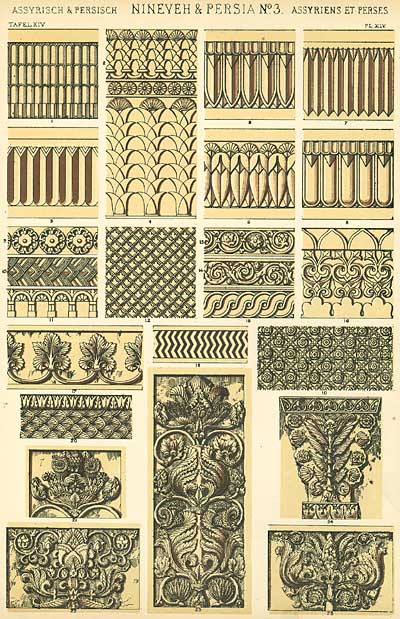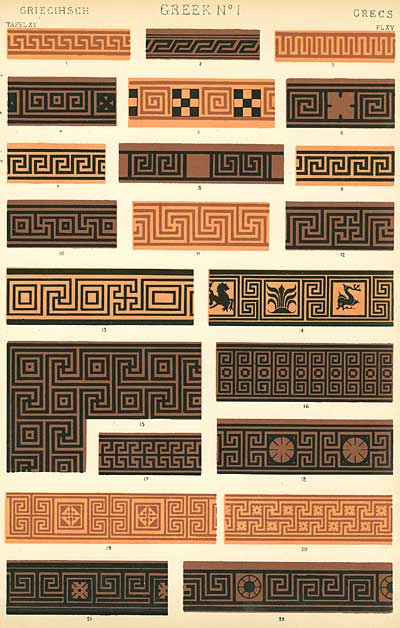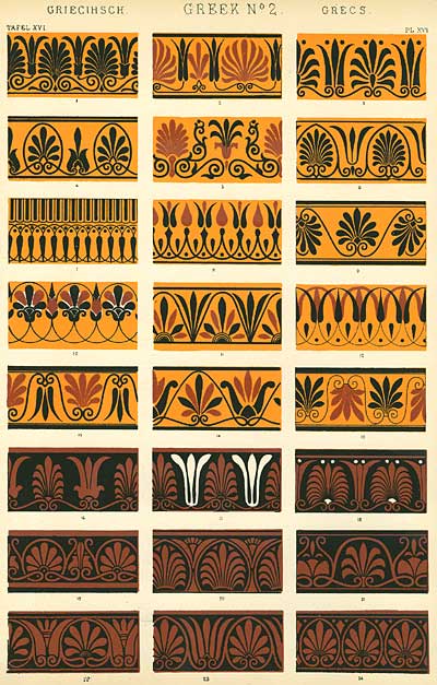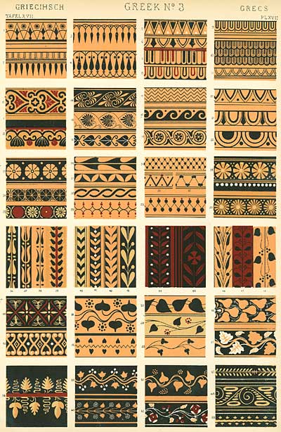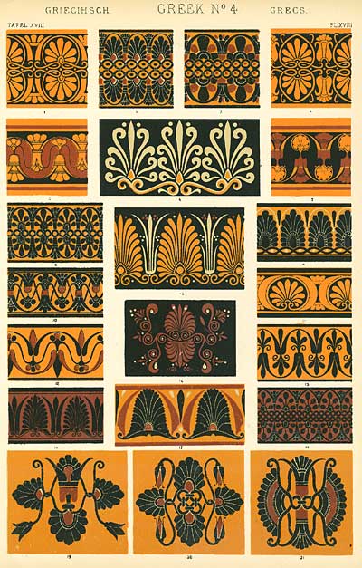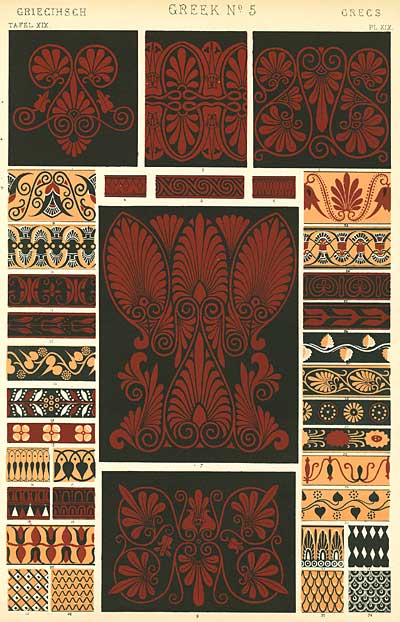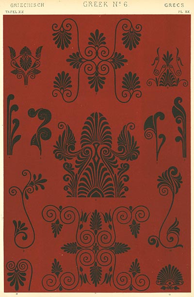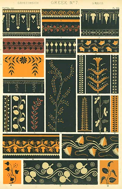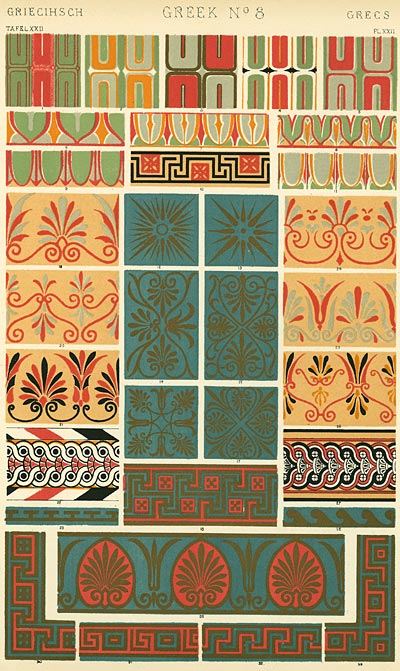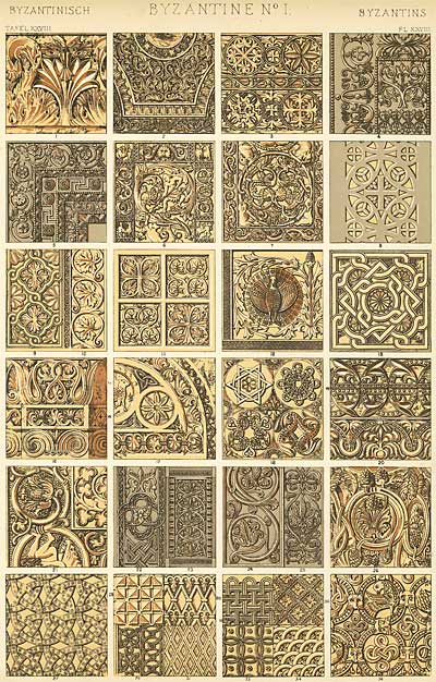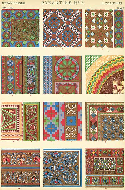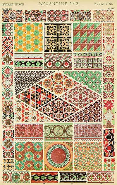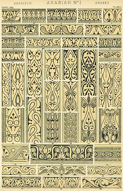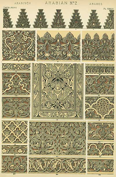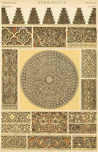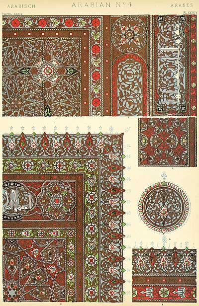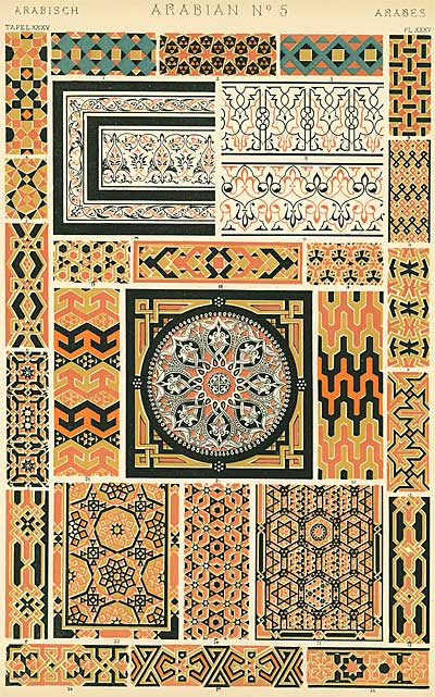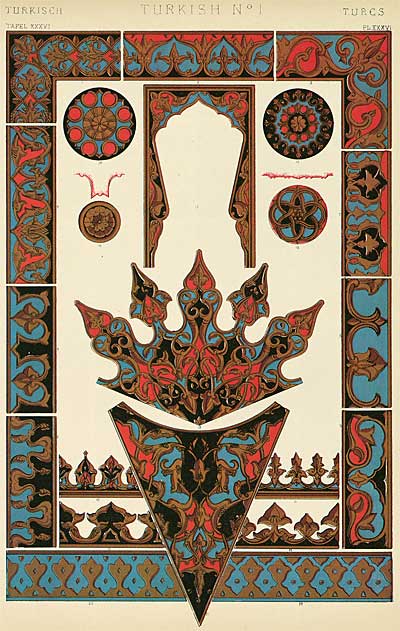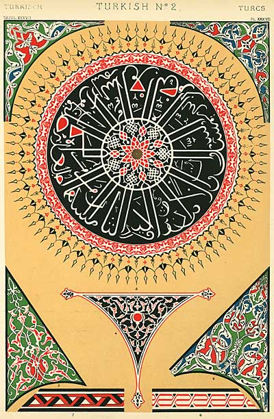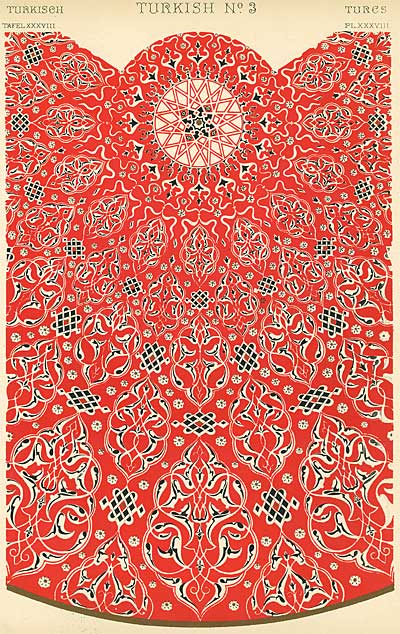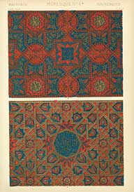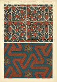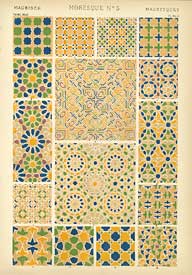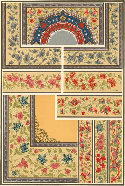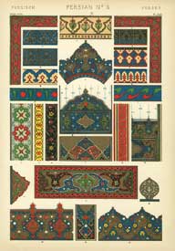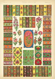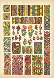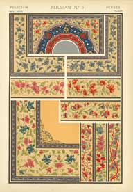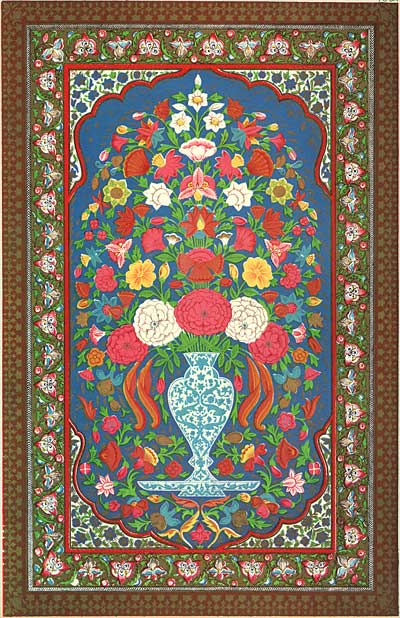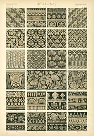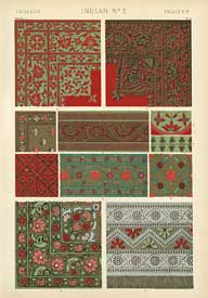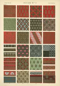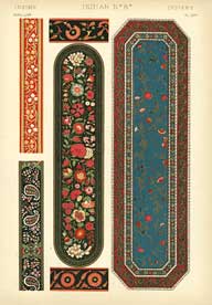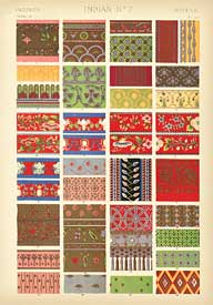
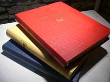
Today, we began digitizing a 1910 printing of the first comprehensive book on design, Owen Jones’s "The Grammar of Ornament". Originally published in 1856, this book is one of the holy grails of art reference books. In 112 oversize chromolithographic plates, Jones collects representative samples of ornamental design from all over the world. It’s a veritable enyclopedia of pattern, contrasts and color harmony, with an almost mathematical perfection of form. The copy we are digitizing from is missing 20 plates, but the ones that remain are stunning. This book has been reprinted over the years, but none of the reissues match the original printings for image quality. Unfortunately, vintage copies of this book complete and in good condition sell for thousands of dollars, so we are very lucky to be able to bring this to you.

A lot of my posts here are very specific, and are aimed directly at learning about animation. But sometimes it’s a good idea to take a step back and get a broader perspective. Although this book may not specifically teach you how to draw Donald Duck or inbetween a scene, it does apply to your creative process as an artist. Along with expressing emotion, the creation of pleasing patterns is at the root of all forms of art; not just animation, but music, architecture, and dance as well. Recognizing the links between different creative disciplines can help you become a stronger artist. This post is very long, but I hope you’ll stick with it to the end where I explain how this century old book can inform your own work.

FROM THE PREFACE
In the following chapters I have endeavoured to establish these main facts-
First. That whenever any style of ornament commands universal admiration, it will always be found to be in accordance with the laws which regulate the distribution of form in nature.
Secondly. That however varied the manifestations in accordance with these laws, the leading ideas on which they are based are very few.
Thirdly. That the modifications and developments which have taken place from one style to another have been caused by a sudden thowing off of some fixed trammel, which set thought free for a time, till the new idea, like the old, became again fixed, to give birth in its turn to fresh inventions.
Lastly. I have endeavoured to show, in the twentieth chapter, that the future progress of Ornamental Art may be best secured by engrafting on the experience of the past the knowledge we may obtain by a return to Nature for fresh inspiration. To attempt to build up theories of art, or to form a style, independently of the past, would be an act of supreme folly. It would be at once to reject the experiences and accumulated knowledge of thousands of years. On the contrary, we should regard as our inheritance all the successful labours of the past, not blindly following them, but employing them simply as guides to find the true path. –Owen Jones
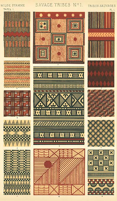
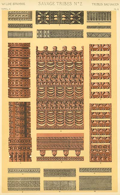
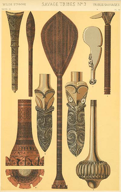
ORNAMENT OF SAVAGE TRIBES

From the universal testimony of travellers it would appear, that there is scarcely a people, in however early a stage of civilization, with whom the desire for ornament is not a strong instinct. The desire is absent in none, and it grows and increases with all in the ratio of their progress in civilisation. Man appears everywhere impressed with the beauties of Nature which surround him, and seeks to imitate to the extent of his power the works of the creator.
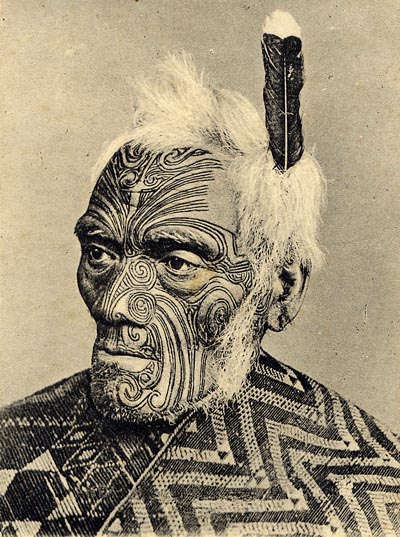
Man’s earliest ambition is to create. To this feeling must be ascribed the tattooing of the human face and body, resorted to by the savage to increase the expression by which he seeks to strike terror on his enemies or rivals, or to create what appears to him a new beauty. As we advance higher, from the decoration of the rude hut or wigwam to the sublime works of a Phidias and Praxiteles, the same feeling is everywhere apparent: the highest ambition is still to create, to stamp on this earth the impress of an individual mind.


EGYPTIAN ORNAMENT

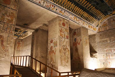
The Architecture of Egypt has this peculiarity over all other styles, that the more ancient the monument, the more perfect is the art. Monuments erected two thousand years before the Christian era are formed from the ruins of still more ancient and more perfect buildings. We are thus carried back to a period too remote from our own time to enable us to discover any trace of its origin; and whilst we can trace in direct succession from this great parent, we must believe the architecture of Egypt to be a pure original style, which arose with civilisation in Central Africa, passed through countless ages, to the culminatiing point of perfection and the state of decline in which we see it.
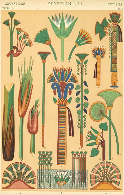
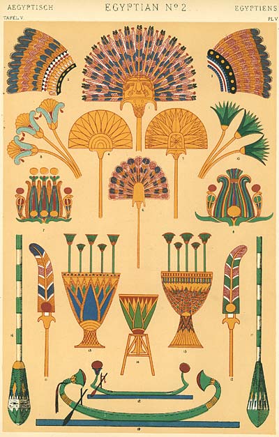
The lotus and papyrus, growing on the banks of the river, symbolising the food for the body and mind; the feathers of rare birds, which were carried before the king as emblems of sovereignty; the palm-branch, with the twisted cord made from its stems; these are the few types which form the basis of that immense variety of ornament with which the Egyptians decorated the temples of their gods, the palaces of their kings, the covering of their persons, their articles of luxury or of more modest daily use, from the wooden spoon which fed them to the boat which carried their similarly adorned embalmed bodies across the Nile to their last home in the valley of the dead.


We may imagine it the custom of the Egyptians in early times to decorate the wooden posts of their primitive temples with their native flowers tied round them; and this custom, when their art took a more permanent character, became solidified in ther monuments of stone. The lotus and papyrus form the type of fifteen of the capitals we have selected for illustration; yet how ingeniously varied, and what a lesson do they teach us!


Egyptian ornament which is simply decorative, or which appears so to our eyes, but which doubtless has its own laws and reasons for its application, although they are not apparent to us. Plates VIII, IX, X, XI are devoted to this class of ornament, and are from paintings on tombs, dresses, utensils and sarcophagi. They are all distinguished by graceful symmetry and perfect distribution. The variety that can be produced by the few simple types we have referred to is remarkable. On Plate IX are patterns of ceilings, and apear to be reproductions of woven patterns. Side by side with the conventional rendering of actual things, the first attempts of any people to produce works of ornament take this direction.
The formation of patterns by the equal division of similar lines, as by weaving, would give to a rising people the first notions of symmetry, arrangement, disposition, and the distribution of masses. The Egyptians, in their decoration of large surfaces, never appear to have gone beyond a geometrical arrangement. Flowing lines are very rare, comparitively, and never the motive of the composition, though the germ of even this mode of decoration, the volute form, exists in their rope ornament.


We venture, therefore, to claim for the Egyptian style, that though the oldest, it is, in all that is requisite to constitute a true style of art, the most perfect. The language in which it reveals itself to us may seem foreign, peculiar, formal and rigid; but the ideas and the teachings it conveys to us are of the soundest. As we proceed with other styles, we shall see that they approach perfection only so far as they followed, in common with the Egyptians, the true principles to be observed in every flower that grows.

 GENERAL PRINCIPLES IN THE ARRANGEMENT OF FORM AND COLOR IN ARCHITECTURE AND THE DECORATIVE ARTS, WHICH ARE ADVOCATED THROUGHOUT THIS WORK
Proposition 1: The Decorative Arts arise from, and should properly be attendant upon, Architecture.
Proposition 2: Architecture is the material expression of the wants, the faculties, and the sentiments, of the age in which it is created.
Proposition 3: As Architecture, so all works of the Decorative Arts, should possess fitness, proportion, harmony, the result of all which is repose.
Proposition 4: True beauty results from that repose which the mind feels when the eye, the intellect, and the affections, are satisfied from the absence of any want.
Proposition 5: Construction should be decorated. Decoration should never be purposely constructed. That which is beautiful is true; that which is true must be beautiful.
Proposition 6: Beauty of form is produced by lines growing out one from the other in gradual undulations; there are no excrescences; nothing could be removed and leave the design equally good or better.
Proposition 7: The general forms being first cared for, these should be subdivided and ornamented by general lines; the interstices may then be filled in with ornament, which again may be subdivided and enriched for closer inspection.
ASSYRIAN AND PERSIAN ORNAMENT


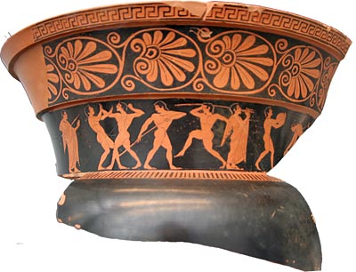
GREEK ORNAMENT


GENERAL PRINCIPLES (cont)
Proposition 8: All ornament should be based on a geometrical construction.
Proposition 9: As in every perfect work of Architecture, a true proportion will be found to reign between all the members which compose it, so throughout the Decorative Arts ever assemblage of forms should be arranged on certain definite proportions; the whole and each particular member should be a multiple of some simple unit. Those proportions will be the most beautiful which it will be most difficult for the eye to detect.
Proposition 10: Harmony of form consists in the proper balanceing, and contrast of, the straight, the inclined, and the curved.


GENERAL PRINCIPLES (cont)
Proposition 11: In surface decoration all lines should flow out of a perfect stem. Every ornament, however distant, should be traced to its branch and root. (Oriental practice)
Proposition 12: All junctions of curved lines with curved or of curved lines with straight should be tangential to each other. (Natural law)
Proposition 13: Flowers or other natural objects should not be used as ornaments, but conventional representations founded upon them sufficiently suggestive to convey the intended image to the mind, without destroying the unity of the object they are employed to decorate. (Universally obeyed in the best periods of Art, equally violated when Art declines.)


GENERAL PRINCIPLES (cont)
Proposition 14: Colour is used to assist in the development of form, and to distinguish objects or parts of objects one from another.
Proposition 15: Colour is used to assist light and shade, helping the undulations of form by the proper distribution of the several colours.
Proposition 16: Those objects are best attained by the use of the primary colours on small surfaces and in small quantities, balanced and supported by the secondary and tertiary colours on the larger masses.
Proposition 17: The primary colours should be used on the upper portions of objects, the secondary and tertiary on the lower.
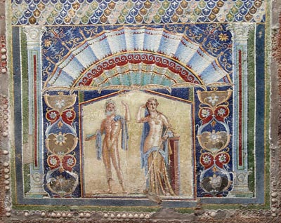
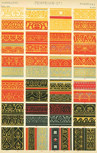
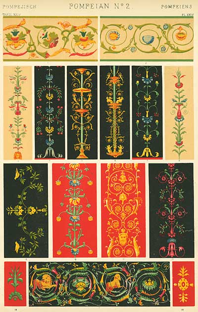
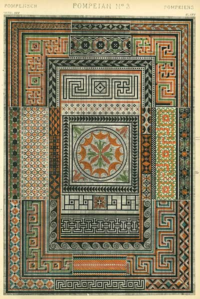
POMPEIAN ORNAMENT


GENERAL PRINCIPLES (cont)
Proposition 18: The primaries of equal intensities will harmonise or neutralise each other, in the proportions of 3 yellow, 5 red, and 8 blue- integrally as 16. The secondaries in the proportions of 8 orange, 13 purple, 11 green- integrally as 32. The tertiaries, citrine (compound of orange and green) 19, russet (orange and purple) 21, olive (green and purple) 24- integrally as 64.
Proposition 19: When a full colour is contrasted with another of a lower tone, the volume of the latter must be proportionally incerased.
Proposition 20: When a primary tinged with another primary is contrasted with a secondary, the secondary must have a hue of the third primary.
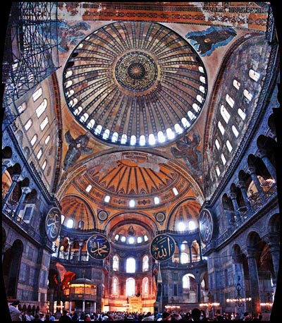
BYZANTINE


ARABIAN


TURKISH


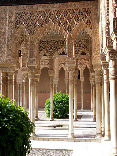
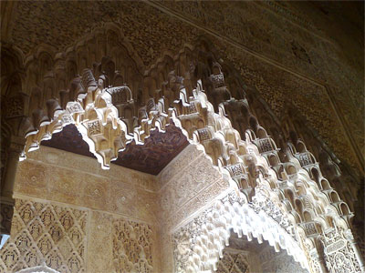
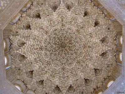
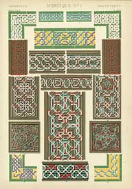
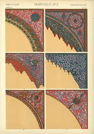
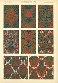
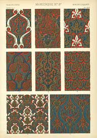
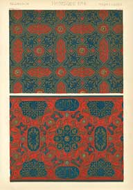
MORESQUE ORNAMENT
Steve’s Comments: The designs in this section all come from the Alhambra in Spain. The Moors believed in decorating construction, not constructing decoration, so even though the graphic designs in this section are elaborate and awe inspiring, they always serve the overall form of the structure. Their religion forbade literal depictions, so the focus is on geometric patterns, along with written inscriptions reminding the viewer that regardless of the great accomplishments of its builders, "there is no greater creator than God."


PERSIAN ORNAMENT

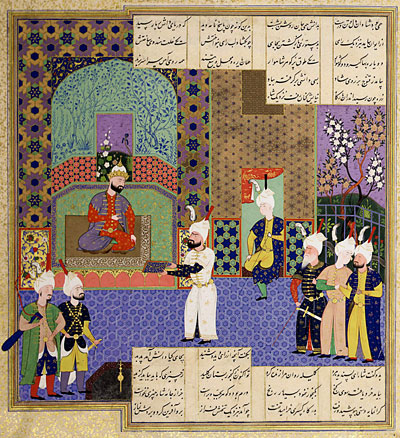
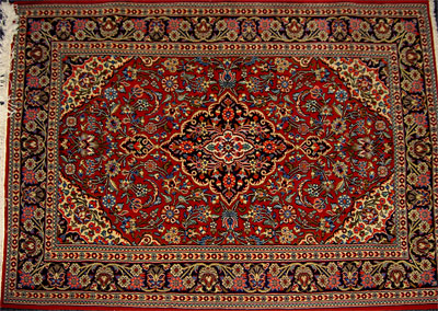
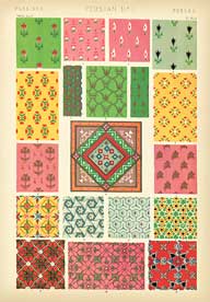
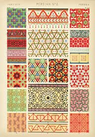
Steve’s Comments: Persian ornament is a mixed style, with elements of both Arabian and Turkish design. Unlike the Moors, the Persians were free to depict human, animal and floral subjects, and their illuminated manuscripts were well known throughout the Mohammedan world. In Persian rugs, you can see floral ornamentation that was particularly influential to the development of art in India.


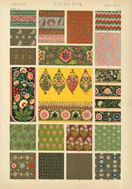
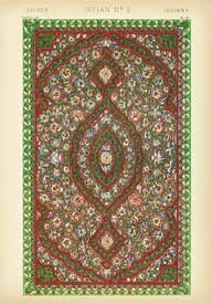
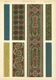
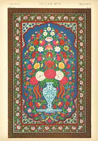
INDIAN ORNAMENT

Steve’s Comments: Indian art is simultaneously elaborate and completely balanced. In both architecture and textiles, there is a remarkable ability to create a heirarchy of detail that holds together from a distance, yet reveals new details as you look closer and closer at the design. Even though the colors are vivid and varied, there’s always an overall harmony. The depiction of plant life is elegantly stylized and well observed. Some of the flowers look like you could pick them right off the page.


 THE IMPORTANCE OF DESIGN
When The Grammar of Ornament was originally published in the mid-19th century, Victorian designers pilfered it shamelessly for fabric and wallpaper patterns. Jones was horrified to learn that designs that had served specific purposes to the ancient artists who created them were being mixed and matched randomly across cultures and centuries for purely decorative reasons.
This book is a lot more than just pretty "wallpaper samples"- it’s an historical encyclopedia of pattern, shape and color. The history of mankind is revealed in its attempts at graphically depicting perfection. While there are marked differences between cultures, there’s also a certain unity of aesthetic. Whether this is a result of "nature or nuture", I’m not sure. No culture ever existed in a vacuum. But I lean towards thinking that there are certain patterns and shapes that appeal to us on some sort of primal level.
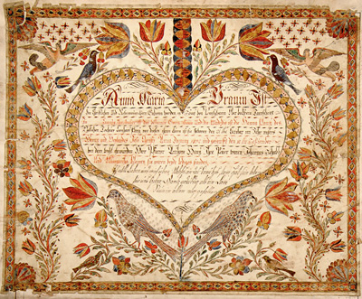
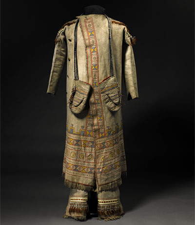
Nowhere is this more evident in recent times than in folk and ethnic art…


If there’s a "magic" to creativity… an element that is just there, defying all attempts to analyze or quantify it… The Grammar of Ornament contains it. (And the book does a pretty good job of analyzing and quantifying!) There are certain combinations of pleasing colors, shapes and sounds that are common to us all. I think of these patterns and designs as being the visual equivalent of music. It doesn’t matter what language you speak or what culture you come from, music speaks on a basic level that all humans comprehend from birth.
MUSICAL DIGRESSION
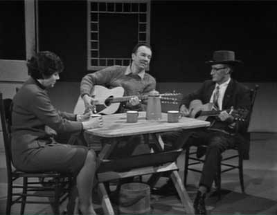
Last week, I got a DVD that illustrated the commonality of different musical cultures very clearly… Pete Seeger’s PBS music program, Rainbow Quest. In this series, Seeger attempted to show the link between all types of folk music- blues, bluegrass, old time country, sea chanteys, Irish folk songs, etc… In this clip, Seeger brings together Roscoe Holcombe (the Kentucky mountain musician for whom the term "high lonesome sound" was coined) and Scottish folk singer Jean Redpath. Even though Holcombe and Redpath come from opposite universes, check out how Seeger gently leads the musicmaking towards the core elements that they share in common…

Pete Seeger’s "Rainbow Quest"

with Roscoe Holcombe & Jean Redpath (PBS/ca.1965)
(Quicktime 7 / 18.6 megs)
I’ve always found that the more you know about different creative subjects, the more you understand each individual one. This is the secret to the magic and power of creativity. I realize that this is a pretty vague and nebulous point to try and make, but I hope the examples I give you here express it better than my feeble words.
Stephen Worth
Director
Animation Resources


This posting is part of a series of articles comprising an online exhibit entitled Theory.


 by
by 
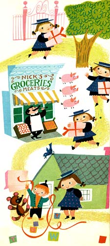
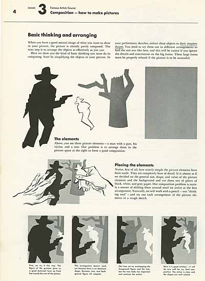
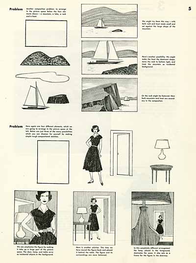
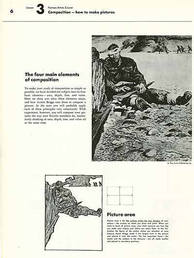
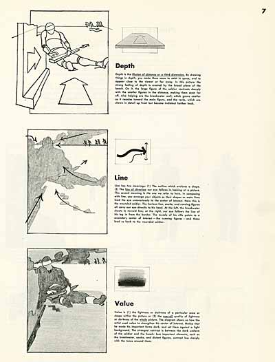
![]() Seeing the fantastic examples by Mary Blair, Milt Gross and Jack Kirby on the internet reminds me how UN-designed many animated films and print cartoons are today. Mark Kennedy has a great post on Rhythmic Composition that you’ll want to check out too.
Seeing the fantastic examples by Mary Blair, Milt Gross and Jack Kirby on the internet reminds me how UN-designed many animated films and print cartoons are today. Mark Kennedy has a great post on Rhythmic Composition that you’ll want to check out too.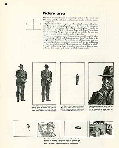
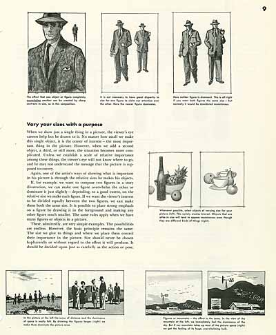
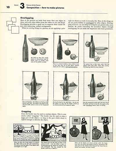
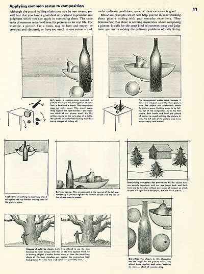
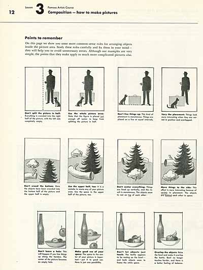
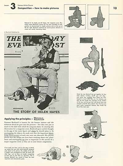
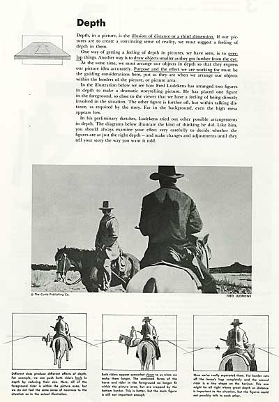
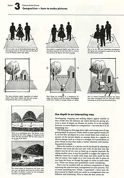
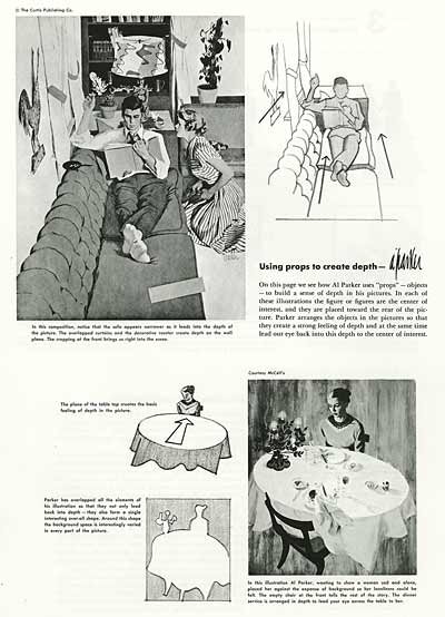
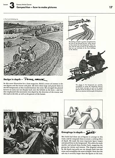
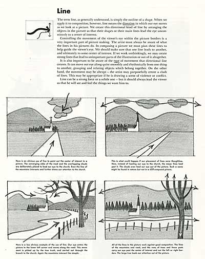
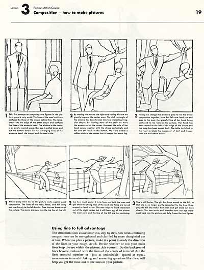
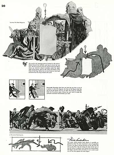
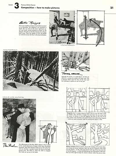
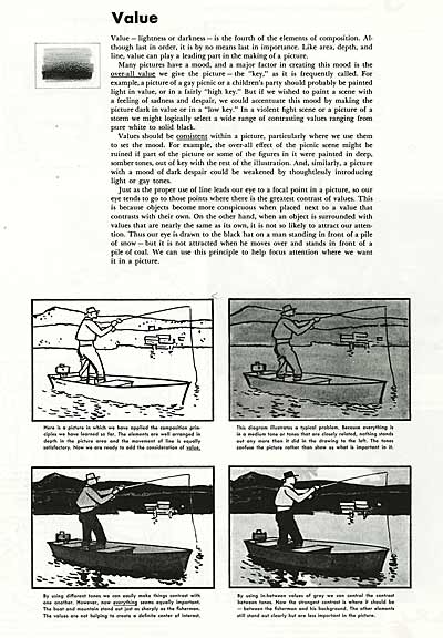
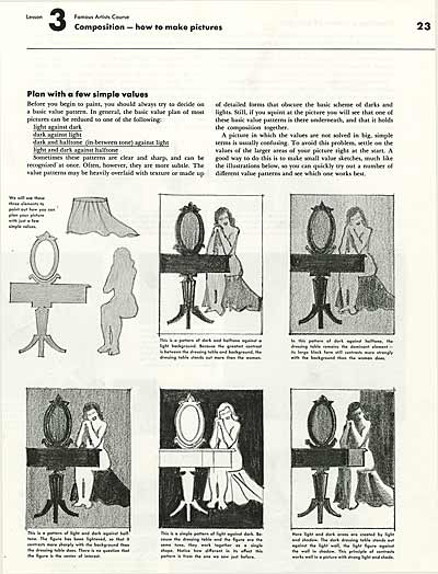
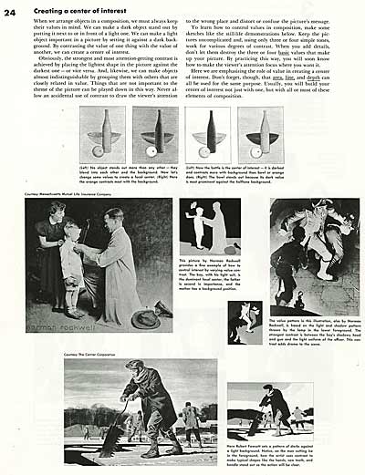
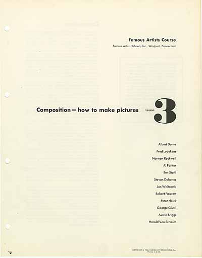
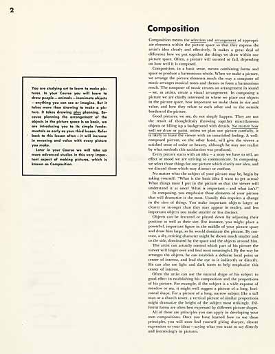
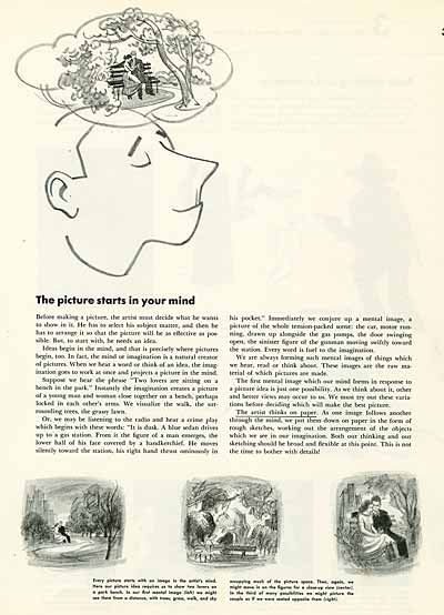
![]() The Famous Artists Course was created in the mid-1950s by Norman Rockwell, Rube Goldberg and Albert Dorne, among others. The correspondence lessons and educational materials are still available at www.famous-artists-school.com. Books from the three courses: Painting, Illustration/Design and Cartooning turn up on eBay as well. I highly recommend these great resources to students.
The Famous Artists Course was created in the mid-1950s by Norman Rockwell, Rube Goldberg and Albert Dorne, among others. The correspondence lessons and educational materials are still available at www.famous-artists-school.com. Books from the three courses: Painting, Illustration/Design and Cartooning turn up on eBay as well. I highly recommend these great resources to students.![]()
![]() Animation Resources depends on your contributions to support its projects. Even if you can’t afford to join our group right now, please click the button below to donate whatever you can afford using PayPal.
Animation Resources depends on your contributions to support its projects. Even if you can’t afford to join our group right now, please click the button below to donate whatever you can afford using PayPal.


