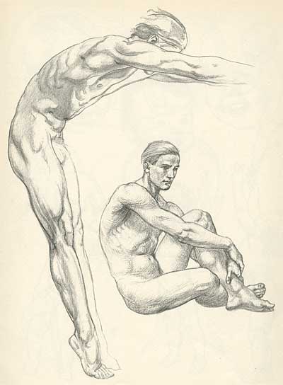
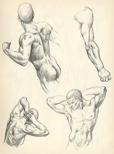
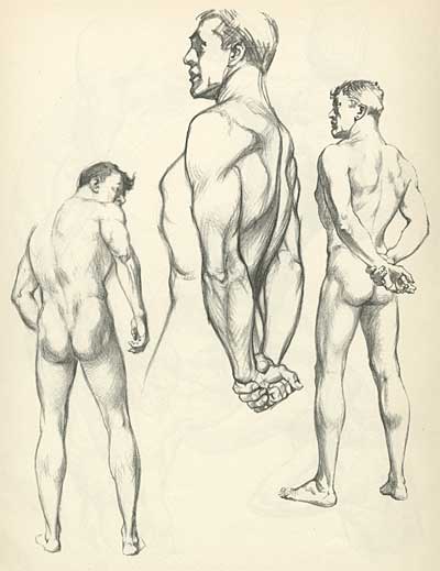
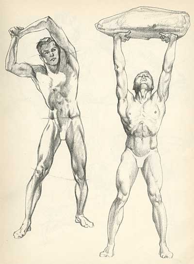
Archive for the ‘illustration’ Category

Monday, November 14th, 2016

REFPACK013: Download An E-Book Of Two Noel Issues Of L’Illustration


REFPACK 013
Download Page
November-December 2016

MEMBERS LOGIN To Download E-Book

JOIN TODAY To Access Members Only Content

Every other month, members of Animation Resources are given access to an exclusive Members Only Reference Pack. These downloadable files are high resolution e-books on a variety of educational subjects and rare cartoons from the collection of Animation Resources in DVD quality. Our current Reference Pack has just been released. If you are a member, click through the link to access the MEMBERS ONLY DOWNLOAD PAGE. If you aren’t a member yet, please JOIN ANIMATION RESOURCES. It’s well worth it.

PDF E-BOOK:
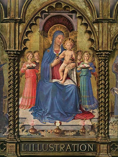
L Illustration

The Most Beautiful Magazine Ever Published

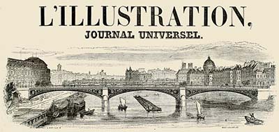
In the latter half of the 19th century, technology forever changed the way society related to images. The invention of photography and inexpensive mass printing techniques opened up a whole new world of pictures to the common person. Before this, paintings were the medium used to reproduce life and express ideas. But paintings were for the wealthy, and they had limited exposure. All that changed in 1843 when L’Illustration was first published.
L Illustration

Based on the format of the London Illustrated News, which had debuted a year earlier, L’Illustration strove to bring the world of current events to its readers, not just in text, but in pictures. Initially illustrated with steel engravings created by artists reporting from the scene of important events, the concept of illustrated news laid the foundation for our modern era of photo-journalism.

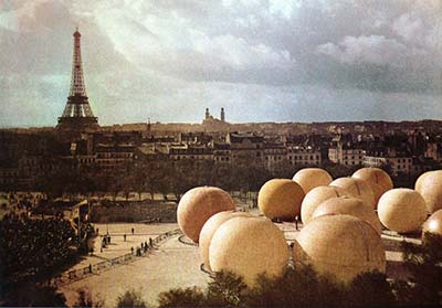
L’Illustration was the first publication to publish a photograph in 1891, and by the early 1900s, they had a staff of photographers, which included photo-journalist Leon Gimpel, who went up in a hot air balloon to take the first aerial photos in history. But Gimpel is best remembered today for his work in color photography. Utilizing August and Louis Lumiere’s Autochrome process, Gimpel exhibited a collection of landscape photos and still lifes to great acclaim.
L Illustration

In 1907, L’Illustration became the first to publish a color photograph in a special feature on Gimpel’s work, and within a month, Gimpel was at work for the magazine shooting color photographs of news events in and around Paris. L’Illustration soon engaged Charles Chusseau-Flaviens, the man who established the first photo-journalism agency to publish his photographs from around the world… from Morocco and New Zealand to Egypt and Japan.
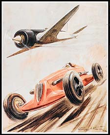
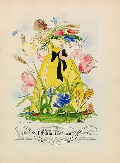
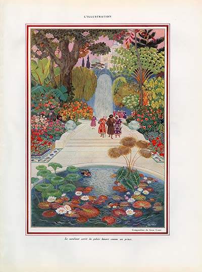
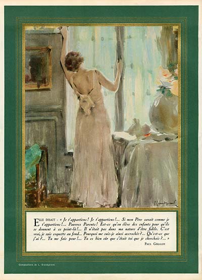
L IllustrationL IllustrationWith the advent of comfortable travel by sea, rail and air, the world opened up, and the public was eager to experience exotic foreign lands that had only existed to them in explorer’s accounts before. L’Illustration devoted special issues to travel themes, as well as the technology of travel by rail or automobile. Full page color photographs and beautiful watercolor paintings brought these subjects to life in a way that had never been possible before.

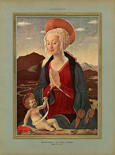
Color printing inspired the publishers of L’Illustration to attempt to bring the artistic treasures of the world, and in particular the collection of the Louvre, to the public. Paintings that used to hang in palaces were now seen by regular people and the study of art spurred a neo-classical revival for a time. L’Illustration saw itself as not just a reporter on current events, but as a cultural beacon and educator to its readers.
L Illustration

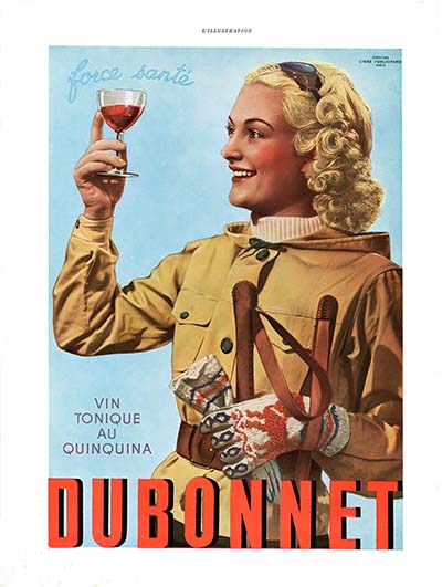
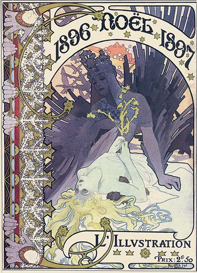
In December of 1896, L’Illustration published a special Christmas issue designed by Alfonse Mucha, one of the leading artists in the Art Nouveau movement. The special issue was very well received and it led to an annual tradition… the Noel issue. Every Christmas, L’Illustration spared no expense to create the most beautiful magazine possible. By the 1920s, the Noel issues had hand tipped in plates and special papers that rivalled the quality of the best hardbound books being published at the time. These Christmas issues became more and more elaborate every year, until World War II and the invasion of Paris by Germany changed everything.
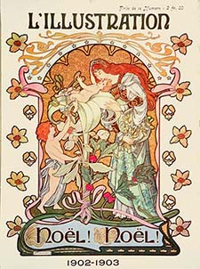
L IllustrationL IllustrationDuring the German occupation, L’Illustration was run by Jacques de Lesdain, a notorious supporter of the Vichy government. The magazine used its resources to produce pro-Nazi propaganda, and when France was finally liberated in 1944, Allied forces promptly shut the magazine down. It resurfaced a couple of years later as France-Illustration, but it never regained its former glory. The magazine ended publication in 1957, over 110 years after it was established. –Source: Wikipedia

REFPACK013: L’Illustration: Noel Issues 1935 & 1938
Download Page
Adobe PDF File / 256 Pages / 716 MB Download


MEMBERS LOGIN To Download E-Book

JOIN TODAY To Access Members Only Content


L IllustrationL IllustrationL IllustrationyL IllustrationL Illustration

L IllustrationL Illustrationy


MEMBERS LOGIN To Download E-Book

JOIN TODAY To Access Members Only Content

Not A Member Yet? Want A Free Sample?

Check out this SAMPLE REFERENCE PACK! It will give you a taste of what Animation Resources members get to download every other month!

Sample RefPack

FacebooktwitterredditpinterestlinkedinmailFacebooktwitterredditpinterestlinkedinmailby feather

Tuesday, June 28th, 2016

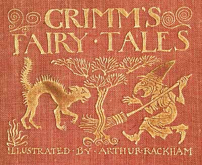
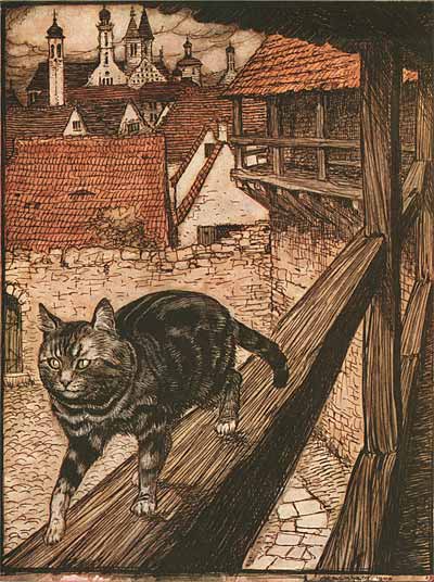
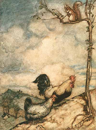
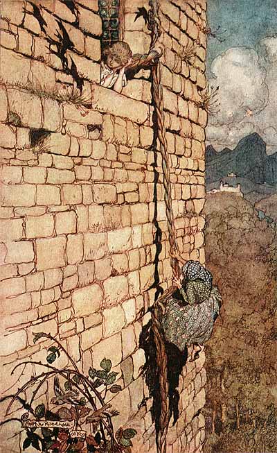
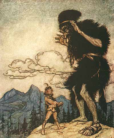
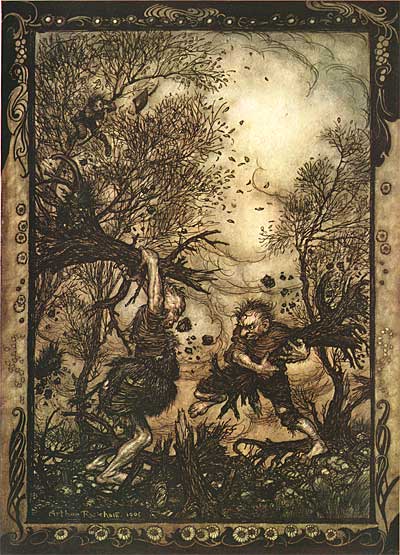
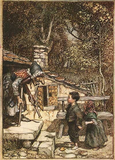
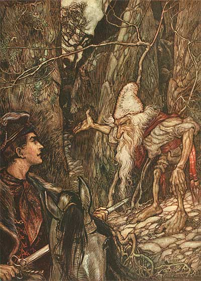
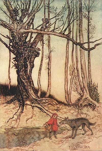
Illustration: Arthur Rackham’s Grimm’s Fairy Tales

Arthur Rackham

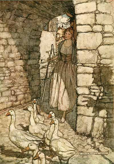
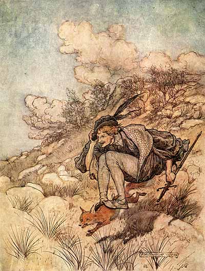
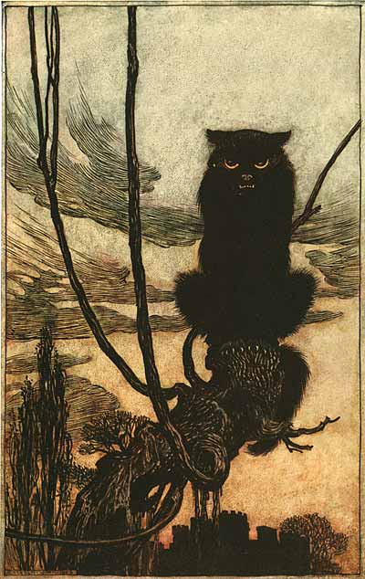
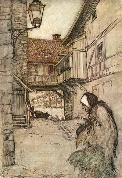
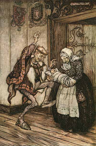
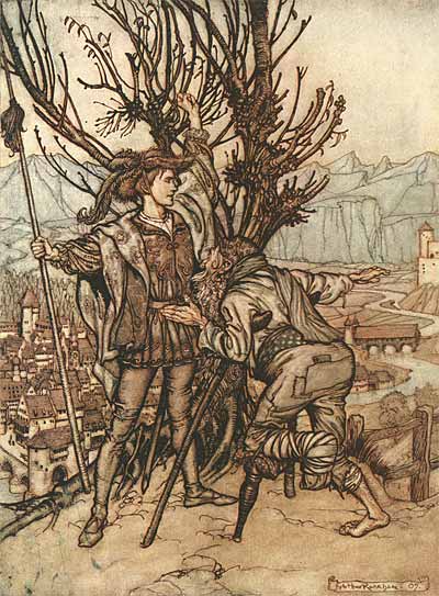
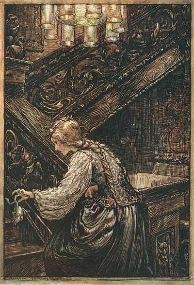
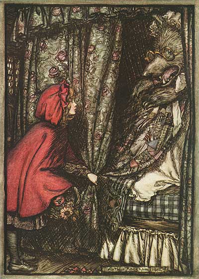
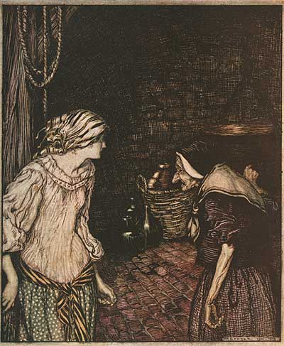
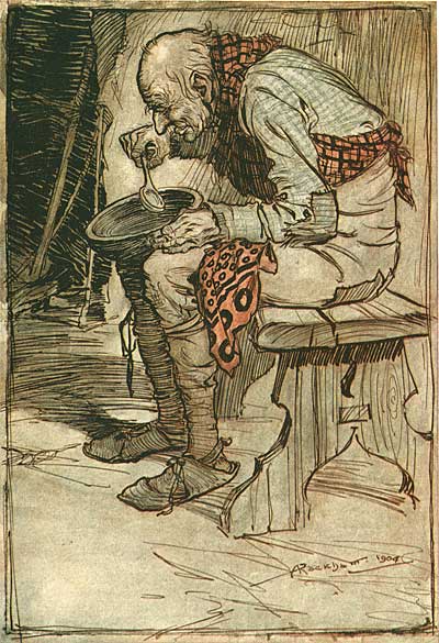
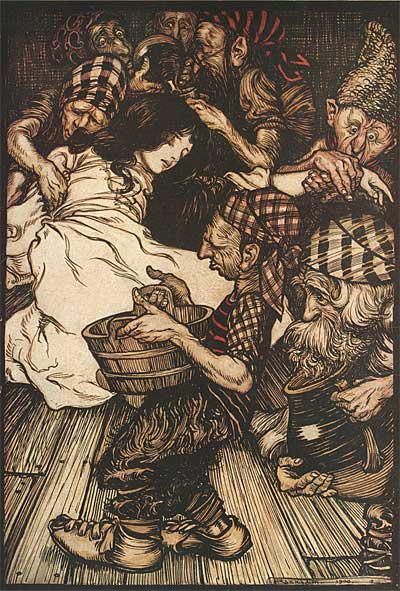
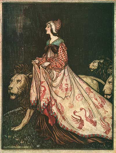
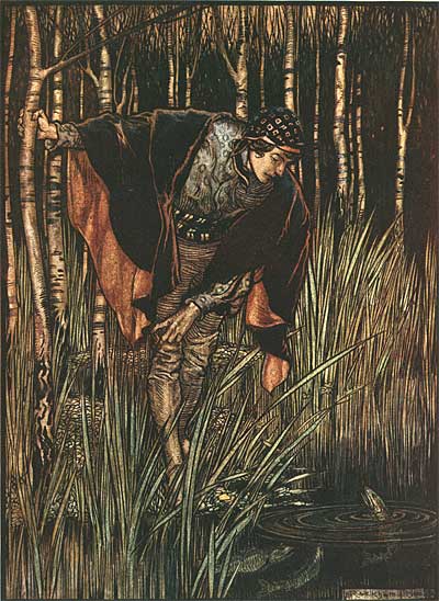
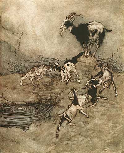
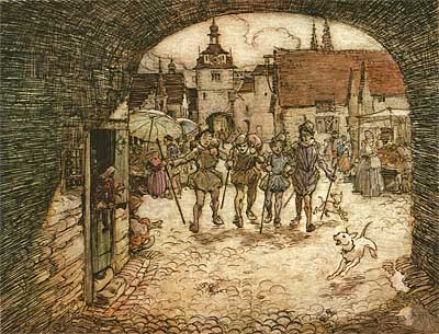
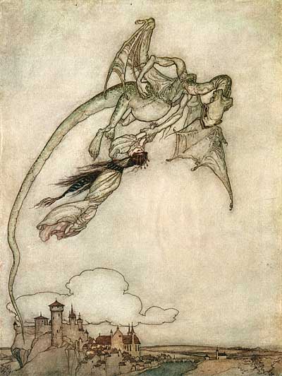
Arthur RackhamArthur RackhamArthur Rackham is probably the single most influential children’s book illustrator. His delicate watercolors define the image of fairy tales in many people’s minds.

If you aren’t familiar with his work, see Bud Plant’s great capsule biography.

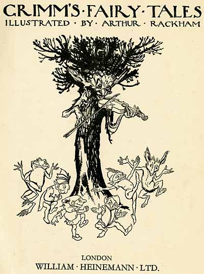
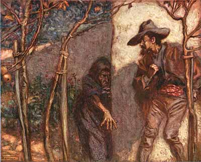
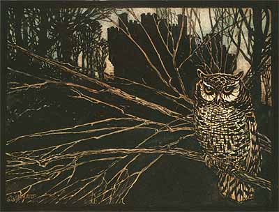
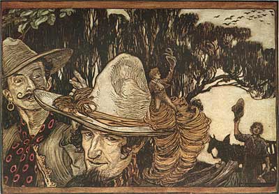
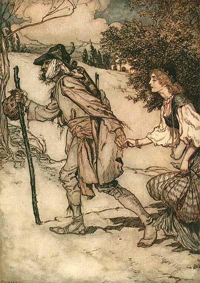
These scans are from a rare first edition of Grimm’s Fairy Tales from 1909. This beautiful book is jam packed with fabulous color plates and ink sketches.

Rackham’s style merges an organic line and earthy color palette with fantastic imagery. He often slipped faces into trees and clouds, adding an extra layer of wonder to his images. His pastoral subjects often seem to be nostalgic for an earlier time, perfect for bringing fairy tales to life.

Arthur RackhamArthur RackhamWalt Disney admired Rackham’s watercolor and pen & ink style, and instructed Gustaf Tenggren to work with Claude Coates and Sam Armstrong to adapt it for use in Snow White and the Seven Dwarfs.

In animation backgrounds however, the sinewy Rackham line was overly busy, distracting from the characters; so Tenggren evolved towards the more dimensional painting style in Pinocchio, which set the standard for Disney cartoons throughout the 1940s.

At Animation Resources one of our projects is to document the images that acted as inspiration to the artists who created the first animated features. No artist fits that bill better than Arthur Rackham. We’re very fortunate to be able to bring the illustrations from this great book to you. I hope you enjoy them.

Arthur Rackham
Arthur Rackham
Arthur Rackham
Arthur Rackham
Arthur Rackham
Arthur Rackham
Arthur Rackham
Arthur Rackham
Arthur Rackham
Arthur Rackham
Arthur Rackham
Arthur Rackham
Arthur Rackham
Arthur Rackham
Arthur Rackham
Arthur Rackham
Arthur Rackham
Arthur Rackham
Arthur Rackham
Arthur Rackham
Arthur Rackham
Arthur Rackham
Arthur Rackham
Arthur Rackham
Arthur Rackham
Arthur Rackham
Arthur Rackham
Arthur Rackham
Arthur Rackham

If you like what you see, please share it with your friends by linking to this page from your blog or webpage.

Stephen Worth
Director
Animation Resources

IllustrationIllustration

This posting is part of a series of articles comprising an online exhibit spotlighting Illustration.

FacebooktwitterredditpinterestlinkedinmailFacebooktwitterredditpinterestlinkedinmailby feather

Thursday, March 5th, 2015

Instruction: Willy Pogany’s Drawing Lessons

Pogany's Drawing Lessons

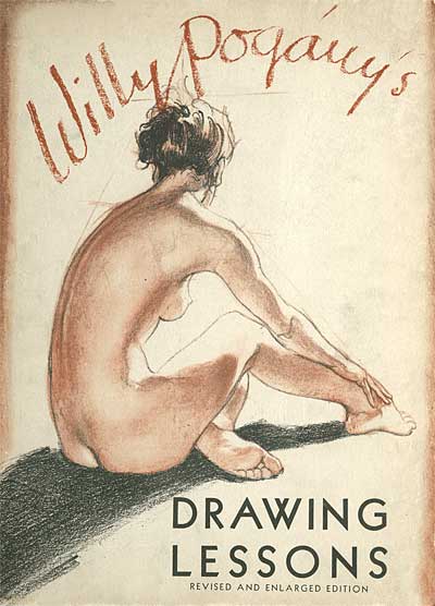
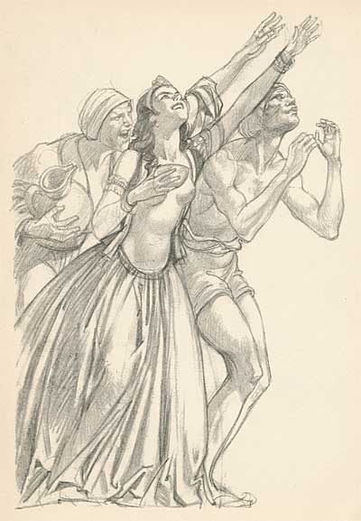
Willy Pogany was one of the most important book illustrators and designers of the first half of the 20th century. His Rime of the Ancient Mariner and books based on Wagnerian opera are masterpieces, to say nothing of his editions of Mother Goose, Alice in Wonderland and Faust. While other illustrators were confining themselves to an occasional tipped in plate buried among page after page of identical text blocks, Pogany broke the mold, designing elaborate pen and ink illustrations that surrounded the text, ornate capitals for the beginning of each page and calligraphy that turned the words into art. He is probably the artist most responsible for establishing what we think of as modern children’s book illustration.

Pogany's Drawing Lessons

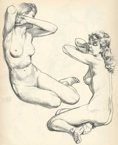
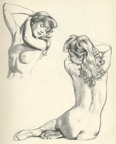
He was also an author and teacher, with three books covering drawing, oil painting and watercolor. Today, I am presenting two sections from his book Willy Pogany’s Drawing Lessons. The first is titled…

FIGURE SKETCHING

Pogany's Drawing Lessons

One of the most fascinating subjects to draw is the human figure. The fine proportions, beautiful modeling and delicate balance, and the infinite variations in movement and repose are such that there is no other living thing to compare with it. Through countless ages artists of all races have drawn, painted and modeled the human form.

Pogany's Drawing Lessons

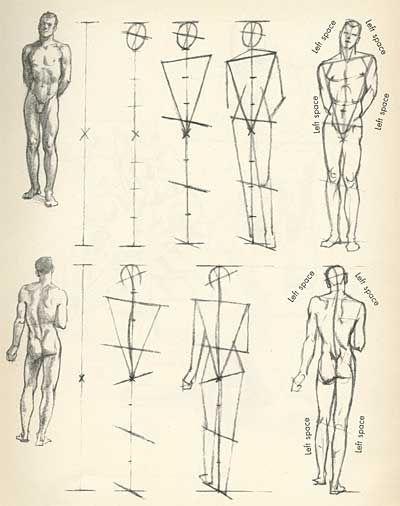
If you have never done any figure drawing, I would suggest that you start to draw the human figure in its simplest pose with little or no foreshortening. This is an upright standing position with arms close to the body and feet together.

Make up your mid before you begin, how large you want your drawing to be and mark on the paper the total length desired. Your drawing must be exactly the size that you have indicated on your paper.

Your next step is to draw a straight vertical line connecting the two marks. This will indicate the imaginary line of gravitation running from head to foot.

Now mark the center of the body by dividing the vertical line into two equal parts. Mark your proportions.

Draw in the oval of the head.

Pogany's Drawing Lessons

Measure the width of the shoulders compared to the length of the body. Draw in the shoulder line. Do the same with the hips.

To measure, use a pencil in your outstretched hand, first getting the width, then measuring vertically the number of times the width goes into the total length of the body. Now proceed to draw the masses of the chest, hips, legs, etc.

Pogany's Drawing Lessons

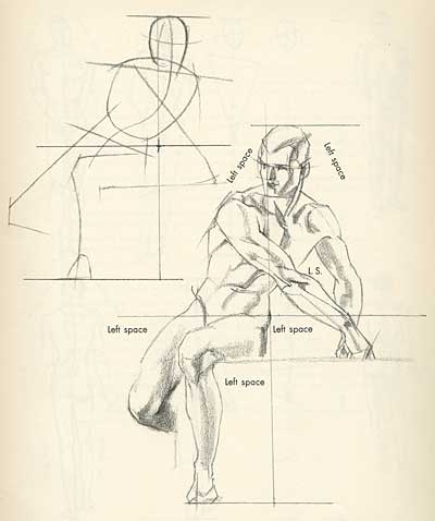
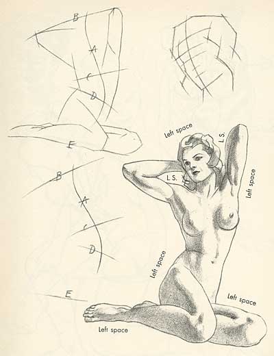
To check on your drawing, watch the shape of the background that surrounds the figure. See if these "left spaces" (or negative shapes) correspond with the outline of your drawing.

For instance, whatever the position of your subject, watch the shape and size of the space between the arms and the body; between the tilted head and the shoulder; between the two legs, etc, etc.

These will be your left spaces. Special attention to them will be of great help in making a correct drawing.

Pogany's Drawing Lessons

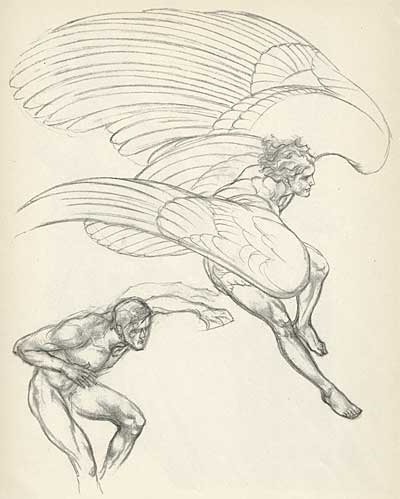
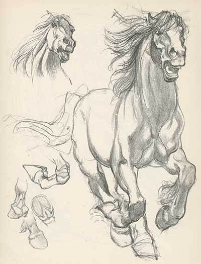
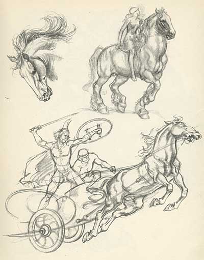
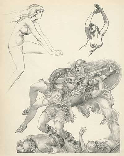
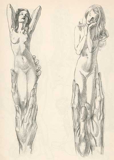
Cartoons are about things that aren’t real- pure imagination. But even here, it’s important to have balance… A friend of mine, Louise Zingarelli once told me, “You can’t draw crazy things until you can draw perfectly straight. Wonky perspective all over isn’t weird or interesting- it’s just ugly and dumb. You’ve got to have both, working right against wrong… just like working warms against cools in colors." The second section of the book we are presenting today illustrates these points.

POGANY’S SKETCHBOOK

Pogany's Drawing Lessons

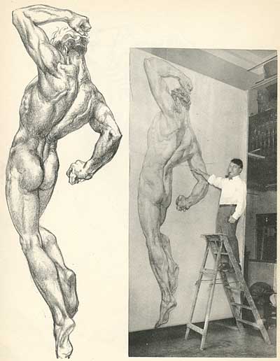
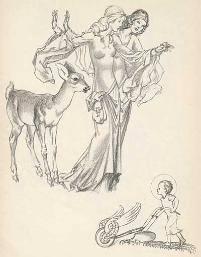
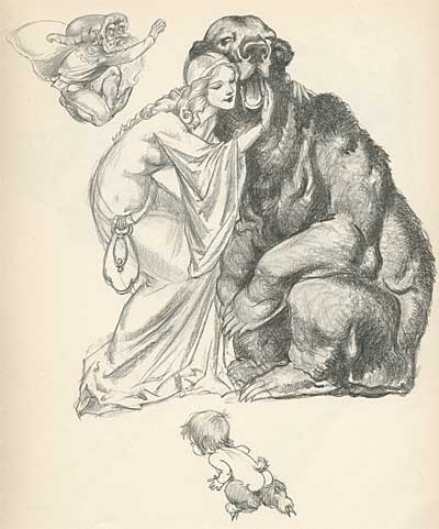
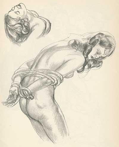
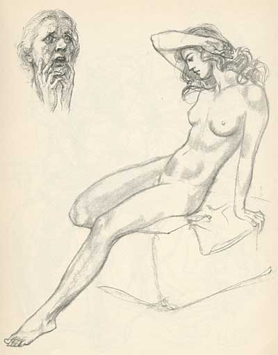
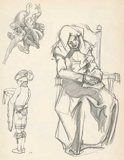
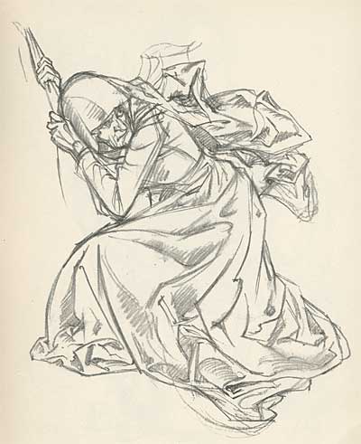
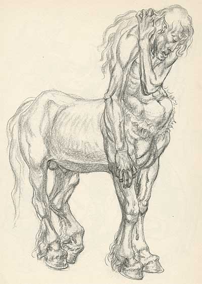
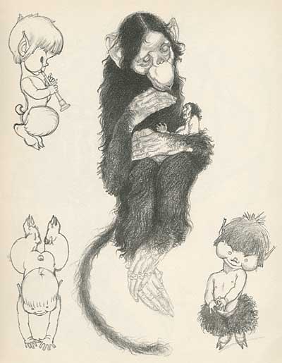
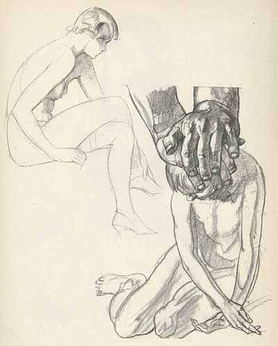
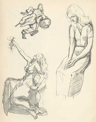
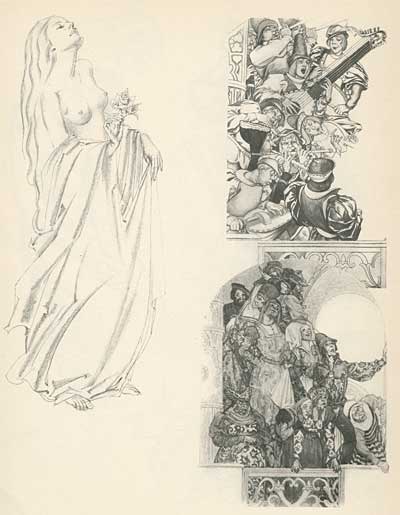
Willy Pogany was a children’s book illustrator who specialized in fantasy subjects. At the end of the book, after the lessons, he presents a selection of his work sketches. Pogany was particularly eloquent, with a huge library of shapes and forms in his head. He also had an amazing sense of balance- making the fantastic seem real. This is truly great draftsmanship.

Pogany's Drawing Lessons

Drawing is a language, and it requires building a vocabulary to be eloquent. Students should carry a sketchbook with them wherever they go and draw everything they see- from people’s heads in a late night coffee shop to fireplugs on the street. Everything you draw becomes part of your dictionary of imagery in the future.

Pogany’s classic drawing lessons are still in print under the title, “The Art of Drawing”. Pick up a copy at Amazon for your reference library.

Stephen Worth
Director
Animation Resources

INSTRUCTIONINSTRUCTION

This posting is part of an online series of articles dealing with Instruction.

IllustrationIllustration

This posting is part of a series of articles comprising an online exhibit spotlighting Illustration.

FacebooktwitterredditpinterestlinkedinmailFacebooktwitterredditpinterestlinkedinmailby feather