Archive for the ‘illustrtation’ Category

Monday, September 23rd, 2024

Theory: WWI and WWII Propaganda

Propaganda Posters

Back when I was in college, I was wandering through a junk shop and found a file folder that was stamped "Return To Louis Van Den Ecker, Technical Director". I peeked inside and found a pile of interesting clippings. It was a reference file dealing with propaganda posters from the First and Second World Wars. I bought the folder and brought it home and did some research on Louis Van Den Ecker. He turned out to have been an expert employed by the studios to insure that their depiction of particular times and places were accurate. He worked on the 1939 version of Hunchback of Notre Dame, Beau Geste, Adventures of Robin Hood, The Three Musketeers and The Count of Monte Cristo among many other films. I assembled his clippings into a logical order and mounted them into a scrapbook. Today, we scanned this book for our archive database.
Propaganda Posters

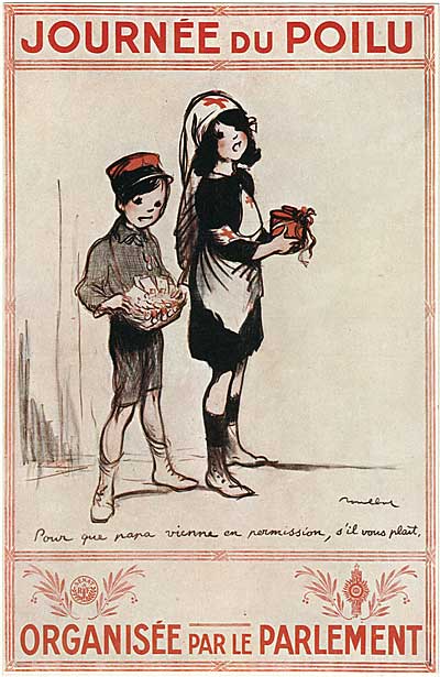
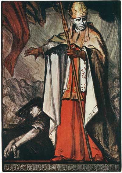
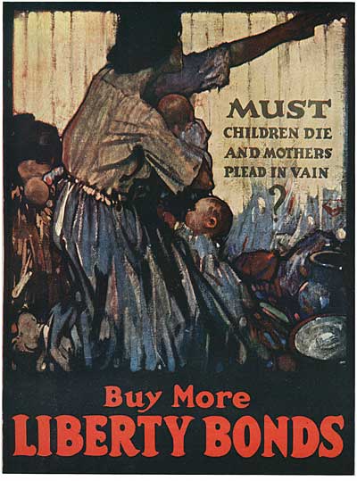
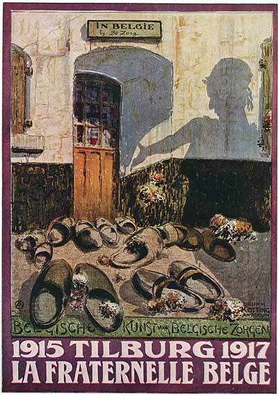
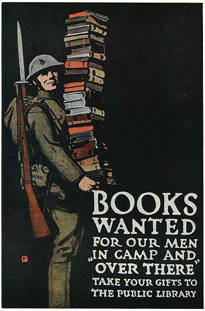
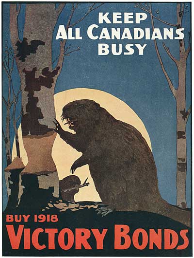
The concept of propaganda is widely misunderstood. Many people automatically assume that it’s a negative thing. But propaganda is just a tool that can be used for either good or bad. Propaganda involves bypassing the intellect and appealing directly to emotion to motivate a group of people to action. During the World Wars, time was of the essence and masses of people needed to work together for the common goal of defending the nation. It would have been too slow to talk each and every move out with the whole population, so governments used powerful imagery to bring everyone together in the war effort.
Propaganda Posters

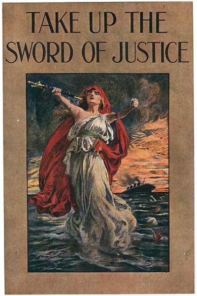
I’m not sure if it’s just the bias of this particular collection, or if it was actually the case during WWI, but looking at these examples, one can see how inept the Germans were at using propaganda. The German posters in this collection seem to appeal to abstract concepts like national pride, flags and mythology; while the Allied propaganda goes straight for the heart with concepts like motherhood, security, and moral outrage. Look at the example above. The figure in the foreground represents the outrage of the nation at the sight of a sinking ocean liner and a sailor’s hand rising from the surf begging for help. Even after nearly a century, the powerful imagery still makes its point.
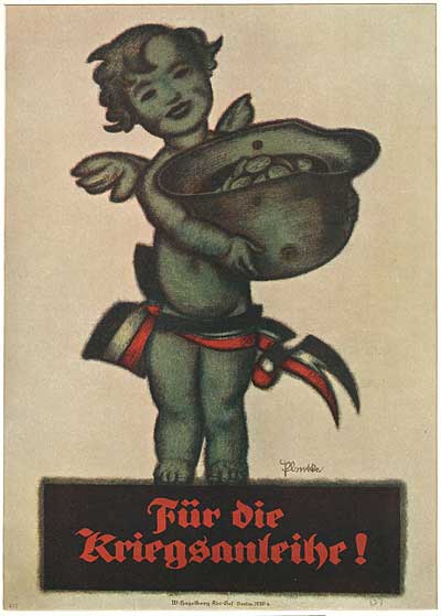
Propaganda Posters

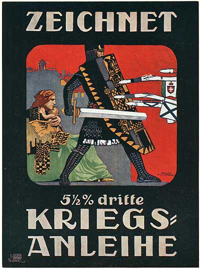
Contrast that impact with the poster above… Abstract concepts are stacked up on top of each other… It’s not a baby… it’s a statue of a baby. And it isn’t even a statue of a baby, it’s a statue of a cherub. There is no eye contact, just empty eye sockets. The emotional impact of the bullet hole in the helmet is totally negated by its similarity to the baby’s belly button! It’s hard to imagine this image motivating anyone to give money to the cause.
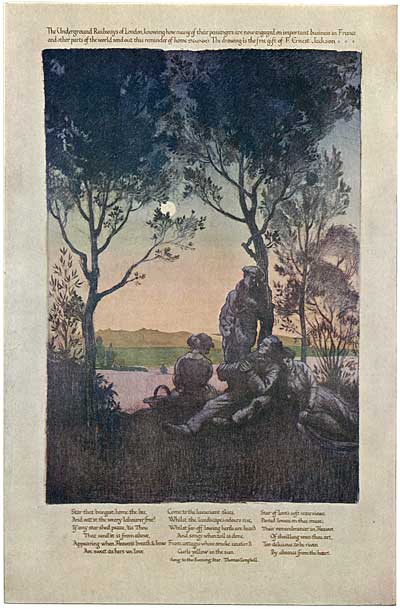
Propaganda Posters

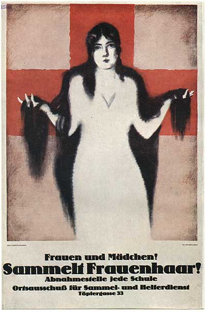
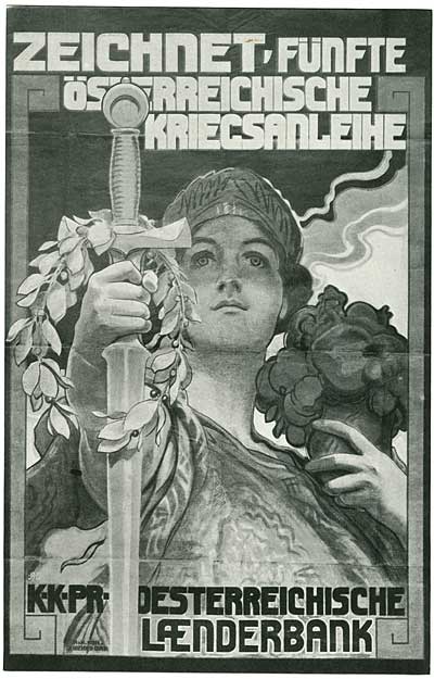
Early examples, like the one above, were created by renowned artists, and the subjects required close inspection, reflection and thought to grasp.

As time went by, the images became more graphic and direct…
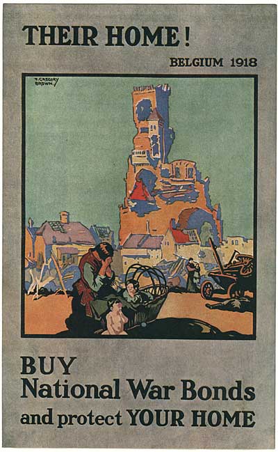
Propaganda Posters

Sketches of children orphaned by the war were potent images…
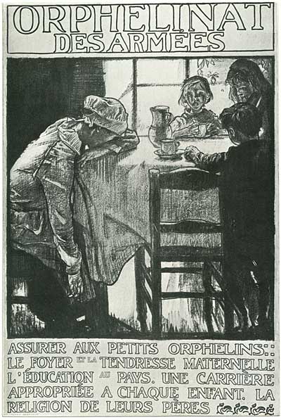
Propaganda Posters
Propaganda Posters

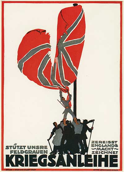
National and religious symbols seem to be much less effective, even when they are more interesting from an artistic standpoint…
Propaganda Posters
Propaganda Posters
Propaganda Posters

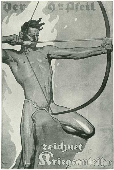
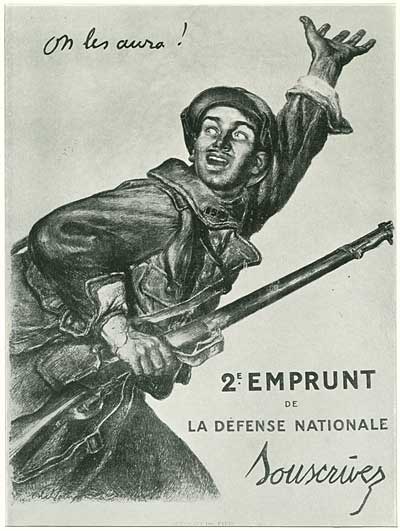
These next two are interesting because they show how the two sides saw themselves. The German soldier is idealized in a kitsch way, while the French soldier seems more real and down to earth…
Propaganda Posters
Propaganda Posters

Which side would you rather be on?

Propaganda Posters
Propaganda Posters
Propaganda Posters
Propaganda Posters

When the nations of the world entered into World War I, the methods and techniques of propaganda were naiive and innocent. But by the end of the First World War, the techniques of waging war in the hearts and minds of the public had entered the modern era. Propaganda had become much more sophisticated and powerful.
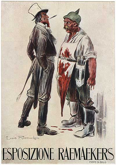
Propaganda Posters

The rapid growth in the sophistication and effectiveness of propaganda during WWI was largely due to the work of one man… a man who went from spending his life as a quiet landscape painter to being the most powerful cartoonist of his day, Louis Raemakers. His story is a fascinating one, and you can read about it and see examples of his work on our article titled…

Louis Raemaekers- The Cartoonist Who Helped Win The First World War
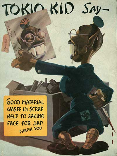
Propaganda Posters

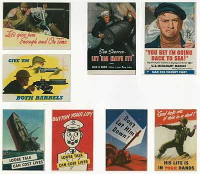
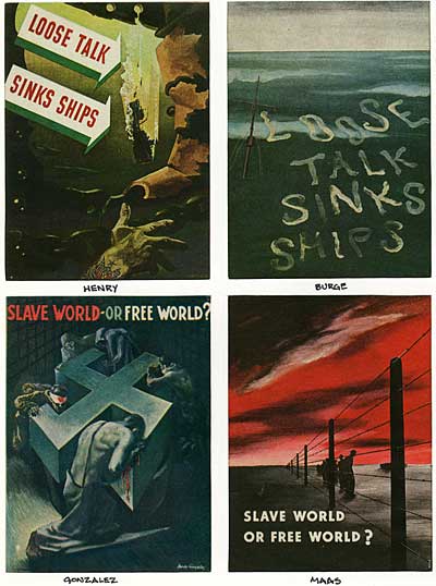
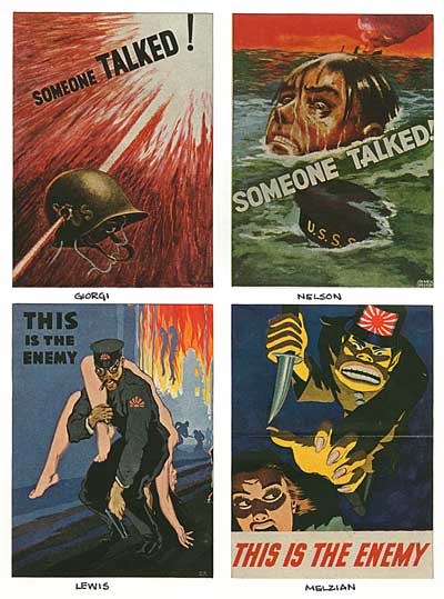
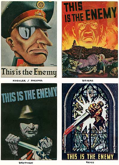
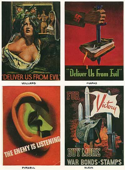
By WWII, leaders realized that battles could be fought and won on the homefront. Propaganda became an important part of motivating the population to work together toward the common goal of defeating the axis powers. Compare the WWI posters in this and the previous post to the examples from WWII presented here. Notice how the design and layout enhance the emotional impact of the concepts. Many of these posters still pack a wallop.
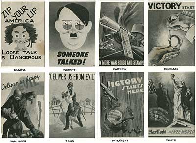
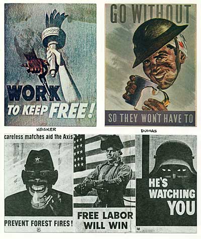
Propaganda Posters
Propaganda Posters
Propaganda Posters
Propaganda Posters
Propaganda Posters
Propaganda Posters
Propaganda Posters

For more on this subject, see Alfred and Elizabeth Briant Lee’s excellent book The Fine Art of Propaganda: A Study of Father Coughlin’s Speeches 1938.

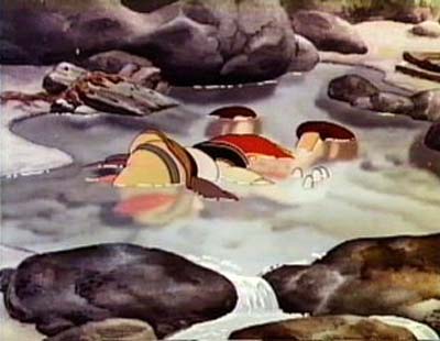
Now you may be asking yourself, what does propaganda have to do with animation? Well… Think for a moment about the definition of propaganda, "bypassing the intellect and motivating an audience through a direct appeal to emotion" and then think about this image from an animated film I’m sure you’re familiar with…
Pinocchio

Can you think of any other plot devices used in animated features that operate on this direct level?

Stephen Worth
Director
Animation Resources

TheoryTheory

This posting is part of a series of articles comprising an online exhibit entitled Theory.

IllustrationIllustration

This posting is part of a series of articles comprising an online exhibit spotlighting Illustration.

THIS IS JUST THE TIP OF THE ICEBERG!

Animation Resources has been sharing treasures from the Animation Archive with its members for over a decade. Every other month, our members get access to a downloadable Reference Pack, full of information, inspiration and animation. The RefPacks consist of e-books jam packed with high resolution scans of great art, still framable animated films from around the world, documentaries, podcasts, seminars and MORE! The best part is that all of this material has been selected and curated by our Board of professionals to aid you in your self study. Our goal is to help you be a greater artist. Why wouldn’t you want to be a member of a group like that?

Membership comes in three levels. General Members get access to a bi-monthly Reference Pack as well as a Bonus RefPack from past offerings in the in-between months. We offer a discounted Student Membership for full time students and educators. And if you want to try out being a member, there is a Quarterly Membership that runs for three months.


JOIN TODAY!
https://animationresources.org/membership/levels/

FREE SAMPLES!

Not Convinced Yet? Check out this SAMPLE REFERENCE PACK! It will give you a taste of what Animation Resources members get to download every other month! That’s 560 pages of great high resolution images and nearly an hour of rare animation available to everyone to download for FREE! https://animationresources.org/join-us-sample-reference-pack/

Sample RefPack

PayPalAnimationAnimation Resources depends on your contributions to support its projects. Even if you can’t afford to join our group right now, please click the button below to donate whatever you can afford using PayPal.


FacebooktwitterredditpinterestlinkedinmailFacebooktwitterredditpinterestlinkedinmailby feather

Tuesday, December 19th, 2023

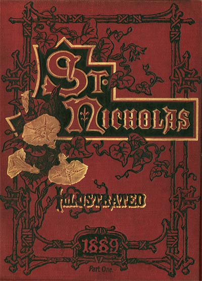
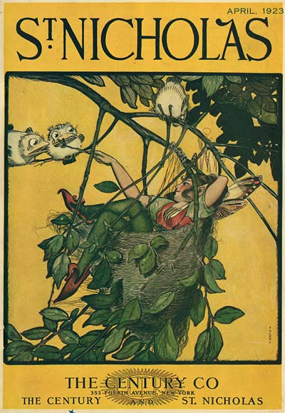
Magazine Cartoons: Reginald Birch and St Nicholas Magazine

St Nicholas Magazine Reginald Birch

A MAGAZINE FOR CHILDREN

In 1872, Scribner’s began publishing St Nicholas Magazine, a sister publication to The Century aimed at an audience between the ages of 5 and 18. As Linda Young points out in her excellent article on St Nicholas, in the late 19th and early 20th century, there was no real distinction between young children and teenagers. Children were considered children until they married or went away to college. Features "For The Little Folk" ran in St Nicholas side by side with articles on natural history or science intended for older readers. When it came to fiction, the subjects ranged from adventure stories about far-away lands to fairy tales and historical romance. St Nicholas was the premiere magazine of its type, and although it was aimed at children, it counted many adults among its readership.

St Nicholas Magazine Reginald Birch

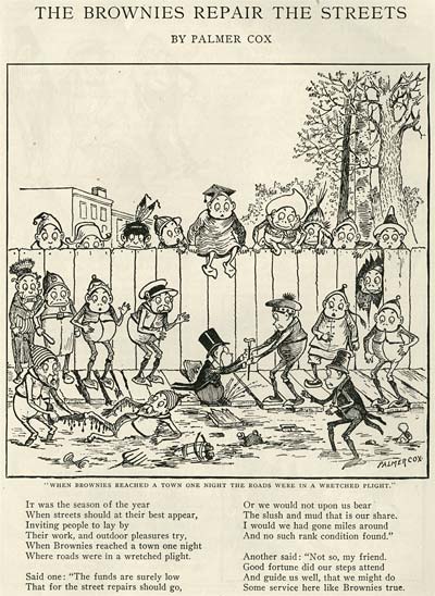
But the main reason why we’re interested in St Nicholas is the illustrations. Scribner’s had access to many of the best artists of the day… Arthur Rackham, Harrison Cady, Maxfield Parrish, Willy Pogany, Charles Dana Gibson, Palmer Cox and Howard Pyle, among many others. But no artist was as closely associated with the look of St Nicholas as Reginald Birch.

St Nicholas Magazine Reginald BirchSt Nicholas Magazine Reginald BirchReginald Birch was born in 1856 in London, England. At the age of 14, he relocated to San Francisco, CA where he prepared wood block theater posters in his father’s shop. In 1873, Birch attended the Royal Academy in Munich and upon his return to America, he settled in as an illustrator in New York City.

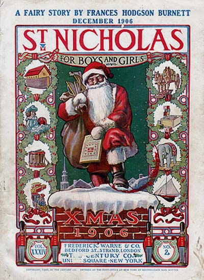
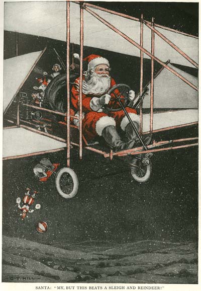
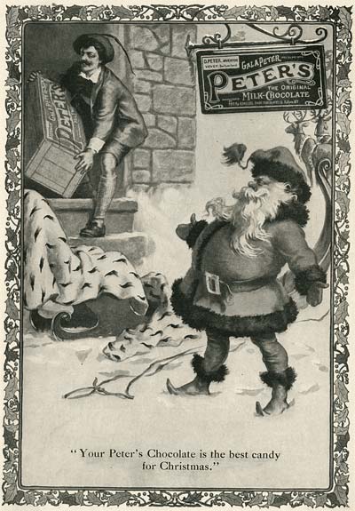
Today, Birch may be forgotten, but his contribution to our American cultural identity certainly isn’t. At St Nicholas Magazine Birch took the character of Santa Claus, created by Thomas Nast in the 1862 Christmas Issue of Harper’s Weekly, and refined it into the jolly bearded character in the red suit that we all think of today.

St Nicholas Magazine Reginald Birch

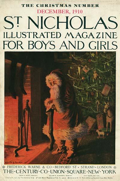
1906 Christmas cover by Reginald Birch

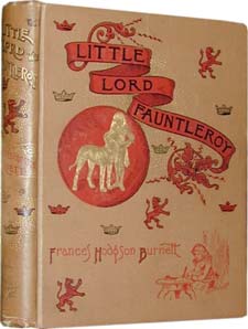
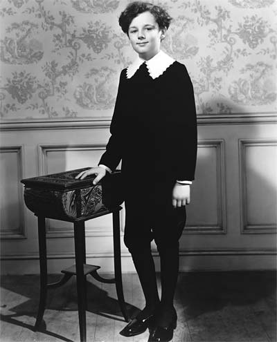
Little Lord Fauntleroy Reginald BirchSt Nicholas Magazine Reginald BirchReginald Birch illustrated a wide variety of poems and stories for St Nicholas, but perhaps the most famous was Frances Hodgson Burnett’s "Little Lord Fauntleroy". Following Burnett’s vivid description, Birch created the iconic image of the precocious little boy in curls wearing a black velvet suit with lace collar. This image became the basis for the character Buster Brown, and was widely lampooned in parodies casting Burnett’s wunderkind as a spoiled brat or monster child, like Eddie Munster. The image of the enfant terrible in the Buster Brown outfit has entered our cultural subconscious to the point where most of us don’t even realize where it came from… but it came from Reginald Birch.

Little Lord Fauntleroy

Freddie Bartholomew as Little Lord Fauntleroy

By the beginning of World War I, Birch’s Victorian pen and ink style was beginning to look dated. Demand for his services began to decline, and by 1930, he was penniless. He enjoyed an "Indian Summer" as a book illustrator in the late 30s until his failing eyesight forced him to retire in 1941. He passed away in 1943.

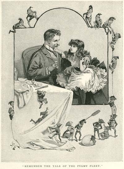
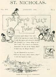
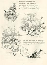
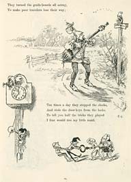
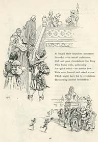
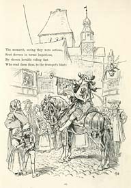
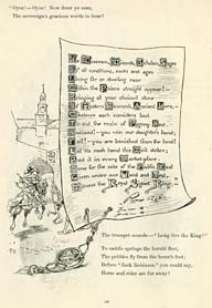
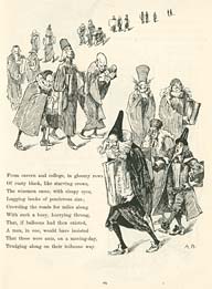
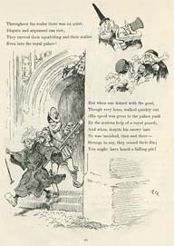
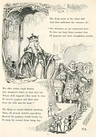
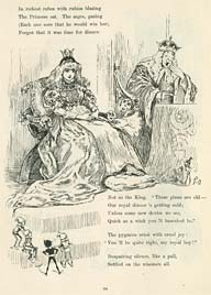
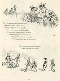
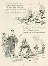
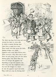
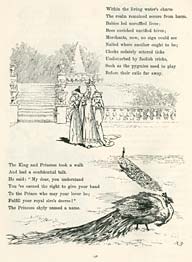
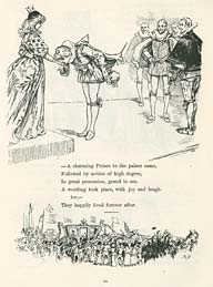
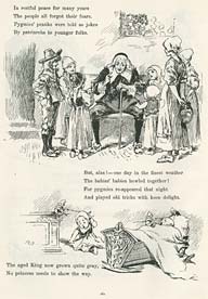
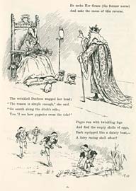
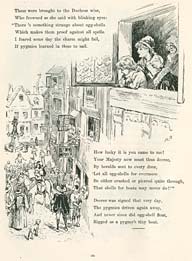
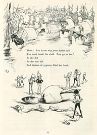
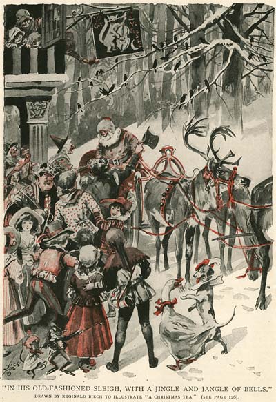
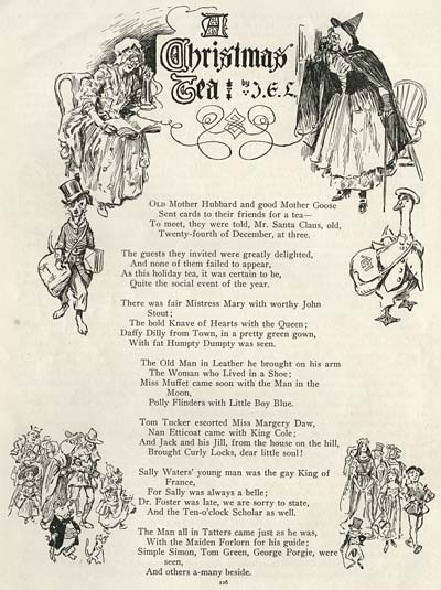
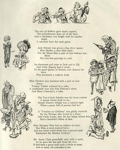
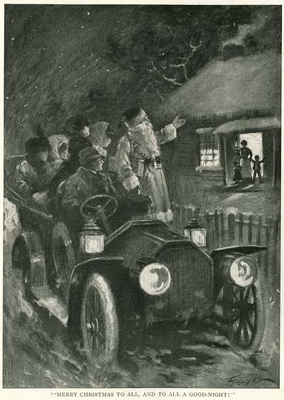
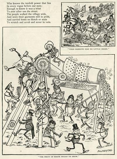
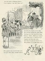
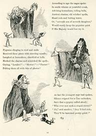
Here is a fantastic story written by St Nicholas editor, Tudor Jenks and illustrated in the distinctive style by Reginald Birch. Notice how Birch juggles the text in the layouts, his superb draughtsmanship and control of perspective, and the expressive posing of his characters.

St Nicholas Magazine Reginald Birch
St Nicholas Magazine Reginald BirchSt Nicholas Magazine Reginald Birch

A SELECTION OF IMAGES FROM
THE CHRISTMAS, 1910 ISSUE

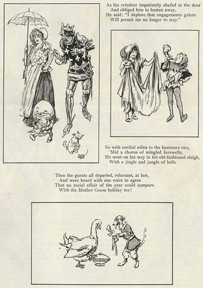
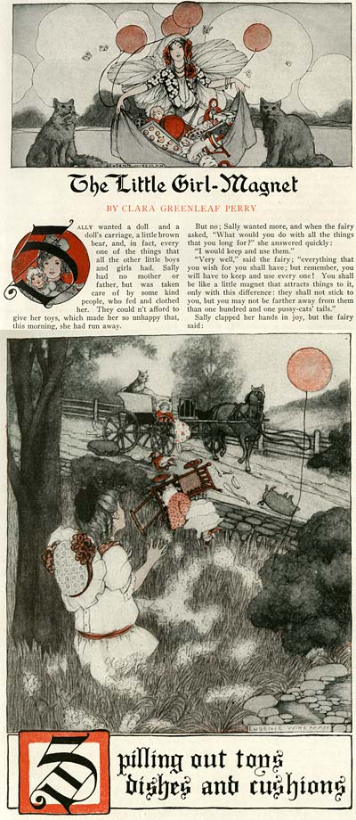
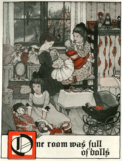
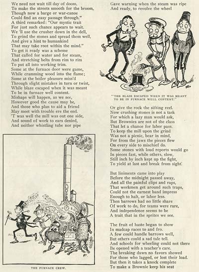
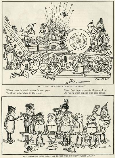
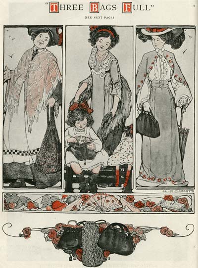
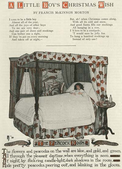
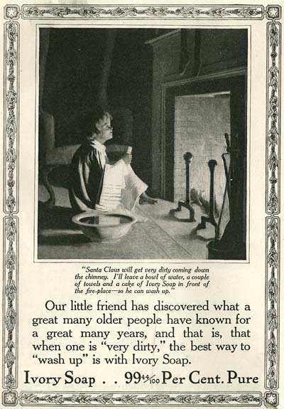
To finish out this post, here is a sampling of the sort of illustration and cartooning that filled the pages of a typical issue of St. Nicholas Magazine.

St Nicholas Magazine December 1910

Stephen Worth
Director
Animation Resources

Magazine CartoonsMagazine Cartoons

This posting is part of the online Encyclopedia of Cartooning under the subject heading, Magazine Cartoons.
IllustrationIllustration

This posting is part of a series of articles comprising an online exhibit spotlighting Illustration.

FacebooktwitterredditpinterestlinkedinmailFacebooktwitterredditpinterestlinkedinmailby feather

Friday, September 30th, 2022

Illustration: Gustaf Tenggren and the Genesis of the Golden Book Style

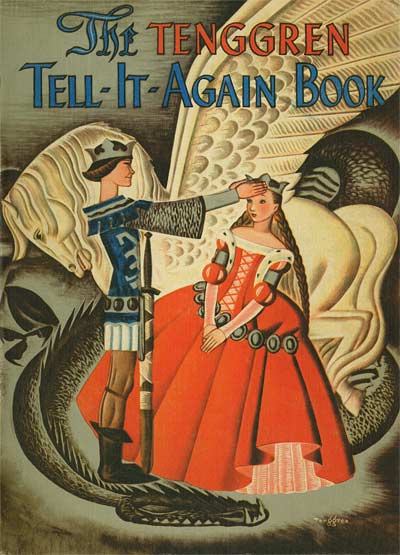
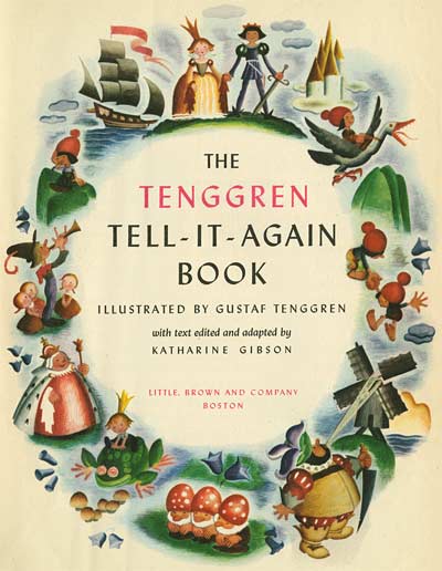
Gustaf Tenggren Tell It Again Book

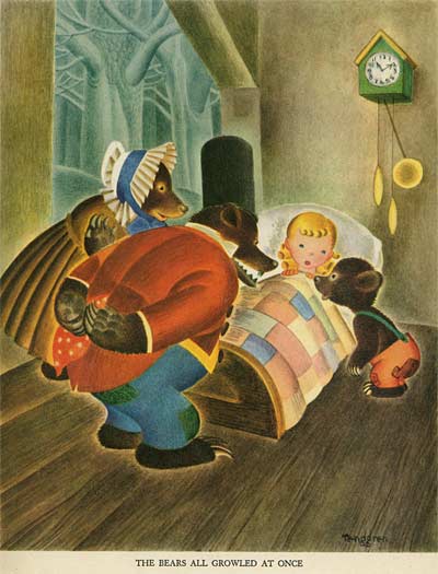
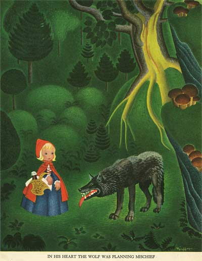
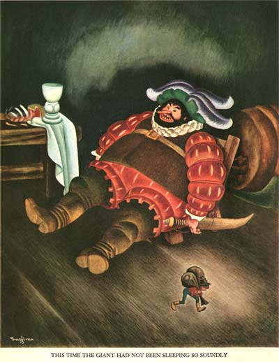
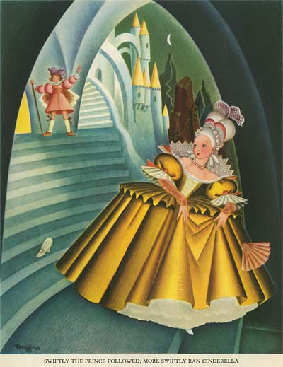
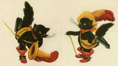
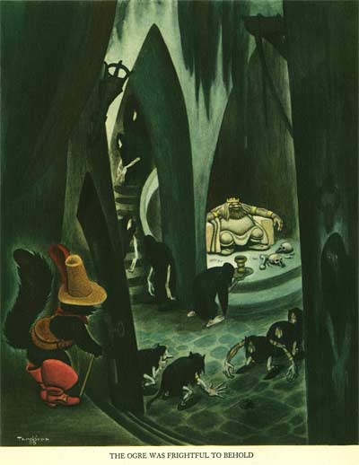
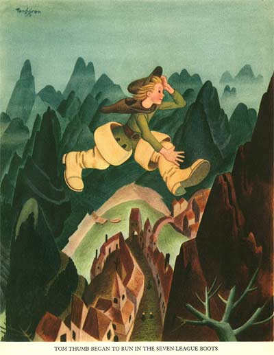
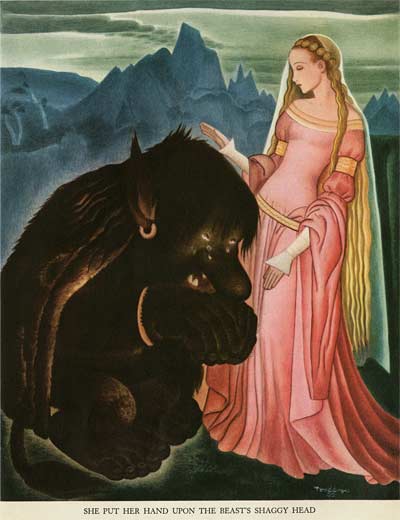
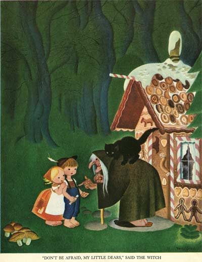
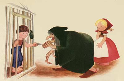
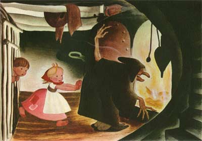
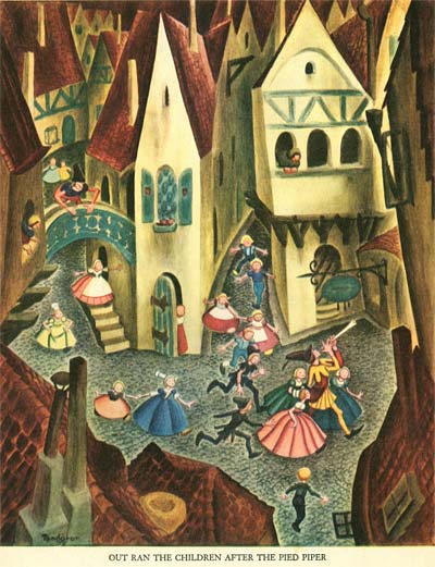
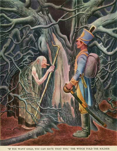
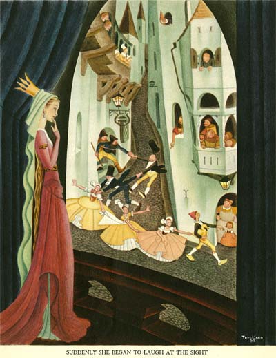
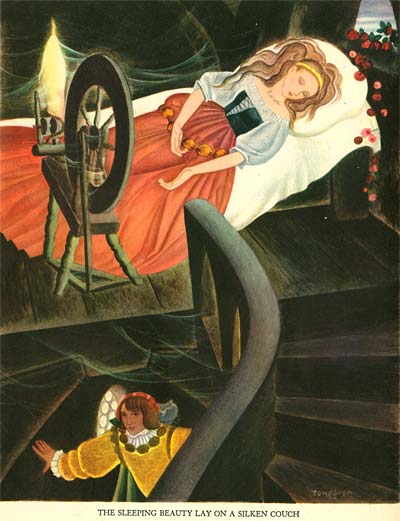
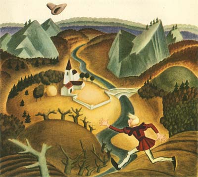
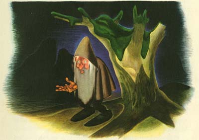
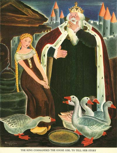
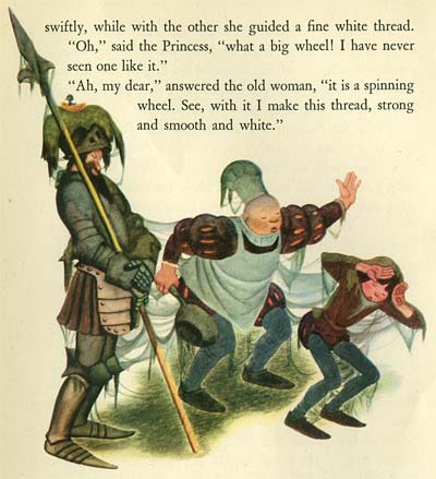
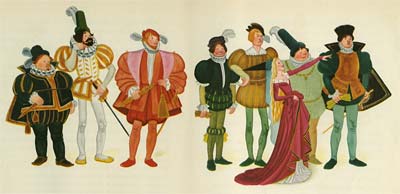
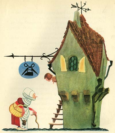
Gustaf Tenggren Tell It Again BookGustaf Tenggren Tell It Again BookIn the twenties, Gustav Tenggren had been paid handsomely for his work. At Disney, his position guaranteed steady work. But the wartime economy changed all that. Publishers were no longer able to pay him to work a week or more on a single painting and jobs were scarce. He was forced to simplify his style.

While at Disney, Tenggren chaffed under the bit of anonymity. It’s said that Walt instructed his artists, "If you’re going to sign a name to your artwork, spell it ‘Walt Disney’." But Tenggren defiantly maintained his individuality, signing many of his key paintings for Pinocchio. He left the studio under unhappy circumstances, and was bitter about the whole episode. But he had learned one thing from Walt… the power of branding one’s self.

Gustaf Tenggren Tell It Again Book

Gustaf Tenggren Tell It Again BookGustaf Tenggren Tell It Again BookTenggren resolved that he would never again waste his skills building a reputation for someone else. He boldly built his name into the masthead of his first major publication after leaving Disney. No longer was it Andersen’s Fairy Tales or Tales By The Brothers Grimm… It was The Tenggren Tell-It-Again Book. This led to a series of self-titled books sprinkled throughout his career… Tenggren’s Story Book, Tenggren’s Jack & The Beanstalk, Tenggren’s Bedtime Stories, Tenggren’s Farm Stories, and many others.

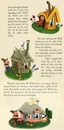
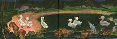
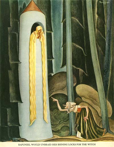
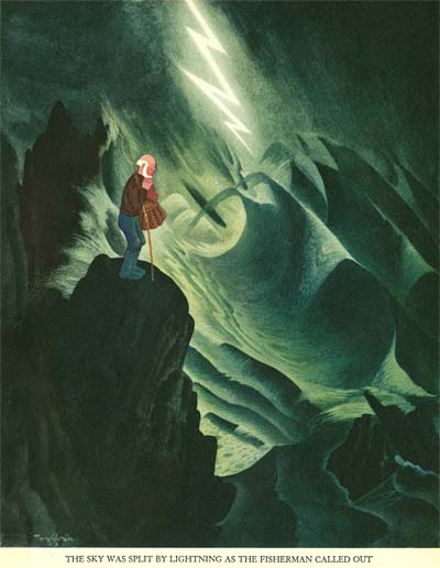
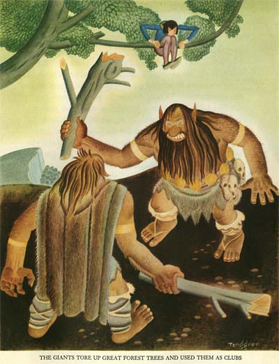
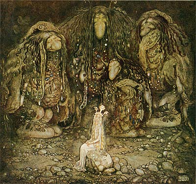
This particular book is amazing, because it shows Tenggen’s thought process and refinement gelling into what would become the classic "Golden Book style". (Click on the Three Little Pigs images above for a vivid example.) He simplifies by going back to his roots… combining the character designs of his mentor John Bauer with the colored pencil and watercolor style of his successor on the Bland Tomtar Och Troll series, Einar Norelius. It’s fascinating to compare this new streamlined style with the techniques of traditional golden age illustration. See how Tenggren has distilled the essence of the earlier attempts into a clear and simple presentation that still has plenty of beauty and balance.

Gustaf Tenggren Tell It Again Book

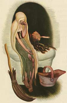
For inspiration, Tenggen goes all the way back to his roots… the work of his mentor, John Bauer. Here is one of Tenggren’s illustrations…

Gustaf Tenggren Tell It Again Book

And here is one by Bauer from the Swedish Christmas annual, Bland Tomtar Och Troll

John Bauer

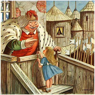
He also appears to be familiar with the work of his successor on the Bland Tomtar Och Troll series, Einar Norelius. Here is Tenggren…

Gustaf Tenggren Tell It Again Book

And here is Norelius…

Einar Norelius

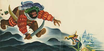
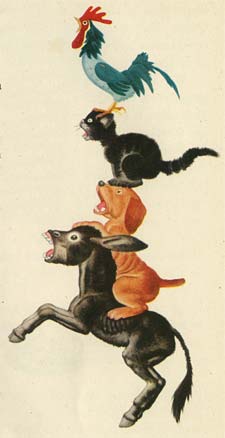
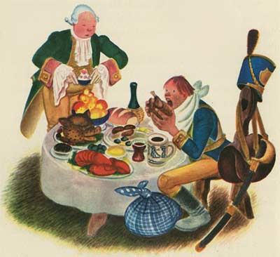
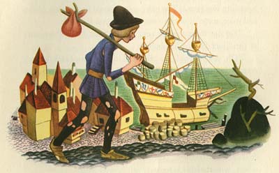
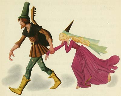
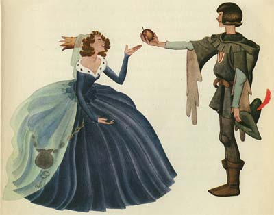
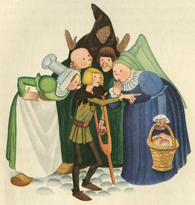
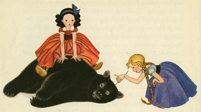
Gustaf Tenggren Tell It Again BookGustaf Tenggren Tell It Again BookBut halfway through Tenggren’s Tell It Again Book comes a huge breakthrough in design. Instead of the full page plates, Tenggren begins to float his characters over the white of the page, wrapping the text around the compositions. Background elements are reduced to small islands on the page, rather than extending out to the edges of a square bounding box. When I first got this book, I wondered why Tenggren had changed format halfway through. Clearly one reason was to save time and streamline the work of producing so many illustrations for a single book. But there was an aesthetic precedent to it as well. The answer has been hanging on my bedroom wall since I was a little boy!
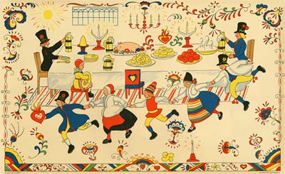
Like Tenggren, my Grandmother was Swedish. In the early 1920s, she took my father to Sweden to visit his Grandparents. It was the only time he was able to meet them, since he lived in Peterborough, Canada, a very long sea voyage away from their farm in Goteborg, Sweden. My great grandparents gave my father a gift to take home with him to remind him of the visit- this Swedish folk art picture…
Gustaf Tenggren Tell It Again Book

When I was born, my father gave it to me to hang in my bedroom, and it’s been there ever since. Notice the similarity between the forward pitched perspective, the staging of the characters in clear profile silhouettes, and the simple rendering of the figures over the white of the paper on this print and the Tenggren illustrations that follow…

Gustaf Tenggren Tell It Again Book

Gustaf Tenggren Tell It Again BookGustaf Tenggren Tell It Again BookTenggren had discovered a way to simplify and refine his illustrations even further. Instead of busy backgrounds full of details, he used just enough information to place the characters, and focused his attention on composing the figures. Immediately after publishing this book, Tenggren produced The Poky Little Puppy, the book that was the model for the hundreds of Little Golden Books that followed over the next seventy years. By going back to his roots and synthesizing his Swedish cultural upbringing, Tenggren invented a style that now seems to us to be quintessentially American.

This is a perfect example of how immigrant artists of all kinds suited their artistic voice to their new lives in the United States in the first half of the 20th century. Carlo Vinci’s Italian heritage resulted in a superhero mouse who sang opera. Bill Tytla’s Eastern European roots helped him summon a devil in Fantasia. And Milt Gross’ Jewish upbringing expressed itself in comic celebrations of the ethnic vitality of New York City.

The melting pot of American culture sure is rich with cartoons!

Stephen Worth
Director
Animation Resources

IllustrationIllustration

This posting is part of a series of articles comprising an online exhibit spotlighting Illustration.

FacebooktwitterredditpinterestlinkedinmailFacebooktwitterredditpinterestlinkedinmailby feather