Archive for the ‘theory’ Category

Tuesday, October 3rd, 2023

Art Education: The Dreyfus Model

Hello everyone I’m Taber, Vice President of Animation Resources. I’m going to be making a series of posts focused on the more academic side of artistic instruction and learning in general. This sort of information can be helpful to both teachers and students as you push yourself to improve and practice your discipline.
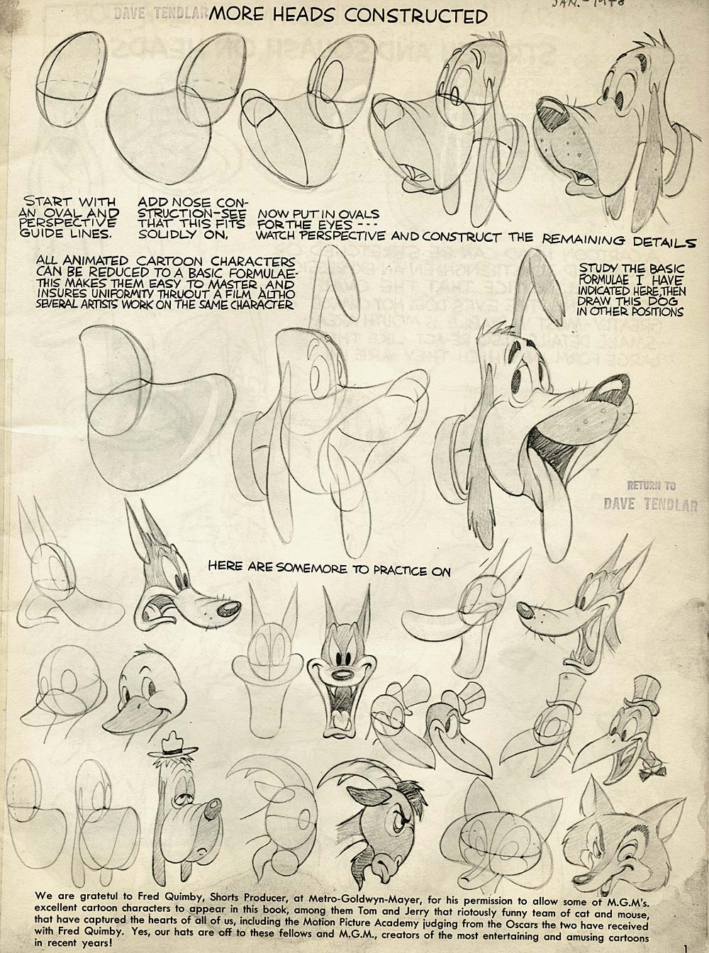
Preston Blair instruction

As a beginning artist it can often be difficult to objectively judge your own progress or the quality of your own work. Being able to place yourself in an accurate position of skillfulness can help you to recognize your past growth and current deficiencies so you can better target areas for improvement. But what if you can’t tell exactly what the differences are between your work and the work of more highly skilled artists?

The Dreyfus model focuses on work practices and approaches as a measure of skill acquisition. This can be helpful to both students and instructors as it tends to be entirely non-judgmental and easy to identify objectively. The model uses four qualities to determine work habits:

  • Recollection (non-situational or situational)
  • Recognition (decomposed or holistic)
  • Decision (analytical or intuitive)
  • Awareness (monitoring or absorbed)

These attributes stack one at a time to provide a framework for evaluation:

dreyfus_chart

(click image to enlarge)

For an accurate measurement, ask yourself these questions regarding the above attributes. Because some of these attributes can flip between a more advanced and a less advanced state, I recommend relying on the lower state. For an example if you were trying to decide if you are an intuitive decision maker, or a rational decision maker but you do both part of the time, put yourself down as rational as a rule of thumb.

  1. When you recall knowledge about the subject, is it always in a related context with other information, or is it sometimes rote memorization?
  2. While thinking about an aspect of the subject, can you clearly distinguish between relevant and irrelevant aspects of the work, or is it sometimes difficult to tell what’s important?
  3. When planning your own work, do you need to carefully and analytically lay out the steps beforehand or can you see the entire project as a whole task?
  4. When making decisions in your work, do you have to do any problem solving, or do the answers come to you intuitively, without effort most of the time?

Once you’ve answered these four questions, find the lowest tier which corresponds to your answers, even if you choose an attribute from a higher tier. Read the Needs column from the above chart and try to focus your learning on the types of practice listed in that section. Don’t cheat yourself by practicing projects which are too complex or unstructured! That sort of practice is really only for very highly skillful artists.

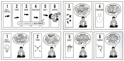
This system is similar to the surface to core concept illustrated by Scott McCloud in his book Understanding Comics which I highly recommend! In the book, McCloud describes how a person who is initially drawn to be a fan of an art-form must undertake a journey to the core of that medium before being able to master and thus give back to that medium.mccloud_understanding_comics

Additionally, this same artist’s journey from surface to core is echoed in much of the advice and instructional material given to artists throughout time, from Zim to Richard Williams. In essence, this is what an “old masters” approach is. This struggle is ultimately the best way to gain skill in an artistic medium, however it is difficult and it does take time.

“Nobody tells this to people who are beginners, I wish someone told me. All of us who do creative work, we get into it because we have good taste. But there is this gap. For the first couple years you make stuff, it’s just not that good. It’s trying to be good, it has potential, but it’s not. But your taste, the thing that got you into the game, is still killer. And your taste is why your work disappoints you. A lot of people never get past this phase, they quit. Most people I know who do interesting, creative work went through years of this. We know our work doesn’t have this special thing that we want it to have. We all go through this. And if you are just starting out or you are still in this phase, you gotta know its normal and the most important thing you can do is do a lot of work. Put yourself on a deadline so that every week you will finish one story. It is only by going through a volume of work that you will close that gap, and your work will be as good as your ambitions. And I took longer to figure out how to do this than anyone I’ve ever met. It’s gonna take awhile. It’s normal to take awhile. You’ve just gotta fight your way through.” -Ira Glass

I have some personal theories about the types of artistic practice activities which benefit artists the most when trying to improve aspects of their work, and I’ll be talking about that next time!


Right now, it’s Back To School time at Animation Resources, and for the next two weeks we will be sharing reasons why students and educators should be a member of our important project. There is no better way to feed your creativity than to be a member of Animation Resources. Every other month, we share a Reference Pack that is chock full of downloadable e-books and still framable videos designed to expand your horizons and blow your mind. It’s easy to join. Just click on this link and you can sign up right now online…


JOIN TODAY!
https://animationresources.org/membership/levels/

FREE SAMPLES!
https://animationresources.org/join-us-sample-reference-pack/

Not Convinced Yet? Check out this SAMPLE REFERENCE PACK! It will give you a taste of what Animation Resources members get to download every other month!

Sample RefPack

FacebooktwitterredditpinterestlinkedinmailFacebooktwitterredditpinterestlinkedinmailby feather

Thursday, September 21st, 2023

Theory: Leopold Stokowski- Artist of the Past, Artist of the Future

Leopold Stokowski

GLENN GOULD ON STOKOWSKI

Glenn Gould was one of the foremost pianists of the 20th century. Best known for his interpretations of Bach, Gould hosted a series of radio programs for the Canadian Broadcasting Company. This article comes from a program by Gould on Leopold Stokowski.

Glenn Gould

When I was a teenager back in the 40s, Leopold Stokowski shared for some years the podium of the New York Philharmonic. His co-director was the late Dimitri Mitropoulis and together they contributed to that memorable Sunday afternoon series on CBS radio, which was one of the few redeeming features of American broadcasting in the years after World War II. Running opposite the Stokowski/Metropoulis programs on CBS was NBC’s entry in the symphonic sweepstakes, a series featuring the orchestra which bore the network’s name, which was created for and conducted by Arturo Toscanini.

Arturo ToscaniniArturo ToscaniniThe attitude of the young people of my generation toward these weekend music specials was rather interesting. It was generally bandied about by my conservatory friends that you were either a Stokowski fan or a Toscanini devotee. There was apparently no middle ground, except perhaps that which was occasionally occupied by Bruno Walter. According to the academic banter of that time, Toscanini embodied most progressive musical virtues. His performances were direct, straightforward and emotionally objective. Whichever notes, dynamic marks or tempo indications appeared before him in the score were, to the best of his and the NBC Orchestra’s ability, what you heard. For Toscanini, the composer’s notational suggestions were gospel.

YouTube: Toscanini conducts the overture to
La Forza del Destino (Verdi) 1944

Not so with Stokowski. He was and is, for want of a better word, an ecstatic. Stokowski is involved with the notes, the tempo marks, the dynamic indications in the score to the same extent that a filmmaker is involved with the original book or source which supplies the impetus- the idea of his film. So, Stokowski’s performances either stand or fall depending on the degree he can infuse them with a sense of his own commitment to the project. And happily for those who became addicted to his way of making music, there’s rarely been a more committed, more imaginative, more resourceful artist than Leopold Stokowski.

Leopold Stokowski conducts the second movement from
Tchaikovsky’s 5th Symphony (Carnegie Hall/1947) at YouTube

There was however another reason for the disrepute into which Mr. Stokowski’s interperative techniques had fallen in those years, besides that penchant for a neo-literalist performing style which the young people of my generation espoused. He was not only a popularizer- a man who thought nothing of transforming the keyboard works of Bach into massive orchestral statements. But more than that, he was a film personality. In the mid-1930s, he’d relinquished his post as the conductor of the Philadelphia Orchestra, in which he single-handedly transformed the standards of orchestral playing in North America, in order to join Deanna Durbin and Donald Duck on the silver screen in Hollywood.


Stokowski from “Big Broadcast of 1937” at YouTube

“I go to a higher calling.” he was reported to have said to the press conference which was called to announce his departure, and if one can filter out the inevitable quotient of defensiveness which one may assume to infiltrate a remark of that kind, it was a remarkably revealing comment.

Leopold Stokowski

Technology for Stokowski was a higher calling. He was indeed the first great musician to realize that the future of music would inexorably wound up with technological progress, and that communications media were in fact the best friend that music ever had. Many of his recordings… and all of which I know from personal experience where he maintains a firm hand in relation to the processes of production… were years ahead sonically.

But the real benefit of his interest in technology, I think, was that it enabled Stokowski to resist the inhibitions induced by those pre-technological attitudes toward music-making which created the stratified roles of performer, listener and composer; and which held that those roles would ever remain separate and distinct. For Stokowski, I think, those distinctions are themselves are the single greatest danger that the artist must face. And I suspect that the enormous appeal of his music-making over the last sixty years or so is precisely his realization of that fact, and his willingness to act upon the assumptions that follow from it.


Bach’s “Passacaglia & Fugue in C minor” at YouTube

Stokowski is 88 now, at least he was when I interviewed him for this program. Nothing in his manner, his outlook or the vitality of his music-making suggests the incipient nonagenarian, but it’s perhaps useful to recall that Stokowski was born while Wagner was still alive, and when Brahms died, Stokowski himself was already a teenager.

In theory, his outlook and his art should represent the aesthetic attitudes of a bygone era, or eras. But in fact, because of his extraordinary warmth and humility, his remarkable receptivity to new ideas, and above all because in his lifetime we’ve already seen nothing but triumph. But the essential humanity of those technological ideas which have informed all of his work as a musician, Leopold Stokowski is very much a man of the future.

-Glenn Gould

Playlist of the entire Stokowski radio program at YouTube


CONDUCTING MUSIC AND DIRECTING ANIMATION

So, what is the connection to animation, you might ask… Well the obvious link is the fact that Walt Disney and Leopold Stokowski collaborated on Fantasia.

Leopold Stokowski and Walt Disney

But it goes deeper than that. Stokowski shared certain creative instincts with some prominent animators. For instance, In the space of a little more than a decade, Stokowski built the Philadelphia Orchestra up from scratch until it was the preeminent orchestra in the United States. He employed the latest technology to bring the highest possible production value to his recordings. After he had reached the peak of popularity, he turned his attention to bring his music-making to a whole new media. He embraced motion pictures, radio broadcasts and television programs as a means to present his music in an entirely new way to the broadest audience possible.

Walt Disney

Walt Disney pressed his artistic staff to improve and develop new techniques for the art of animation, making huge strides between “Steamboat Willie” and “Snow White”. He employed Technicolor, the multiplane camera and live action/animation compositing to advance the tools available to his artists, which set his films apart from his competition on a technical level. After he had conquered the medium of the cartoon short with Mickey Mouse, he turned his attention to creating the first hand drawn animated feature. And when that was established, he turned to live action films, television and theme parks to take his ideas to new mediums. He succeeded in reaching the entire world with his creations.
Arturo Toscanini

In the article above, Glenn Gould touches on the differences between Arturo Toscanini and Stokowski. Toscanini was a disciplined conductor who demanded and got complete control. He unified a group of over 80 musicians into a single mind, expressing the will of Toscanini. This resulted in performances of incredible directness and power. Toscanini’s aesthetic choices were consistent and were handed down as the law through the regimented beat of his baton.

Leopold Stokowski

In contrast, Stokowski was more of a magician, evoking a unique performance out of each and every musician in his orchestra. Instead of deciding on a plan of attack in advance and executing it with precision, Stokowski allowed for the inspiration of the moment to guide him. He was constantly experimenting and evolving as an artist. His carefully modulated hand gestures directed the ebb and flow of the performance without rigidly controlling it. Even without a rigid hand controlling the proceedings, he could take an orchestra with which he had never worked before and quickly lead them to that distinctive “Stokowski Sound”.

Chuck Jones

Chuck Jones was a director of animated cartoons who planned out his films in great detail at the layout stage and required his animators to hew close to his drawings in their scenes. He precisely controlled every aspect of the timing of his films, and as he developed his characters, he created a canonical set of rules for the story structures and the way the characters acted within them. His Roadrunner and Pepe Le Pew cartoons were more like variations on a single theme than individual cartoons because they were constantly refining and focusing the specific ideas of Chuck Jones.

Bob Clampett

Bob Clampett approached the direction of his films quite differently. Instead of insisting that the artists draw precisely the way he did in the layouts, he encouraged them to go beyond his drawings and work within their own style to express themselves in the most creative way possible. Robert McKimson was encouraged to create scenes of great solidity and strength, while Rod Scribner was directed to explore the fourth dimensional aspects of cartoony exaggeration. This freedom didn’t result in a dilution of Clampett’s control over the film. On the contrary, he used his artists’ strengths and weaknesses to put across his own unique vision and sense of humor. There were no rules in Clampett cartoons. In one, Bugs Bunny would be the victor, in another, he would be foiled at every turn. Each film was developed as its own creative experiment, and the variety of moods, stories and atmosphere in his films is kaleidoscopic.

Both Toscanini and Stokowski were great conductors. In fact, they may have been the two greatest artists ever to work in their artform. But they were as different as they could possibly be. The same might be said of Chuck Jones and Bob Clampett.

Stephen Worth
Director
Animation Resources

TheoryTheory

This posting is part of a series of articles comprising an online exhibit entitled Theory.


FEATURED EXHIBIT

Music ExhibitMusic ExhibitAdventures In Music

Music shares an indescribable magic with animation. It’s hard to describe in words exactly why certain walk cycles or pantomime gags are so wonderful. Music is a source of non-verbal delight as well. The rhythms and pacing of cartoons often mirror the construction of popular music with a statement of theme followed by variations, culminating in a restatement of the theme and a big finish. If you think about it, the best cartoons are inseparable from music. Adventures in Music explores the wide world of music with an eye to revealing the relationships between music and creativity.


FacebooktwitterredditpinterestlinkedinmailFacebooktwitterredditpinterestlinkedinmailby feather

Thursday, September 14th, 2023

Story: Writing Cartoons Part Four- The Rough Board

Cartoon Story The Rough Board

Woolie Reitherman, Bill Peet, Ken Andersen and
Ham Luske tussle during a story meeting for
"101 Dalmatians" (via Michael Sporn’s Splog.)

When we left off last time in our series on cartoon writing, the gag sessions had led to the establishment of an overall structure and continuity. The random threads of ideas had meshed into the framework of a story with a beginning, middle and end. Today, we are going to look at how that bare skeleton outline was fleshed out for the first time in rough storyboard form. But first, a little bit about the relationship between the story men and the rest of the animation staff…

In the photo above, you see story man Bill Peet rough-housing with designer Ken Anderson and directors Woolie Reitherman and Ham Luske. Unlike today, when a cartoon scriptwriter rarely if ever ventures into the artists’ domain, golden age cartoon writers interfaced with a large chunk of the animation staff on a daily basis. As we discussed in the first couple of articles in this series, animators were on hand at all story meetings to suggest sequences of action that would lend themselves to funny animation. But at Disney, the influence of the animation staff on the story went even further than that…

INSPIRATIONAL ART

Cartoon Story The Rough Board

Disney employed a special crew of artists whose sole duty was to visualize the ideas being tossed out for consideration during the story meetings. They established the key setups in the film. The drawing above is a very early inspiration sketch from Snow White and the Seven Dwarfs. It was drawn by one of Disney’s greatest concept artists, Albert Hurter. At the time this sketch was created, the character designs hadn’t yet been finalized, however Hurter was called upon to determine the best way to stage the scene. If you compare this sketch to the scene as it appears in the film, you’ll see how closely Hurter’s background details were followed by the layout department.

Hurter’s drawings acted as “setups” for many of the scenes in Snow White. They established the space the characters inhabited clearly, so the storyboard artists didn’t create the space randomly one scene at a time. For example, compare the Dwarfs’ cottage or Roger and Anita’s living room in 101 Dalmatians to the house in Tom & Jerry cartoons. The individual shots in the Disney cartoons all fit within a specific space, while in many of the Tom & Jerry cartoons, the house is just a random assemblage of baseboards, potted plants and pictures hanging on the walls. Nailing down the setups before the storyboard is done helps the artist envision the space from different angles.

Cartoon Story The Rough Board

Concept artists would also experiment with the overall design approach. In the "Dance of the Hours" sequence from Fantasia, it was decided to contrast different design motifs for each of the various times of day… the morning section consisted of static horizontal and vertical lines, the afternoon was made up of ellipses, the evening was represented by S curves, and in the example above by James Bodrero from the night sequence, zig zags predominated.

Cartoon Story The Rough Board

As the story progressed, the cast of characters would come into focus. Artists would be assigned to establish and refine the way each of the characters looked. This example is a design by Grim Natwick for an unmade Silly Symphony based on the Aesop’s Fable, "The Three Musicians of Bremen". Joe Grant was charged with the task of creating a character design department at Disney. His crew would establish the design of the characters and provide the artists with model sheets of the characters in various attitudes and from various angles.

All of the designs from the conceptual artists would filter back to the story department, where they were pinned up on the boards and incorporated into the story sketches as the project progressed. I’ll have more on that in the next article in this series.

THE ROUGH STORYBOARD

The technique of drawing out stories in sketches goes back to the earliest days of animation. It probably evolved out of newspaper comics. Here we have a thumbnail storyboard from around 1927 by Grim Natwick from Bill Nolan’s Krazy Kat studio. Unlike most storyboards, this one reads top to bottom instead of left to right.

Cartoon Story The Rough BoardCartoon Story The Rough Board

The basic story of this board is as follows…

Krazy Kat is spending a quiet evening at home with his wife, who is listening to the radio. Krazy sneaks away to call his girlfriend and crawls into the phone and through the wires to meet her at the "Flaming Youth" nightclub. They dance to the music of the hot jazz band, and as the tempo speeds up, the whole room joins in a wild dancing frenzy. Krazy begins swinging his girlfriend around the dance floor. It is revealed that the music is being broadcast on the radio and Krazy’s wife is listening in. The station announcer mentions that Krazy Kat is on the dance floor, and the wife stomps down to the nightclub to confront him. Just as the song reaches its climax, the wife enters and bops Krazy over the head with a bass fiddle.

Grim told me that the earliest form of storyboard he ever saw was at Hearst’s International Film Service studio. The director, Gregory LaCava would doodle out the story in rough thumbnail form straight ahead as a comic strip. Then he would mark the scene cuts, assign an approximate length to each scene, and take a pair of scissors and cut the panels up into sequences to hand out to the animators. This technique probably had its origins even earlier at the Raoul Barre studio, where LaCava trained to animate. The interesting thing about the Krazy Kat storyboard pictured above is that by 1927, the technique was well enough established that stock storyboard paper was printed up with the boxes ready to be filled in.

Writing Cartoons

In the early 30s at Disney, the technique was perfected by Webb Smith, who suggested drawing the panels on individual sheets of paper and pinning them up on cork boards. This made it simple to insert or delete panels, and allowed the storyboard artist to see the visual flow of an entire sequence at once.

At Disney, the boards evolved as the sequences developed, but at Warner Bros, there were two iterations of storyboards for each cartoon- the first draft thumbnail board and the final director’s board. The thumbnail board was the storyboard artist’s first pass at the story. He was free to work out the basic gags, staging and cutting, without having to deal with drawing the poses “on model” or putting a lot of detail into the backgrounds. At this stage, dialogue was just a general suggestion- it wasn’t locked down until the director had input on the board. That way the dialogue would be a natural outgrowth of the action, instead of the action being driven by the dialogue.

Here is an example of a thumbnail board by John Dunn from the Bugs Bunny Show (1960)…

Cartoon Story The Rough Board

There are a couple of interesting things we can deduce from this board. It appears that the panels with the glue stains were boarded first. They probably represent Dunn’s first thoughts on gags for the story. He then went back and expanded the introductions to the sequences and the transitions in and out of the commercials. Dialogue for some sections is indicated by placeholders. (ie: "Foghorn introduces commercial.", "Foghorn cons hawk.") These lines would be written once the action of the cartoon was all approved. At this stage, only the dialogue needed to sell the gag was necessary, and even that could change as the board developed. The end of this board is quite choppy. It’s likely that more development was done on the final gags before the board was ready to go into production. At this early stage, the scene numbering for production tracking had not yet been established. Scene cuts might still be moved or eliminated as the board evolved. So the numbering on the panels is simply a page number to keep the drawings in order.

Here is an example of a thumbnail board from Format Films’ The Alvin Show…

Bob Kurtz was a story man at Format, and he tells me that this board was most likely drawn by one of the directors as a quick reference to help him organize the scenes. Notice how he juggles different sorts of shots to create a visual rhythm. The animation on this show was extremely limited, so contrasts in design were needed to make up for it…

Cartoon Story The Rough Board

It appears that page five required some revision, but the pre-printed paper made it difficult to juggle the order and number of panels. The artist was forced to completely redraw every panel on the page, wasting time and losing some of the spark of life in his thumbnails in the process. Also note the pasteover at the bottom of page seven and the numerous erasures throughout the board.

Cartoon Story The Rough Board

This particular board has an interesting last page. The Director planned out the shots very carefully to allow background paintings to be reused in multiple shots. This saved money and allowed the background painters more time to paint the establishing shots. Very clever!

Sometime in the early 1960s, the technique of storyboarding took a huge step backwards. Instead of using Webb Smith’s more flexible cork board and push pin system, story artists went back to drawing out the action on stock printed paper with three to six boxes printed on it. This made it difficult to insert or delete panels. Why did they abandon a system that worked well for one that didn’t?

The next article in this series will deal with the pitch…

Stephen Worth
Director
Animation Resources

INSTRUCTIONINSTRUCTION

This posting is part of an online series of articles dealing with Instruction.

FacebooktwitterredditpinterestlinkedinmailFacebooktwitterredditpinterestlinkedinmailby feather